Keeping design system contributions in check

This article is based on the foundational work on the Doneness Matrices conducted by Nathan Curtis. Here, we’ll explore how you can establish a component matrix and checklist that governs the steps necessary to create a design system-compliant component.
Establishing a design system can be both exciting and daunting. When the initiative kicks off, everyone is eager to dive in and start creating the building blocks of a successful system. But what happens when progress stalls and morale begins to dip?
This was the situation I found myself in working as a design system consultant for a team that had all the right resources and buy-in. Yet despite everyone's efforts, nothing tangible seemed to emerge. The team began to feel demoralized. Everyone experienced bottleneck issues, yet couldn’t pinpoint where exactly. Next the stakeholders, unable to grasp all the moving parts, began to grow impatient.
It wasn't until we introduced a component matrix that we were able to get back on track.
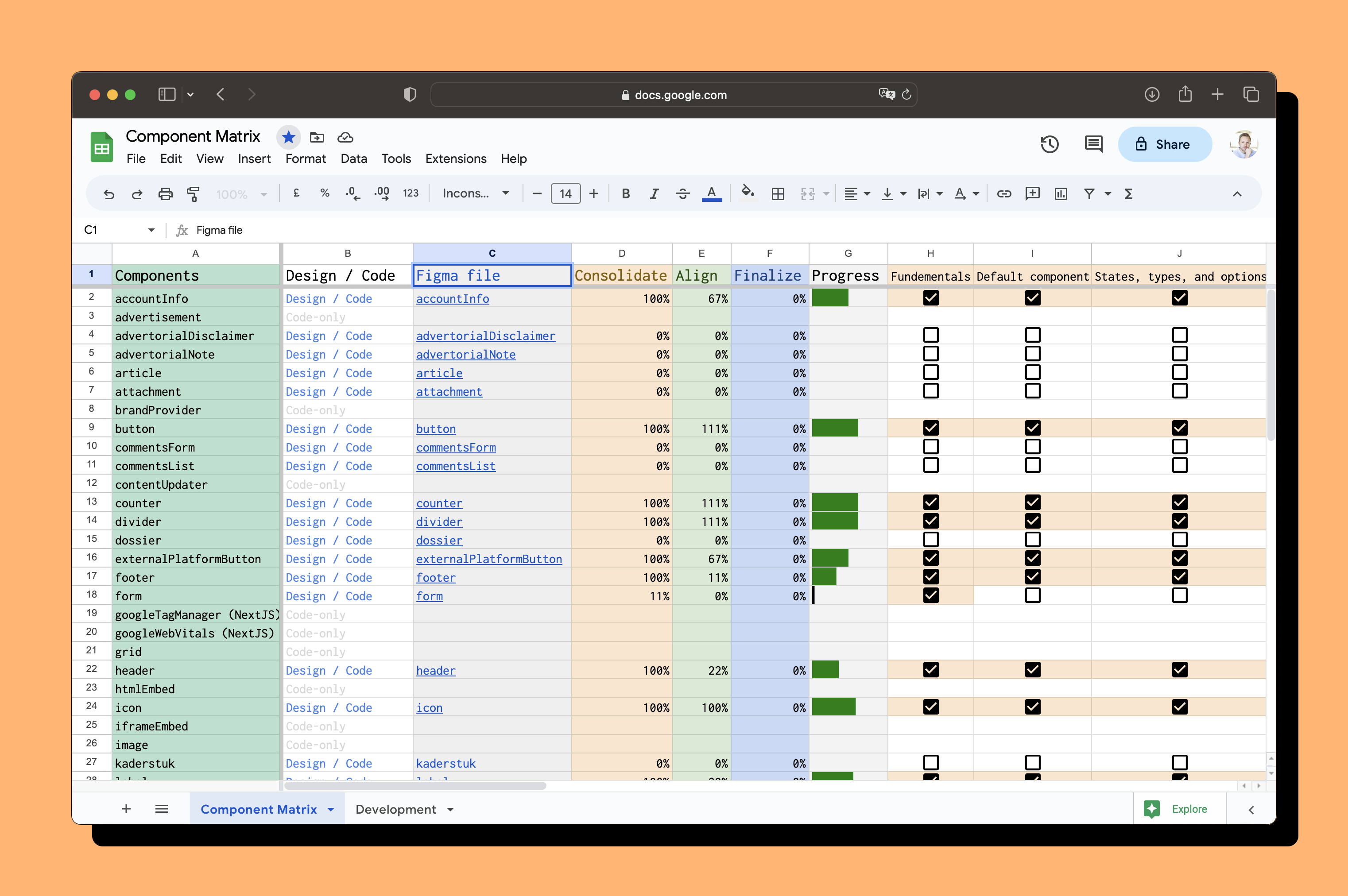
Typically taking the form of a trusty table (in the form of a spreadsheet), component matrices have long been the go-to tool for organizing different parts of a design system and keeping track of progress. Component matrices can be used to govern contributions, spot bottlenecks, and foster collaboration by enabling asynchronous collaboration between teams and individuals.
Whether your design systems team is centralized or federated, component matrices can provide vital visibility to other members of the organization, including future users, and any stakeholders who need to be kept in the loop. This transparency not only builds trust and peace of mind, but can also visualize the effort required for a compliant contribution. For the team in the previous example, a component matrix was crucial to keeping everyone in sync. In combination with a checklist, we turned the matrix into a central tool for their organization.
The importance of compliant components
Compliance means making sure that every requirement is met when someone submits a new component or variation to a design system. This ensures that the system remains a reliable source of truth. Compliant components maintain consistency across products and platforms, creating a better overall experience for users and for teams to collaborate and iterate on designs.
Unfortunately, not every contribution to a design system is compliant, and that's okay. Especially in federated setups where designers may be primarily accountable to a product surface (over the design system), a designer might have the time to create the component they need for a specific design, but not enough to deliver a full, compliant contribution. This is where checklists come in handy; they help us keep track of missing attributes and ensure that we are moving towards compliance over time.
Throughout the article, we’ll keep these scenarios in mind:
- A contribution, meaning done enough to be delivered in product.
- A compliant contribution, which contains additional attributes, that meets all the requirements of the design system, enabling other teams to use it.
Setting goals to reach compliance
When submitting a contribution to a design system, a Definition of Ready for development is often sufficient. However, for a compliant contribution, it must meet additional requirements such as documentation, examples of how to use the component (and how not to use it), and sometimes extra features or types. Although these requirements may not be immediately beneficial to the initial designer or creator of the component, they are crucial for other users of the system to understand how to correctly reuse the component. By defining these requirements upfront, we can ensure that the contribution is compliant without needing to revisit or refactor it later on. Establishing compliance goals at the beginning of a project helps set the right direction from the start and avoids unnecessary delays and headaches down the road.
These are the goals we established for our Definition of Ready:
- Component must be clearly defined
- Component must be similarly represented in all environments: in code, design application, and documentation
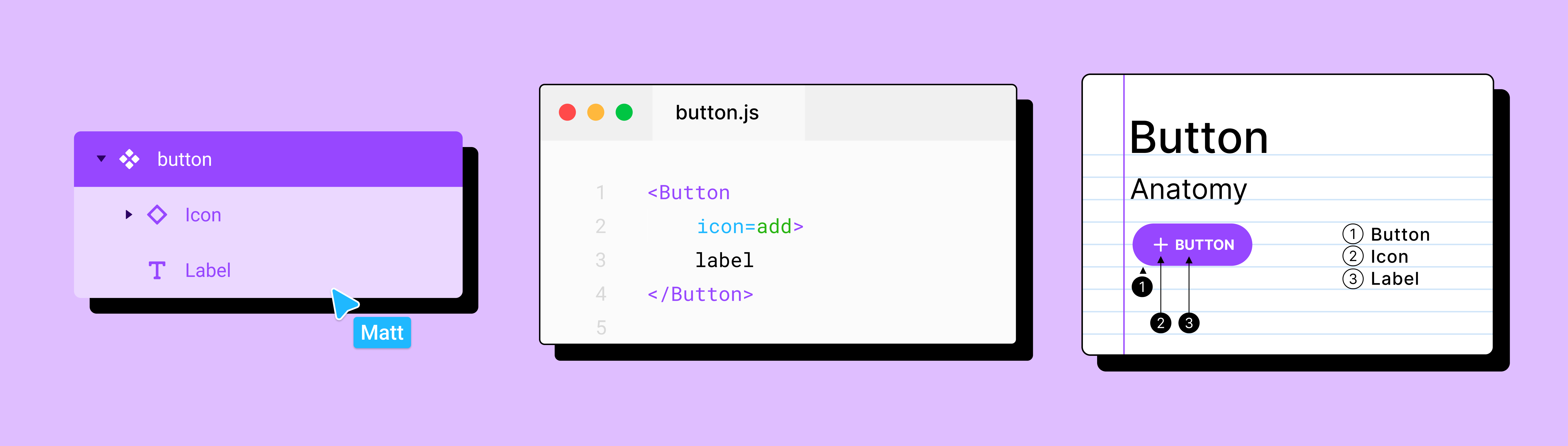
* Read more about component representation here: API alignment and stack mirroring.
Defining the steps
To ensure that your Definition of Ready leads to compliant contributions, it's essential to check in with your designers and developers to make sure they’re on the same page. Consider adding prefixed steps that guide everyone through consolidating design solutions, applying foundational styles correctly, and examining related solutions to help self-govern the contribution process. These steps should be mandatory even for regular contributions to prevent the need for future refactoring.
The suffixed steps focus on reusing the component and should include documentation, do and don't examples, live-copy examples, and accessibility features, if missing. Once you have put them all in chronological order, you'll end up with a usable step-by-step guide for creating compliant contributions.
At first, defining even the most scrutinizing tasks may feel tedious. But in the end, it can become a mnemonic device for even the most senior designers, who might sometimes forget basic tasks or want to see where they'd left off. More junior designers, less familiar with the system, can be assured that they’re following the best trajectories by using these steps as guardrails.
Keep monitoring the use of the list by checking in with its users to see if you need to adjust descriptions or add incremental steps. The goal of defining steps is to give enough guidance that leads to a compliant contribution, including the design system's standards.
Your first matrix
Once you have your checklist done, it’s time to choose a place to host your matrix. Consider a location accessible to everyone within the company for viewing and editing, such as Google Sheets.
Incorporating the checklist into Figma lowers the threshold for designers to start registering their progress. Consider adding it into a template file to make it the starting point of a new contribution.
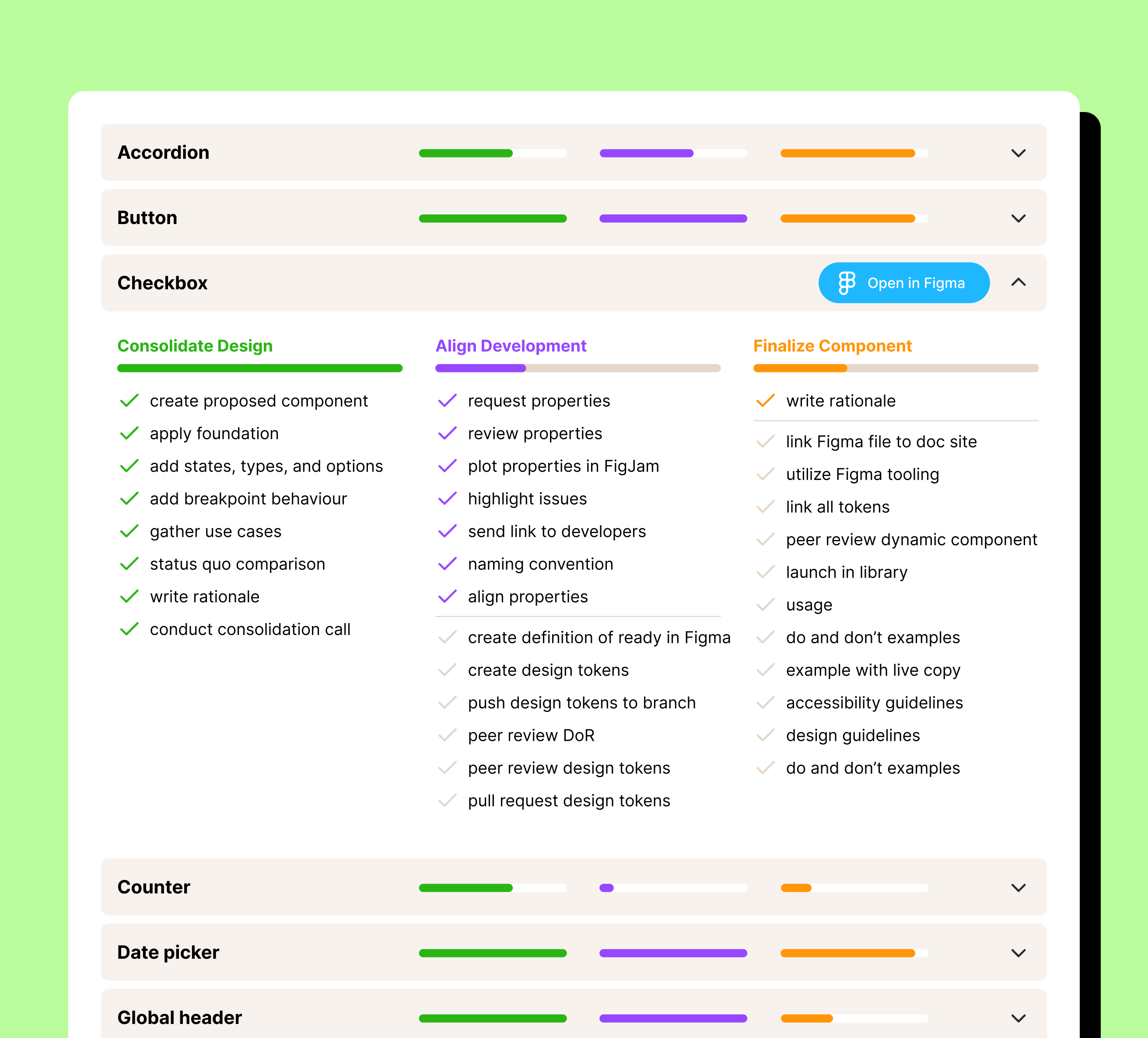
Using a component matrix to track progress on a design system is a powerful way to make intangible progress visible. When checks are marked on the matrix, progress becomes visible, and it becomes easier to oversee the process in detail. This increased visibility has many benefits to governance: You can catch disregarded steps that may indicate a process issue, as well as bottlenecks that need to be addressed. While product managers can deal with most tie-ups, taking the next step in defining the component matrix can further smooth the process.
Increased visibility through the use of the component matrix not only benefits governance, but it can also help gain buy-in from outside stakeholders. By showcasing a clear and comprehensive process with many moving parts across multiple disciplines, stakeholders can better understand the value and effort required to deliver a single component, like a button. This helps to elevate the importance of each component and ensures that every aspect of its creation and implementation is visible and tangible.
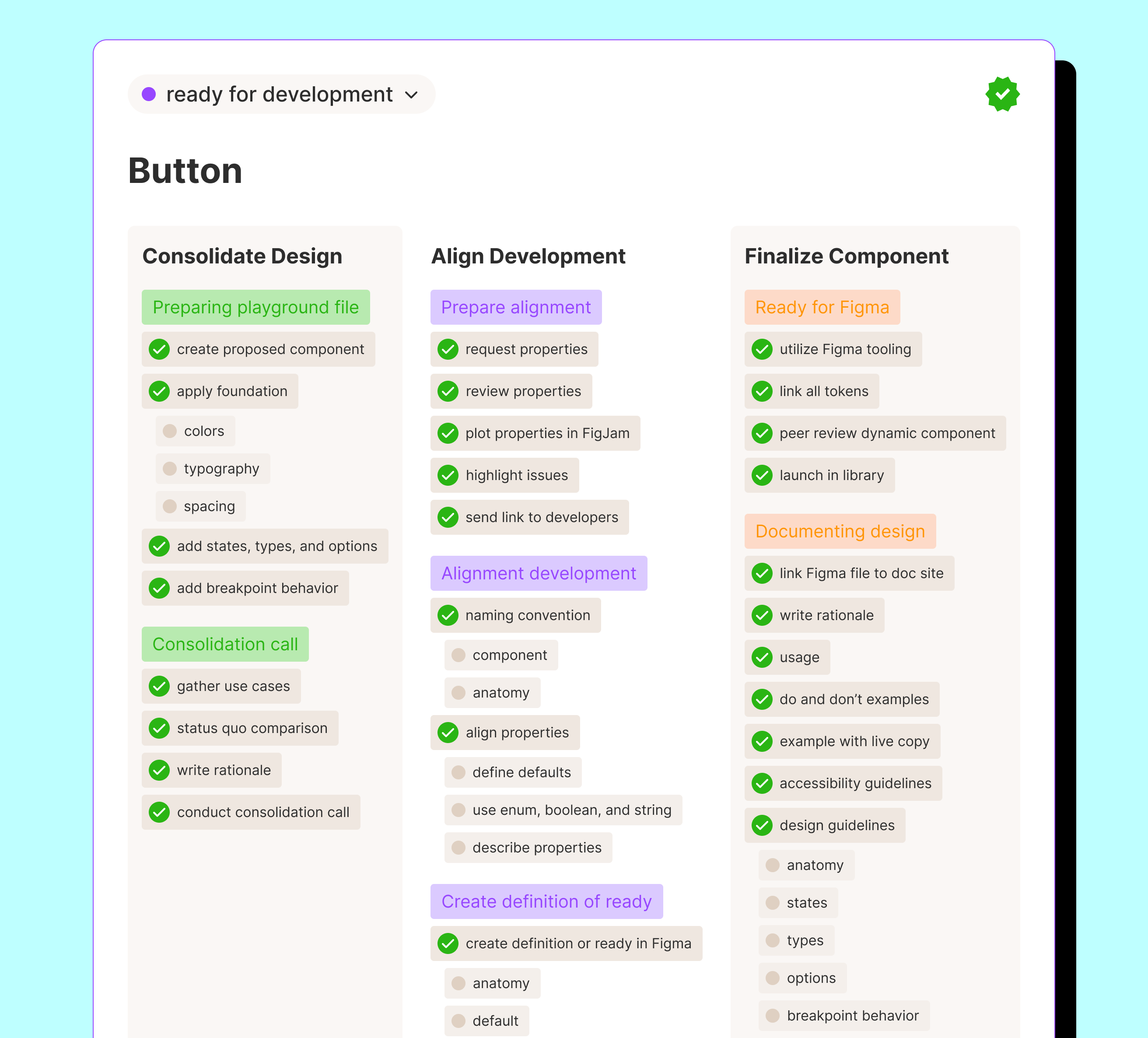
Creating your checklist
When building out our checklist, we ended up with 32 steps—a long list like that can be overwhelming! To make it more manageable, we divided the list into phases. In these phases, we focus on governing the contribution by consolidating the design, delivering design, and finally, achieving compliance. By breaking down the checklist into manageable phases, it becomes less daunting and serves as a series of stepping stones. This approach not only helps contributors focus on the tasks at hand, but also assists product managers in planning and overseeing the process.
Consolidating design
Remember the prefixed steps we talked about earlier? This phase contains most of these checks and is about verifying the contribution's need and quality. You can rephrase the initial checks as questions, such as, 'Have you tried solving with existing components?' and 'Do you have a presentable use case?' Then, when the proposal seems justified, you can check if it inherits other parts of the design system correctly by asking, 'Does it impact other design system components?' and 'Did you apply the fundamentals?'
Delivering design
In this phase, you can focus solely on the attributes necessary for developers to start developing, which will speed up delivery. To ensure that these attributes align with the design, you can include tasks related to naming the component’s anatomy, design tokens, states, options, types, and viewport behavior. The final step in this phase is to create a Figma file containing all the relevant details based on the alignment meeting. Consider a static component in Figma as sufficient to save the designers some time. This Figma file will serve as the Definition of Ready document and can be attached to a JIRA ticket or included as a link in the component repository's README file.
Achieving compliance
Compliance in this phase means making the component reusable by others. Here, a designer can use Figma's attributes, like auto layout, booleans, and enums to refine the component and prepare it to be published in the library. Developers can work on adding any remaining features that didn't make it in the first release, and provide all the necessary guidance for adopters to apply the component correctly.
Delaying compliance
In the interest of speeding up delivery and getting a contribution into the final design, you may want to hold off on that last phase required to make it a compliant contribution. With a component matrix, that’s ok, too! With a governed- and aligned- design, there is less worrying about possible discrepancies, letting everyone work on their part concurrently. You can pick up compliance tasks when the dust settles.
Getting started
Ready to try it out for yourself? As part of our solution, we developed a Figma widget that automates registering checks in a component matrix. This custom checklist can be placed right in Figma, and synced to a dashboard. As an admin, you can propagate your checklist from one central place to all Figma files, and view updates instantly on a dashboard, categorized by component and phase. Sign up to try the beta version today. We are working hard to make it available to everyone.
Alternatively, you can make a copy of our sample spreadsheet and map to our Definition of Ready checklist. I look forward any feedback or suggestions for improving these resources.

