A collaborative approach to defining components and their features

Naming is hard. We’ve all heard this before. Whether it’s a new brand, code functions, or a beloved pet, coming up with a name everyone universally understands and likes is hard. The same is true for design system components. A radius is called ‘border-radius’ for web and ‘cornerRadius’ for iOS. So, which do you pick? Radius? Corner-Radius?
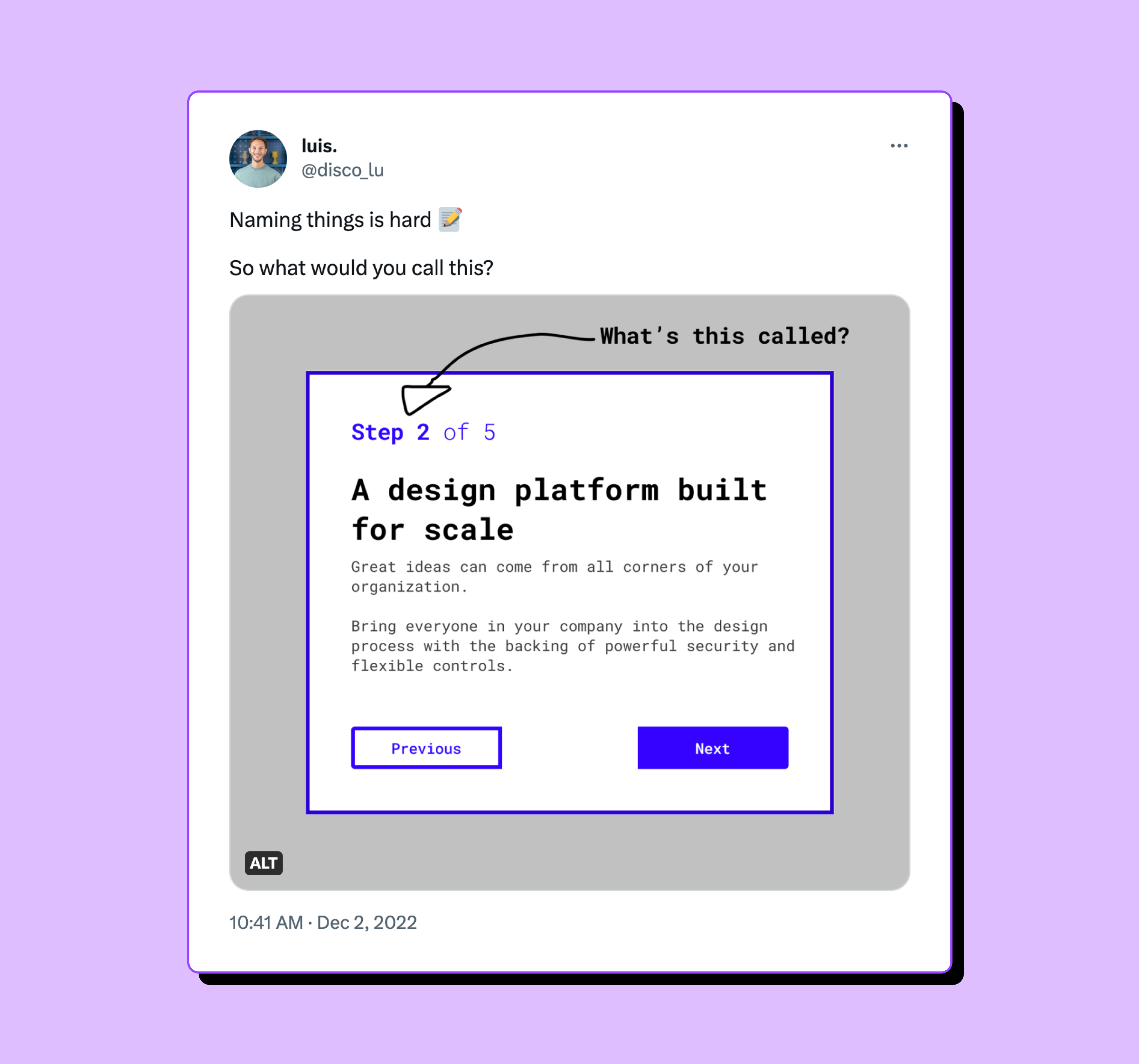 Figma Design Advocate Luis often asks his followers what they would call various design elements within components.
The lack of alignment doesn’t stop with naming, echoing other misalignment that can exist around a component’s functionality and how it fits within the overarching system. As a design systems consultant, I’ve stumbled upon this problem in many organizations. If even the slightest deviation between these definitions remains, it can eventually become a discrepancy, a crack in the source of truth, leading to problems down the line. So, how can we come up with component definitions that everyone agrees on, and that can scale with the system as it continues to evolve?
Differences in perspective
Part of the challenge in agreeing upon a shared function and categorization for a component is that each discipline interacts with it differently, and from a different perspective: A developer might value a concise codebase, while a designer looks at visual cohesion. Meanwhile, a design system maintainer aims to create a lasting system that can be easily extended and governed.
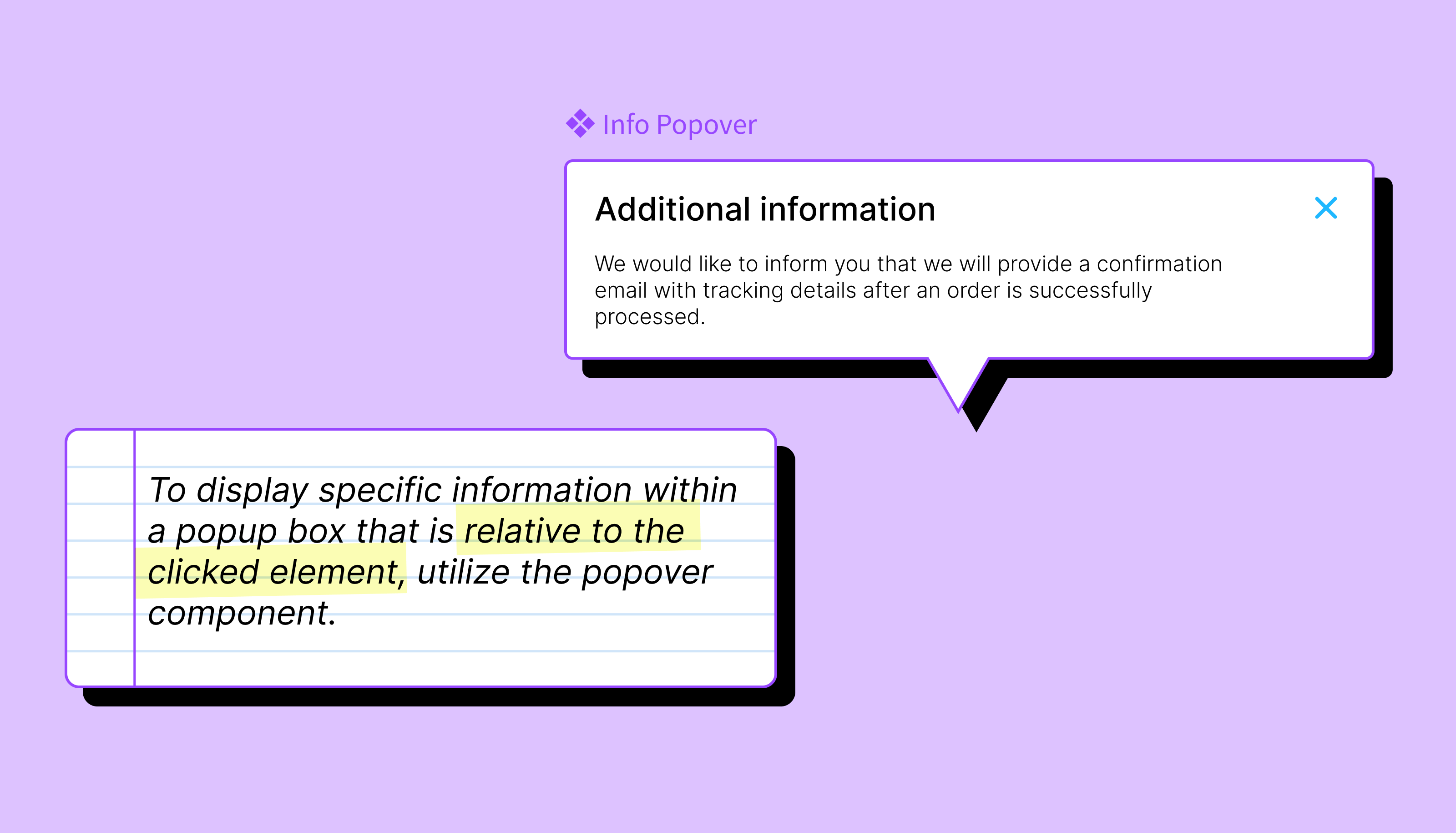
It's not just a matter of preference. These unresolved differences can result in ambiguous documentation and, in turn, implementation issues. A while back, I encountered a situation in which a designer wanted to present additional information within an app in the form of a pop-up. Looking through his company’s design system, he decided that an existing modal seemed like a good fit for his needs. He only needed to remove the button for the component to solve his use case while maintaining visual cohesion.
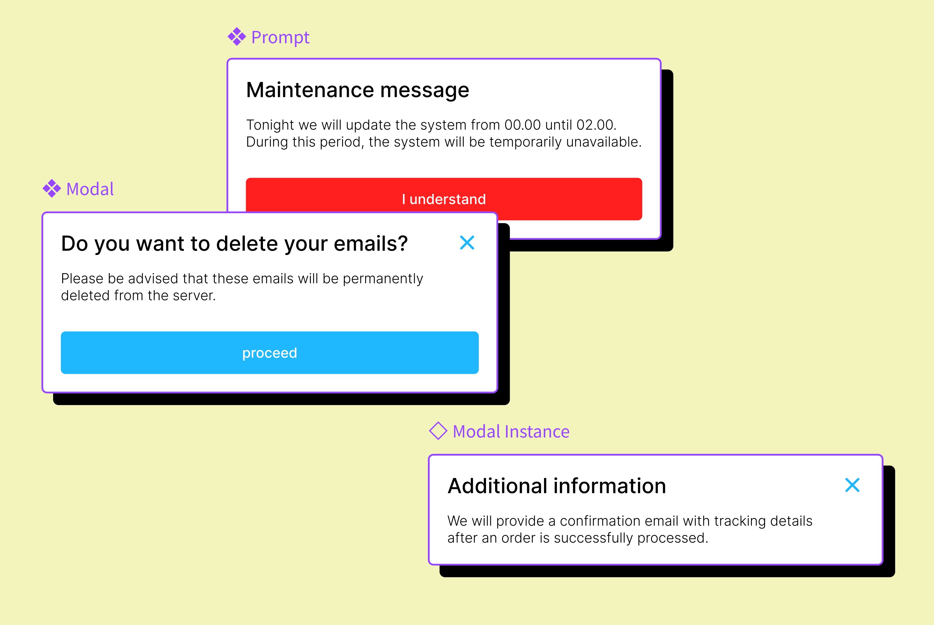
But, the modal wasn’t designed to solve his specific use case. Later, an update to the modal broke his implementation. Modal, prompt, and popover are components that may look alike, but are intended to solve very different problems. Generally speaking, a modal asks a user for confirmation, a prompt informs them about something they can’t change, and a popover shows detailed information inside a pop-up box relative to the element they click.
The takeaway? Components with clear and distinct use cases are more likely to be used for their intended purposes. This gives designers confidence that their solution is long-lasting, while also giving the maintainers of that system confidence that they can continue to update and evolve their components, knowing that they won’t break or cause issues within the product. Win-win.
Driving with purpose
So, how do you get everyone to agree on a component’s use case? Our biggest breakthrough happened when we invited a content strategist into the room with our designers and developers. They immediately began by writing it all out:
‘Purpose: Asking a user for confirmation..’
When everyone agreed on the component’s purpose, naming and behaviors suddenly became clear. Together, we decided that a component’s purpose or design rationale should serve as its “driver,” informing its not only its name, but any future functionality. A design rationale is an explicit written description of the purpose and reasons for creating a component.
Taking this approach when defining a component means we start with just the concept (modal), followed by a short, detailed description (e.g. a modal displays content in a layer above the page, requiring the user’s interaction to proceed), and then usage documentation, along with “do” and “don’t” examples. We can explain the justification for the design, alternatives considered, trade-offs evaluated, and any final decisions along the way. The final design documentation should describe the component’s design and behavior, capturing everything from the overarching concept to the smallest detail. This design rationale explains why things are the way they are.
Using the design rationale as a driving force can lead to a consistent outcome every time. It enables you to write clearer guidelines, simplify governance, and form the foundation for adopting valuable additions or improvements. The purpose functions as an entity of the solution, regardless of how it is shaped, its features, or how the code optimizations will evolve—the entity will always abide by its purpose.
A guide to drafting clear guidance
When we talk about an effective design system, we often call it a “single source of truth.” However, design systems are often maintained across multiple environments such as git repositories, design applications, and documentation platforms. Therefore, a single source of truth is only achieved when the code, design, and documentation are all mirrored in their respective environments.
Starting with a purpose, you can further clarify the components’ documentation by removing ambiguous language such as: sometimes, in case of, in general, and mostly.
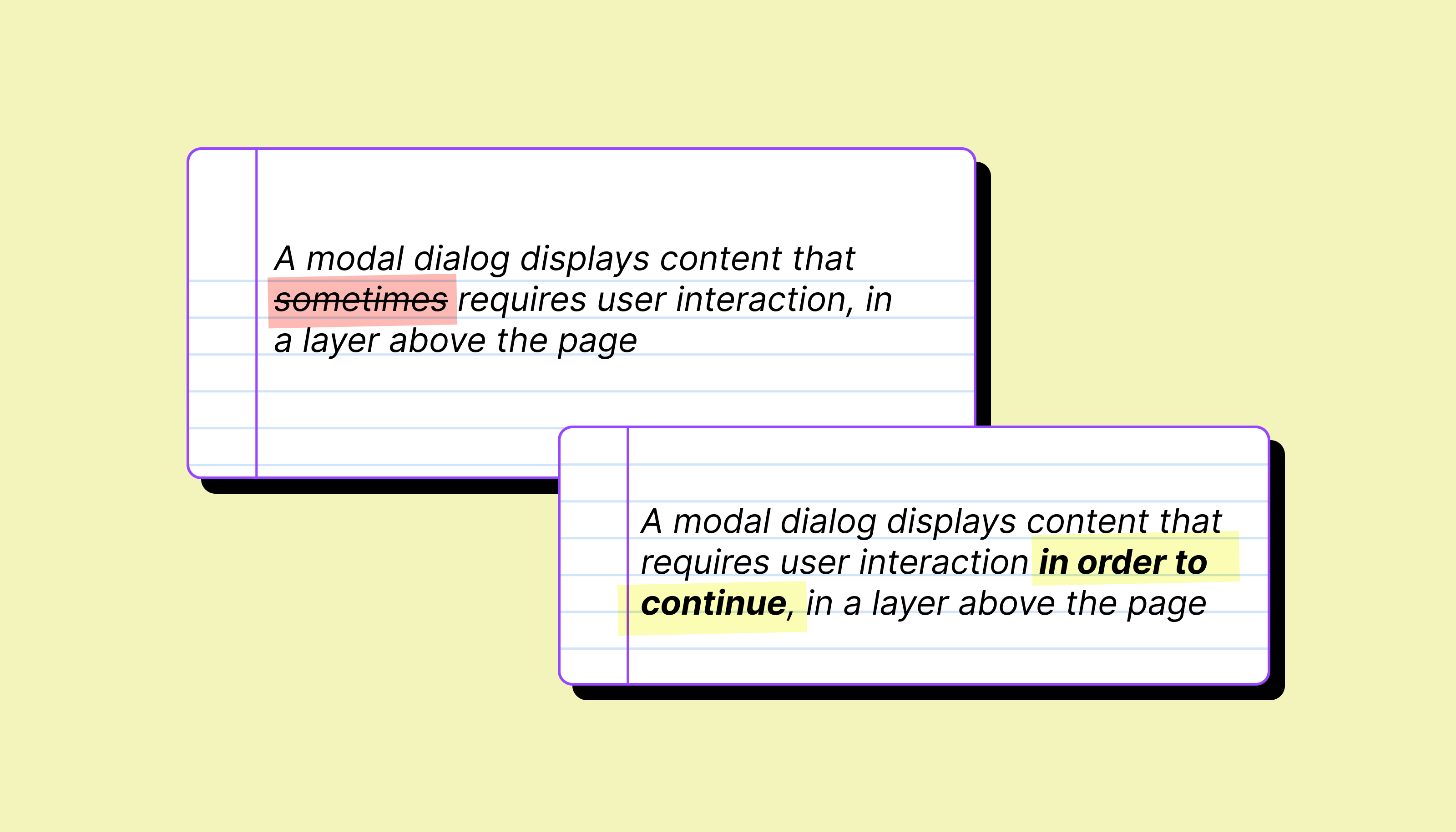
The more specific the documentation, the easier it is for the user to understand the components’ purpose and limits. On the other hand, such specificity can annoy adopters, keeping them from making their own judgments and trade-offs. Ideally, if a design system isn’t serving its users’ needs, we want those users to share that information, so that maintainers of the system can improve it for everyone. Clear documentation not only clarifies usage, but also reveals its limits. When adopters hit a wall, they can contribute by improving the component; identifying any shortcomings of a design solution is key to further enhancing and completing the rationale.
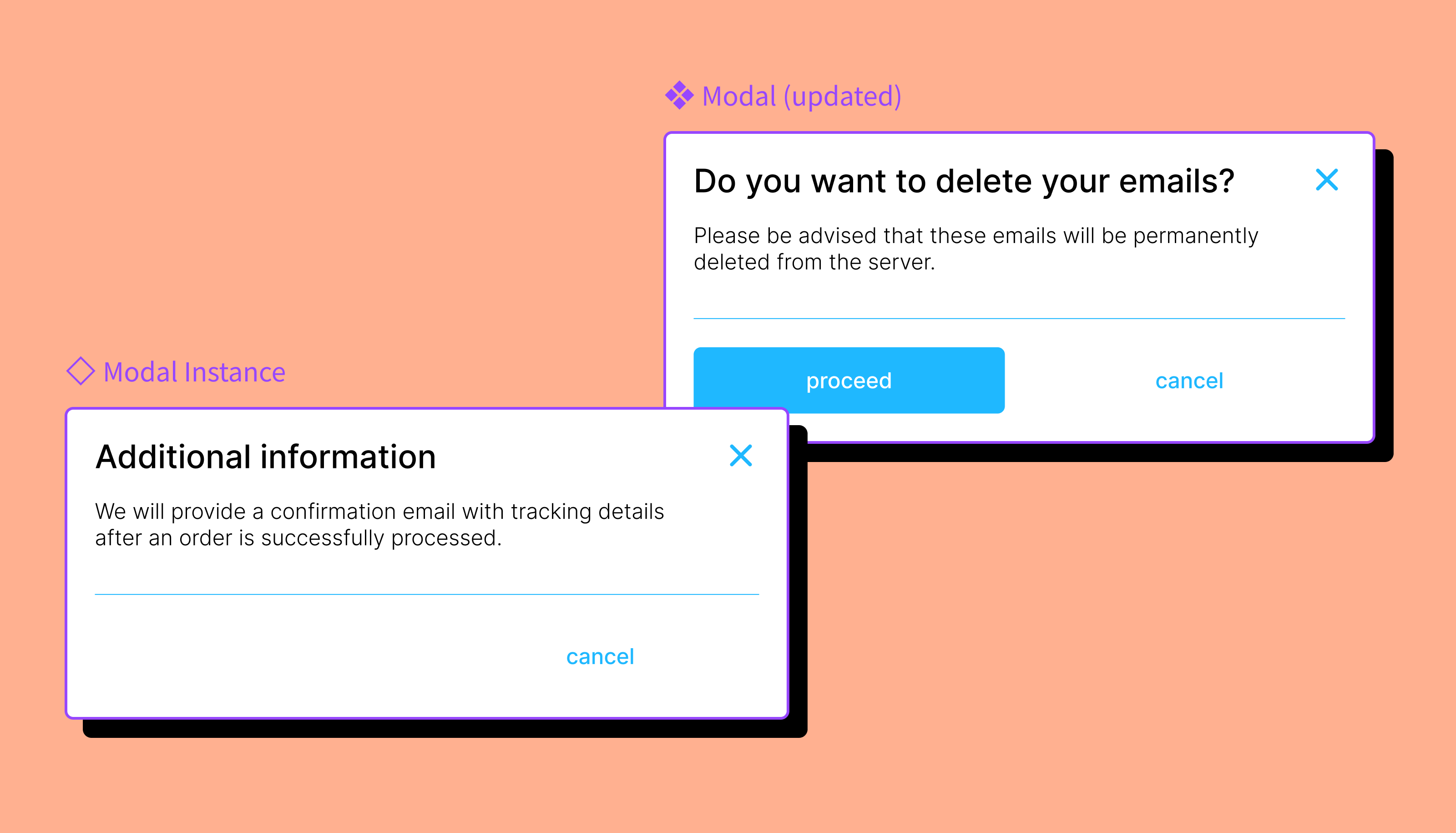
This was the issue with that modal I mentioned earlier. By not communicating the limitations of the current component, future updates to the components didn’t account for his use case. Others may have also needed to use a new pop-up component, and thus the cycle continues.
Future-proofing your design rationale
Representing the complete rationale for a product is an ongoing task. When new use cases arise that can’t be solved by the existing design system, we need to make adjustments to solve new issues. Again, in the case of visualizing information in a pop-up, the use case didn’t fit the existing purpose or design rationale of the modal. The change request was valid; no component was available to solve the use case. It just meant the contribution needed to be its own entity, as ‘info popover,’ with its own rationale, serving a single purpose.
We can prevent future misalignment by having a common, agreed-upon driver. In another article, I describe an inclusive contribution process based on purpose. Part of that process is presenting how the improved solution solves for the new use cases, while still supporting its current use cases. This ensures that the component continues to serve its existing purpose, and can maintain a clear design rationale.
When you start reorganizing your library on the basis of purpose, you might come across components that serve multiple purposes, and want to split them up. You may even have to justify why this is necessary to your cross-disciplinary partners. It might feel unnatural for developers to duplicate these properties, especially if most of the APIs of these components are the same. However, giving these components their own entities allows designers to tailor them without being dependent on other (unrelated) components.
Ultimately, when a design rationale accurately defines a component and its behavior, it can safeguard a component's application and ensure it supports all known use cases—forming a solid foundation for future governance and contributions. New use cases will always arise and require adjustments, but managing those adjustments is so much easier when it’s clear why components exist, and for which use cases. Does the addition fit the mold? Incorporate the adjustments. If not, perhaps it’s time for a brand new component and design rationale.
