Stack mirroring: Designing for code and coding for design
Let’s be honest, design systems are doing what code has been doing for a long time now.
Programming by nature is functional, reusable, extensible, and version-controlled. Modern design systems aim to accomplish much of the same and more, and therefore can take direction from how programming already functions.
Design systems are important because they enable faster design iteration, team and product scalability, and programmatic thinking. I’ve always been onboard with the first two, but it’s programmatic thinking I’m currently most interested in. Thinking programmatically when building and implementing design systems gives superpowers to product design teams.
Mirroring code structure in design files
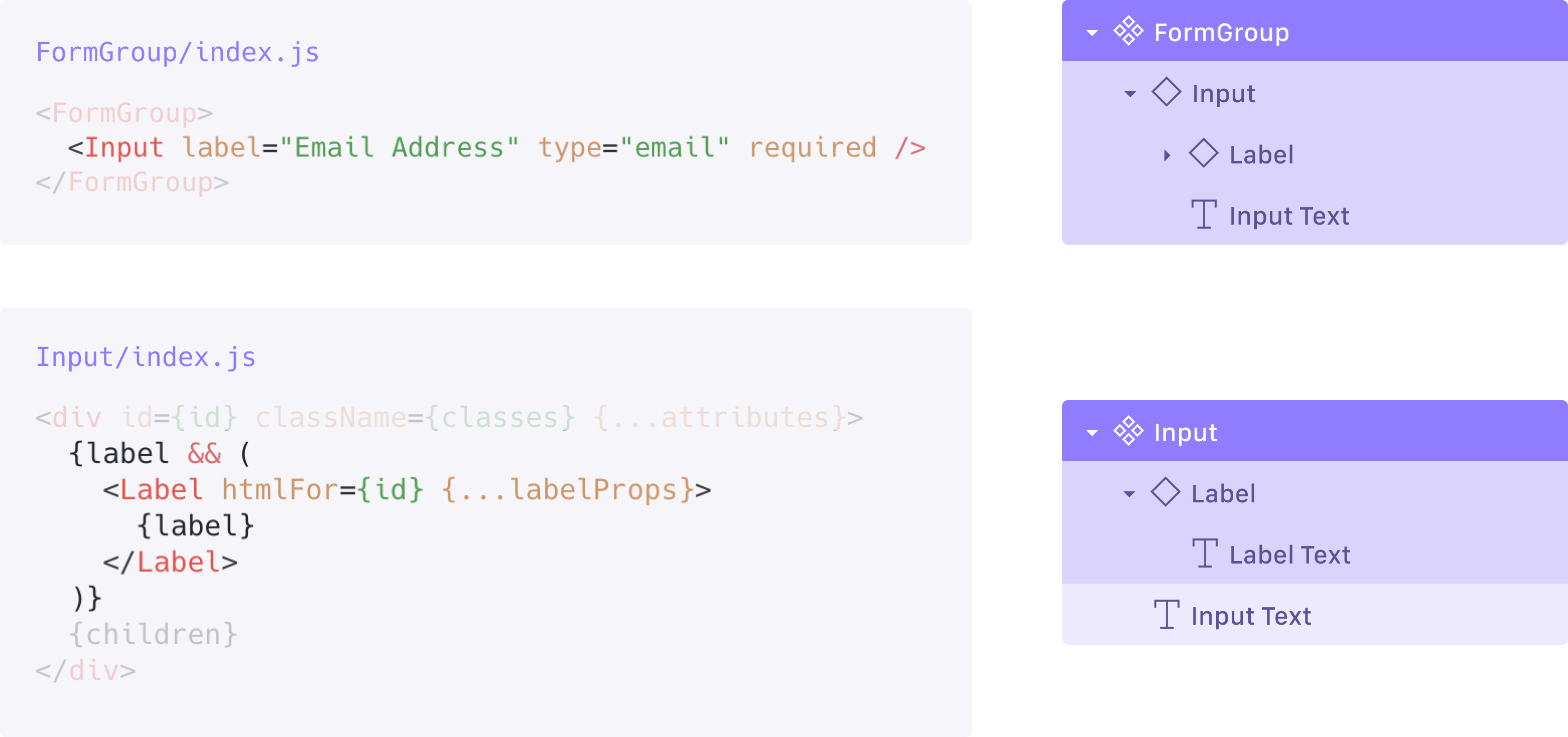
Here’s an example I came across most recently. I was building a UI component library in Figma for our web apps. Our UI Engineering team had already built this component library in React as an npm dependency. Since I was already familiar with React, I started working backward by using the React component code as inspiration for building the Figma instance. I immediately saw the benefit of isolating and nesting components of all sizes, and accounting for all options and props that exist in the React schema.

For years I had already been modeling layers and groups after markup – nesting, ordering, layer naming, mirroring class names – so mirroring code structure in design files didn’t seem like a crazy idea to me. I did have the luxury of starting with the code first and working backward, but the lesson stands. There is power in design mirroring code and vice versa. It begins to further approximate the actual with the static.
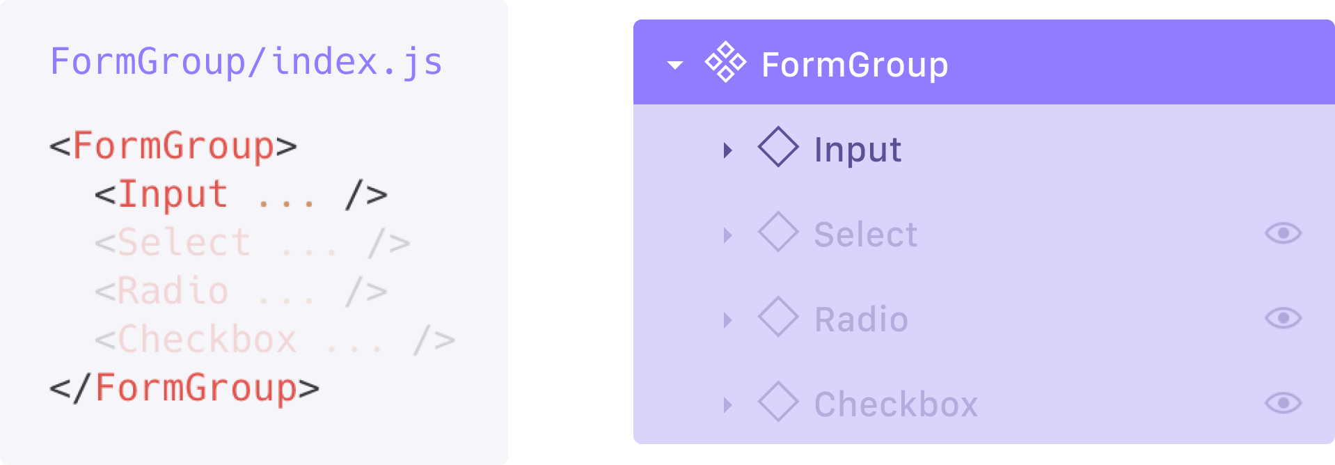
In the example above, I’m using a series of nested components to mirror how we construct a form input. It goes like this FormGroup > Input > Label. Input and Label are their own master components. These instances of Input and Label are then bundled in the master component of FormGroup. Similar to React, this allows for the independent management and integration of the component. When handling a component that can have multiple variations or when trying to simulate React’s “props,” a simple on/off toggle will suffice.

Stack Mirroring from a dependency level
Markup mirroring is fine and dandy, but I don’t want to stop there. I see an opportunity to further mirror our front-end code stack (Node, npm, React, Javascript, markup, etc.) with our design stack (Figma, Figma Libraries, Figma Components, layers and groups, etc.). Enter my idea of “stack mirroring.”
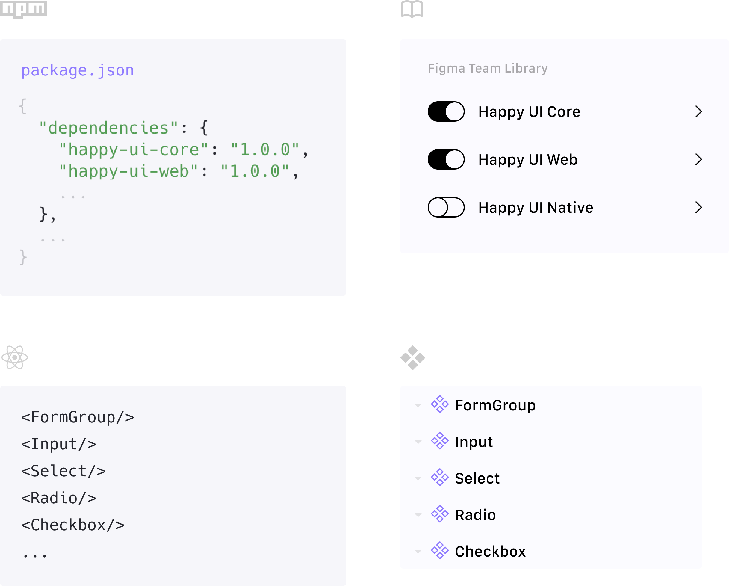
Before I was mirroring on the element level, but now I’ve started thinking about how to mirror on the dependency level. Platforms like npm enable the limitless inclusion of externally managed packages and dependencies (learn more about npm here). For example, the component library I mentioned earlier is a dependency we call Happy UI. This is a front-end component library that is shared across our web products, not unlike Figma’s shared libraries. This alignment is another obvious opportunity to leverage mirroring.

Just as dependencies can be included on a package.json file in a node project, you can think of Figma’s Team Libraries the same way. We’ve separated our Happy UI dependencies into a few different projects: Core, Web, and Native. Happy UI Core has shared fundamentals like brand assets, colors, icons, and utility components. Happy UI Web has all of the functional components to build a web interface and when combined with Core, we’re cookin’ with gas. So if I’m working on a new onboarding flow for the web, I’ll use Web and Core and it’s as easy as that.
When working with our UI Engineers or Software Engineers, we use a shared namespace and model to facilitate scalability, efficiency, and iteration in our fast-paced environment. With stack mirroring, there is less panic and confusion around the ways and means to accomplish these goals.
I believe that design and development work better together when our namespace, tools, and models are in sync. When we reduce mental overhead, teams don’t have to compromise on quality, even while they build and ship features fast. Keeping development and design concurrent means your product is easier to maintain, test, and update. What are you waiting for? Work with your developers to start stack mirroring today.