Building a design system one brick at a time


Front-end engineer at PlanGrid and web lead for the company’s Arc design system.

At PlanGrid, the key to creating a successful design system was to move in small steps that demonstrated value and motivated institutional change. This allowed us to get the right people involved and gain executive buy-in, all while building a strong partnership between design and engineering.

Start small and show the benefits
We didn’t start by trying to build a full-fledged design system right out of the gate. Instead, we started with lightweight elements that would have real customer benefits. The low-hanging fruit we identified were fonts, colors, and icons.
At the time, our web app used several custom-hosted web fonts, which we replaced with a set of default system fonts. It was a minor change, but one that had a major effect for users—it reduced page weight by 53%, vastly speeding up our load times.
We were also using over 120 hardcoded, difficult-to-read colors in our web app UI. We reduced this to 34 colors, and our engineering team transitioned us from hardcoded colors to systematic color variables. This was a relatively lightweight effort that created a more customer-friendly product and improved engineer speed and consistency.
Finally, we consolidated and redrew our icons. Previously, our icons varied widely across platforms, creating a lot of confusion for users.
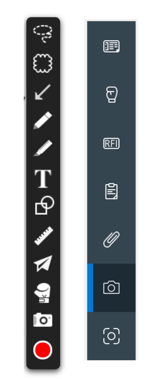
We were running off of an image spreadsheet and using CSS to map to icons. It turned out to be a fairly minor engineering task to swap the old icons for the new ones. We immediately got positive feedback from our support and consulting teams, who were grateful to no longer have to explain icon inconsistencies to customers.
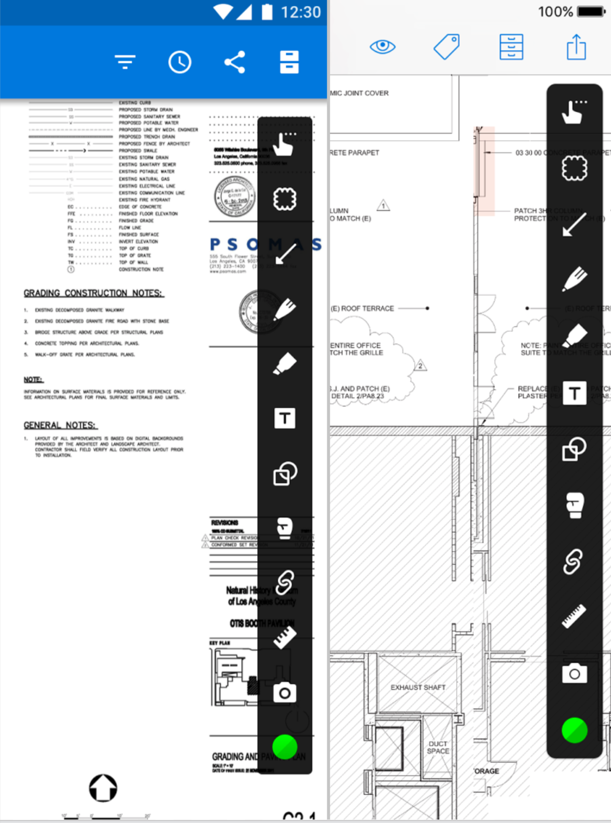
Our engineers also loved having a cleaned up icon repository which made it easier for them to quickly assemble new pages. Eventually we developed this implementation further to use inline SVGs, bundled with our JavaScript, but at the time it was easiest to just swap out the image assets.
These were manageable steps that improved consistency across the product and sped up design and development time. We were seeing great outcomes from small changes and wanted to sustain that momentum with the new design system. That meant finding ways to devote more resources to the work.
To gain executive buy-in, it was important to show the tangible benefits from the work we’d done to that point. We made the product experience more consistent, but that had to be put into more concrete terms. We enlisted the help of our Sales and Customer Support teams, who provided us with customer feedback and quotes about our improved usability. Our VP of regional sales praised the “improved ease-of-use for us in demoing” because of the improved navigation and consistent iconography. The director of our Consulting team thanked us for getting rid of the icons that proved particularly confusing to users. In both cases, people interacting directly with our customers and training them on our product were seeing tangible benefits from relatively simple changes.
We made the case that we were moving faster on the design and development side, all while making the product easier to sell and fielding fewer customer support problems. Using the hard data we’d collected, we successfully won over our executives. Their approval meant a full-time engineer working on the design system, and additional time and resources to expand from web to all the platforms we serve.
Gain institutional traction
With an engineer fully dedicated to the design system, we were able to think more carefully about how to approach our components. PlanGrid’s web platform uses React for UI development work across all web features. This allowed our design system engineer to focus solely on building React components rather than making components work across multiple frameworks.
The goal was to give engineers components with all UI interaction details built in while providing escape hatches for them to swap out chunks of the components with their own implementations if any part fails to meet their needs. For instance, in our dropdown menu, the default case shows a vertical list of items with text labels. In one exception, we have a dropdown menu that displays a grid of colors to serve as a color picker. Instead of merging the implementation details of the color picker with the vertical list of text labels, we set a default and allow app engineers to simply replace the default implementation with their own.
Engineers only have to worry about the interaction details that directly impact the functionality they own. This flexibility is especially valuable for a design system in its early stages, as its set of built-in UI interactions may not be complete.
As a simplified example, let’s take a look at a component that displays an image with a caption. We can draw a natural boundary around both the image and caption. The component provides its own defaults for both pieces, but each, or both, can be swapped out with an implementation provided externally.
import Caption from './Caption'
import Image from './Image'

const MyImage = ({
  renderCaption: Caption,
  renderImage: Image,
}) => (
  <>
    <Image />
    <Caption />
  </>
)

MyImage.defaultProps = {
  renderCaption: Caption,
  renderImage: Image,
}
While this is not the most direct way to create this component, a design system engineer will build on this component like they would if they were an engineer on a feature team. The only difference is that the design system engineer’s implementation is set as the default. Everyone at PlanGrid can choose to write their own implementations, but typically feature engineers will rely on the defaults provided by the library. This doesn’t apply to simple components, but the approach has proven to be quite valuable when architecting components with multiple parts, like dropdowns and tables.
We went from a situation where engineers were complaining about components being overly specific to one where they enjoyed functional components with a great deal of flexibility. We found that this created a feedback loop: the more benefits our engineers experienced from design system components, the more likely they were to contribute to the design system effort.
In addition, the use of escape hatches clearly outlines how each component instance deviates from the default. Each deviation serves as an example of how to officially pre-bundle those interactions in future versions of the library.
The escape-hatch implementation was an important selling point for the engineering team, and a similar feedback loop happened on the design side as well, with designers experiencing benefits and becoming more likely to contribute. As a result, we implemented a design system council to bring together designers and engineers and implement a joint decision-making process that helped everyone become more invested in the project. Putting this more formalized structure in place made it easy for design and engineering to come together in a productive way that would make implementation easier for everyone involved.
The council consists of leads from the design team, engineering representatives from each platform (web, iOS, Android, and Windows), and any other designers interested in the standardization of components. Anyone can bring a proposal in front of the council, which is then evaluated based on our shared experience principles. Before getting implemented, proposals get sign-off from representatives of the design teams that work on each platform.
As part of an effort to codify design system implementation, we built out our design system website. In addition to centralizing documentation, it also houses our experience principles, illustrations, and copy style. In effect, the design system website has become a repository for how we work effectively as designers and engineers.
Where we are now
We decided to name our design system Arc as a nod to design elements—the arc of a circle—and our role in the construction industry—an electrical arc. It’s allowed us to build a more consistent, user-friendly product across multiple platforms. And it’s also an ongoing project, one that helps bring design and engineering together to move more quickly and efficiently.
We now have a full-featured design system that was built in manageable chunks to meet the problems we were encountering at any given time. Now it’s an integral part of the PlanGrid Research and Development organization and a vital aspect of our feature development. The benefits have been immense: it helps us onboard new designers and engineers, speeds up design and development, and increases product quality by becoming a key resource for quality assurance.
At PlanGrid, starting small allowed us to quickly demonstrate the value of a design system, which made it easier to get everyone on board to start tackling bigger problems. The results have gone far beyond feature development. PlanGrid was recently acquired by Autodesk, and a crucial aspect of the sale was PlanGrid’s ease-of-use for workers in the field. During the acquisition, the design system was specifically called out as one of the strengths of PlanGrid’s Research and Development organization. Arc was seen as a key indicator of PlanGrid’s strong design vision and our ability to deliver experiences that users love in an operationally efficient way.
We’re particularly proud of what we’ve been able to accomplish with Arc, from creating a stronger user experience, to forming a closer partnership between design and engineering, to having our work highlighted during our acquisition. We think other companies can see the same benefits as they pursue their own design system work.
You can read more from the PlanGrid design team over at the PlanGrid Design blog.

