Taking cues from code

This week wrapped Schema by Figma, our annual design systems conference. Read on for a recap of Product Manager Jacob Miller's New York opening keynote on navigating the increasing complexity of design systems and what we can learn from the world of code, and check out full session recordings from our New York, Tokyo, and London events!
At our first-ever design systems conference, our Director of Product Sho Kuwamoto talked about freeform and structured design, two conflicting yet essential modes for designing great products. The need for both is still alive and well today as we continue to wrestle with striking the perfect balance. Our goal has been to to exist in the middle and allow you to move easily between the two.
As design continues to evolve, our work has increased in complexity and scale. In response, we’ve introduced more structure to mitigate that complexity (take, for example, design systems), which has, in turn, hampered free-form expression. So, how can we reduce the chaos while allowing the necessary freedom for creativity and exploration?
Taking cues from code
First, let’s take a step back: Once upon a time, design happened locally. You saved your files to your machine or disk, and that was it. You didn’t have to worry about coordinating with anyone or dependencies between files floating around in the cloud. Sure, you may have been plagued by a folder of files named final_final_final2.png—but, for the most part things were relatively simple.
Today, design is more complicated, often encompassing larger teams working together on multiple, interconnected systems. This requires better solutions to organize and make sense of it all. Teams seek solutions to problems like maintaining coherence, and quality at scale, all while enabling countless individual contributors to participate in a shared ecosystem.
Here at Figma, we’re starting to see are addressing this increasing complexity, with solutions that mirror existing engineering frameworks. Design is borrowing from code. To illustrate, I’d like to share a few examples:
Nesting components for flexible layouts
First, let’s talk about layout. For simple design systems, components might only have a single layout. As your product needs expand, however, you may need to vary these layouts. Take card or menu components, as an example. If you only have a couple, you can simply draw each of these representations as variants, but as you add more and more, that process becomes unmanageable. Component properties can help manage this by providing easy ways to create arranged variations of common elements like images, buttons, pull quotes, or text fields.
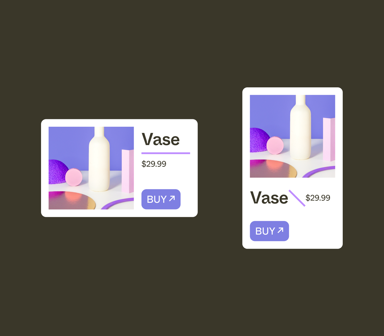
Alas, optionality doesn’t work for all cases, and we’re seeing that teams want even more flexibility in their designs. Take the above example of two different cards. Each has a different orientation (horizontal, vertical) and layout (where the image, title, price, and button sit in relation to each other) and therefore isn’t something that can be easily streamlined with component properties. You’ll still need to draw out each card, which adds complication to the authoring and maintaining of these components.

To solve for this, we’re seeing designers use composition, creating smaller sub-components and nesting them inside larger, layout-specific components. These various nested sub-components can be combined and recombined in a million different ways to achieve layouts that many design systems managers may not have considered. (Plug: Nathan Curtis will be speaking more on this at our virtual event!)
Decoupling structure from presentation
The simplest design systems don’t have a theming system at all. Generally speaking, an initial component will have just one color directly baked in (and very likely, there’s also a customer support ticket asking for dark mode). Eventually, you, the maintainer of that solitary component, will give in and implement both a light and dark mode.
A simple, bounded set of themes can be addressed in many different ways, but depending on your situation, you may need to add more themes for sub-products and sub-brands. Different products have different brand colors, and as the number of brands multiplies, so too does your organizational overhead. As theming complexity grows, you’re going to need help managing it.
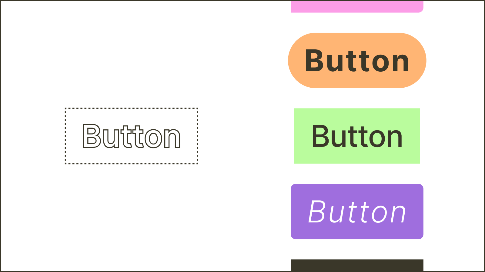
One answer to complex theming demands is a new approach to component architecture. Enter headless design systems, a term we first learned from Esther Cheran, co-creator of the Figma Tokens plugin. Instead of a component having three, four, or five different themes, the main component has no style at all but a set of invisible layers with a defined structure. You can apply themes to these blank sub-layers, effectively creating an infinitely adaptable component. By separating the layer hierarchy from the look and feel of the component—or the structure from the presentation, as familiar to in front-end development—you're able to drastically increase your design system's flexibility. Different brands, products, and themes can all use the same components while appearing completely different from one product to the next.
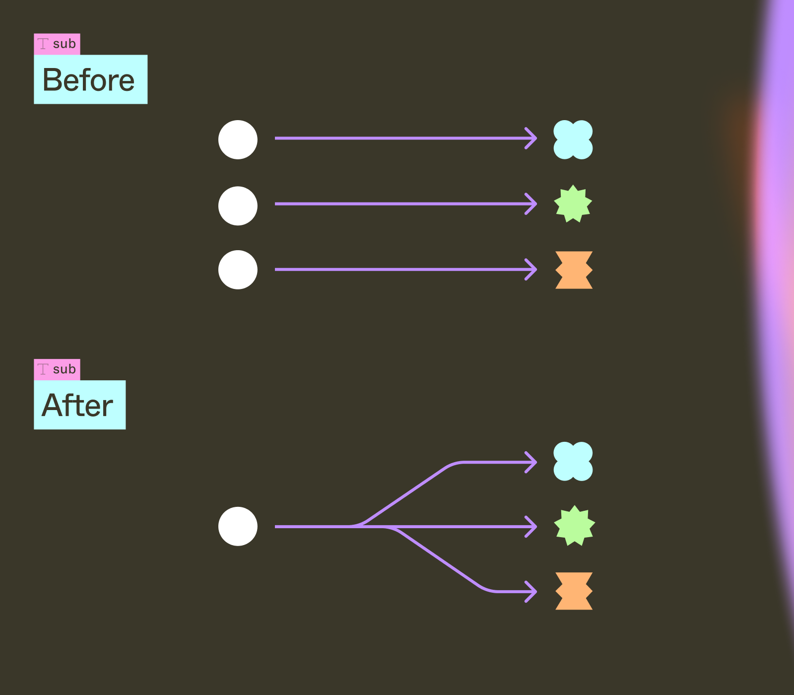
Investing up front in a headless system makes styling and theming a lot easier and greatly reduces the maintenance of these components. Whereas previously, you would need to manually implement a change across any number of uniquely branded components, now you can update the layout of a single component and have those updates roll out to all distinct variations. Meanwhile, individual product teams can handle visual changes while still using the same core component.
Managing change at scale
It’s no surprise that teams with great design systems also have great process. These teams tend to have established methods for managing updates, contributions, and curation.
If you work on a smaller team, your process can be fairly ad hoc, quickly talking to your coworkers to make changes. As your team gets bigger, these ad hoc processes start breaking down. It becomes harder for you to know what everyone else is doing. And for very large teams, it’s nearly impossible to avoid stepping on someone else’s work. Just as layout and theming complexity make it hard to manage design systems, so does organizational complexity.
One of the responses we’ve seen to this is test-driven design. Similar to its namesake test-driven development, quick tests are used to identify if any changes will break the existing structure. Adopting this review step in a design workflow can help you catch (and fix!) any issues before deploying them to your final product.
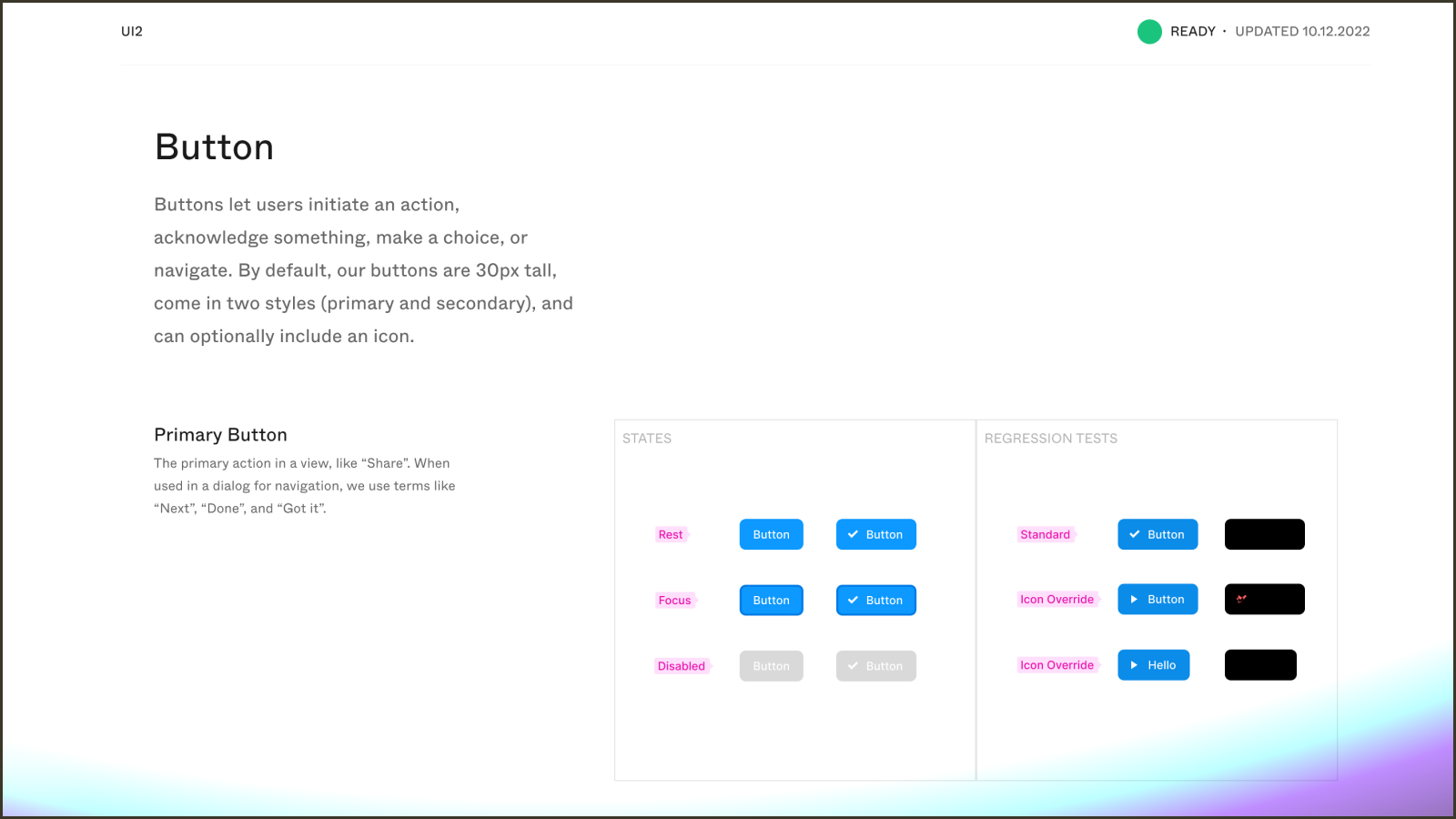
We do a bit of test-driven development in Figma today. Above is an example of a visual regression test. It works by taking one detached and one live version of an existing component and uses a blend mode to highlight differences between them.
Branching and merging is another way we’re seeing teams control changes to important, central files. By working on a branch, you can do your work without affecting others, and a review process can be put in place to ensure that your contributions are production-ready and conflict-free before being merged into the main file.
Treating your system like a product
Sub-components, composition, branching and merging, headless components, and test-driven development are all techniques that mitigate complexity. The result is a trove of solutions for designers to borrow from, all originating in code. But as our teams continue to implement solutions for managing design complexity, we also need to find ways to protect the freedom needed to create great design. We should treat our design systems like products and listen to the people using them. If they’re too constrained, we need to find ways to loosen them, and if our teams are telling us that there’s too much chaos, then we need to add more structure.
I used to hear people talk about the benefits of design systems in terms of their ability to reduce inconsistency by enforcing consistent spacing values or encouraging brand alignment. This belief fundamentally stems from a lack of trust in designers. These days, I hear more about how systems help streamline work and free up time so that designers can be more creative.
At the end of the day, our design systems should lower the barrier for creative expression. Not make it harder.
Watch Jacob's opening keynote from Schema by Figma 2022 below.

