Guide to content strategy

When it comes to adding copy and content to your product, you’re doing pretty well if you have a defined style guide. Clear guidelines for style and tone and answers for common questions about mechanics are essential for developing a coherent product. But style guides have their limitations, especially when it comes to nuanced styling for UI elements and patternized components.
That’s why it’s important to incorporate content strategy when building out your design system. Content and microcopy appear all over design system components. Without an effort to standardize early, you’ll end up making decisions about how copy should appear each time you implement a component. A well-defined content strategy even helps facilitate better design decisions because it gives your team clear parameters for exactly when and how copy will be used.
You don’t want to scale your product with a shaky foundation. Thankfully, you can head off plenty of problems early by standardizing content styling and copy concerns and determining exactly how you’ll document these decisions for your whole team.
How exactly you implement content strategy into your design system will depend on your team and product. So instead of an exhaustive account of everything you could include, let’s take a look at some of the common culprits and think through how they can be effectively standardized and documented.
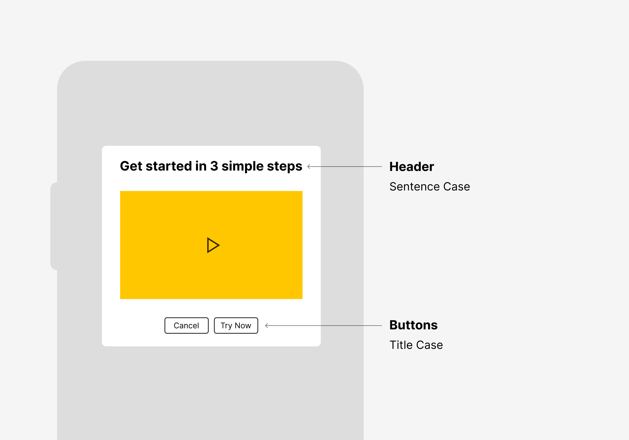
Title and sentence case
Once you start looking for it, the choice between title and sentence case starts to come up pretty much everywhere in your product—modal headers, button copy, table headings, text-entry fields. The list goes on.
But it’s not just a matter of picking one and sticking with it. A smart choice about what to use where helps you differentiate UI elements and call attention to text when needed, and it also bears on readability, comprehension, and usability.
What’s the difference? With title case, you capitalize every word in a heading (with the exception of pronouns and coordinating conjunctions, like “and”). With sentence case, you only capitalize the first letter. So you get this:
Title case: Folders and Documents
Sentence case: Folders and documents
This comes up often when you’re designing for something, say buttons, that mostly contain one word. But later you find instances when you need two. Do you capitalize that second word or not? Without thinking it through beforehand, you’ll end up bouncing between the two.
We can draw some broad distinctions between the choices. Title case is more formal and attention-grabbing and can help short strings stand out more. But it tends to look awkward with very long strings. Sentence case is generally a bit easier to read, especially for anything longer than a few words.
My advice: stick to title case when you have a series of short strings appearing near each other, such as with table headings or buttons. Use sentence case when your user’s attention will be on a single string at a time, especially if it’s likely to be more than a few words long. This is more likely in modal headers or as placeholder copy in a text-entry field.
These decisions might get lost if you tuck them into your overall style guide. Instead, consider documenting them alongside the visual guidelines for your components. That will ensure that the decision to use title or sentence case is top-of-mind for anyone referencing the component when they’re implementing it.
There’s a caveat here, though, which is that it also makes sense to include in your style guide an overview of title and sentence case and, generally speaking, when to use each. That’s because it probably won’t be possible to define which choice to use for all situations as you’re getting started; you’ll find more instances as you keep working. With your overall perspective documented, you’ll give people the right tools to make good decisions.
Common vocabulary
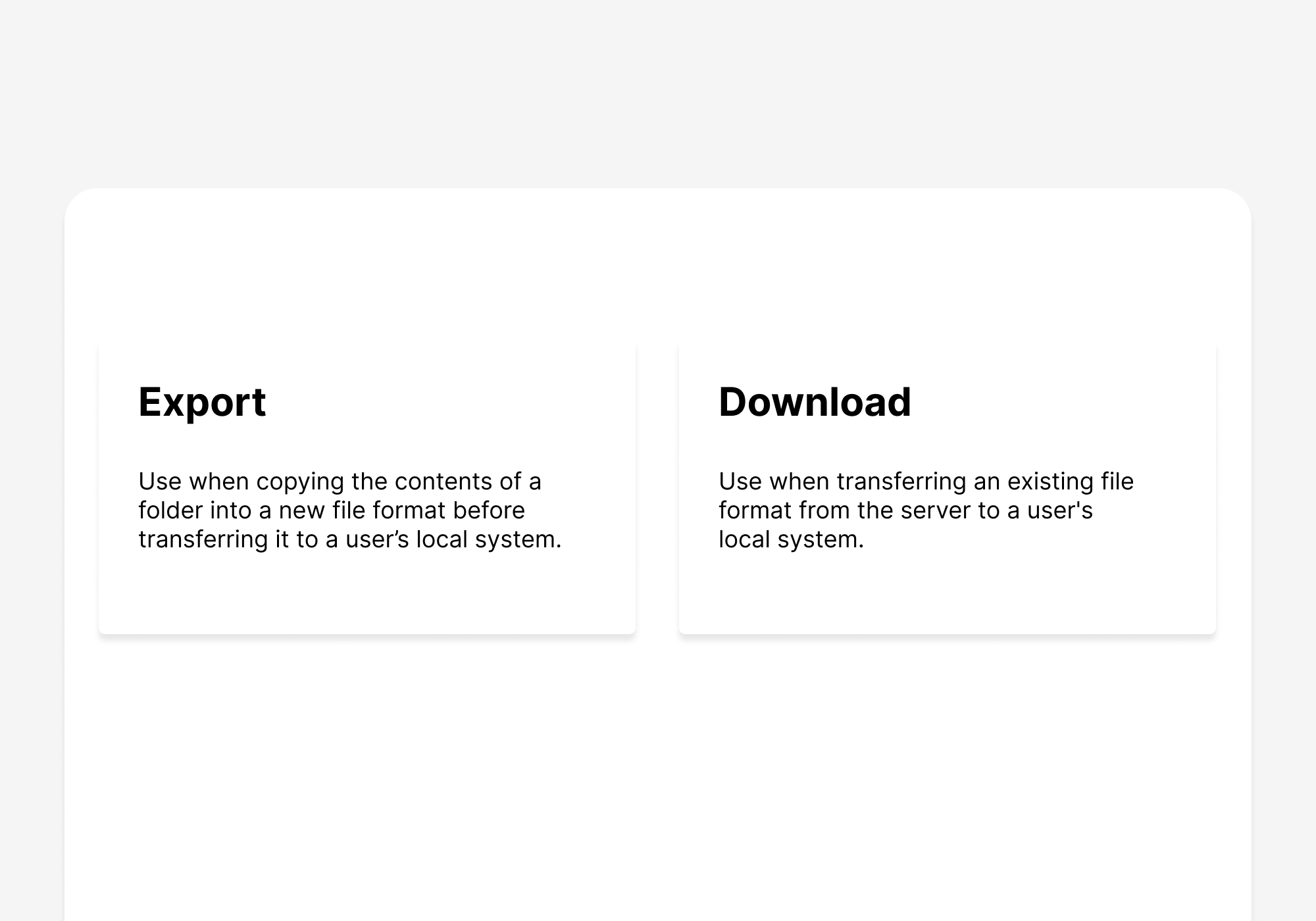
When do you use “delete,” “discard,” or “remove” in a product? What about “export,” “download,” and “share?” They all have different meanings, but within each set, there’s enough overlap that it’s possible to run into conflicts.
The worst-case scenario is to mix terms to such an extent that users think they’re being asked to take different actions depending on the scenario. To avoid this, you can either try to map out all terminology before designs begin or audit your product to identify inconsistencies.
Bring a strong viewpoint about the terms to use and make a glossary. Each time you run across terms that are potentially being used interchangeably, take a stance and get your decision in the glossary. The sooner you do this and make a habit of it, the more clarity you’ll bring to your product’s design.
A glossary is only useful if people actually use it, so keep it where it’s likely to be accessed. Whether that means you include it in a style guide or incorporate it in a design system depends on who’s going to be using it.
You’ll want to clearly lay out how each term should be used along with disambiguation from other related terms. It’s also helpful to distinguish between two closely related terms that both need to be used in the product (like when to use “export” and “download”). In these cases, it’s helpful to simply list them side-by-side with examples of good and bad uses of each.
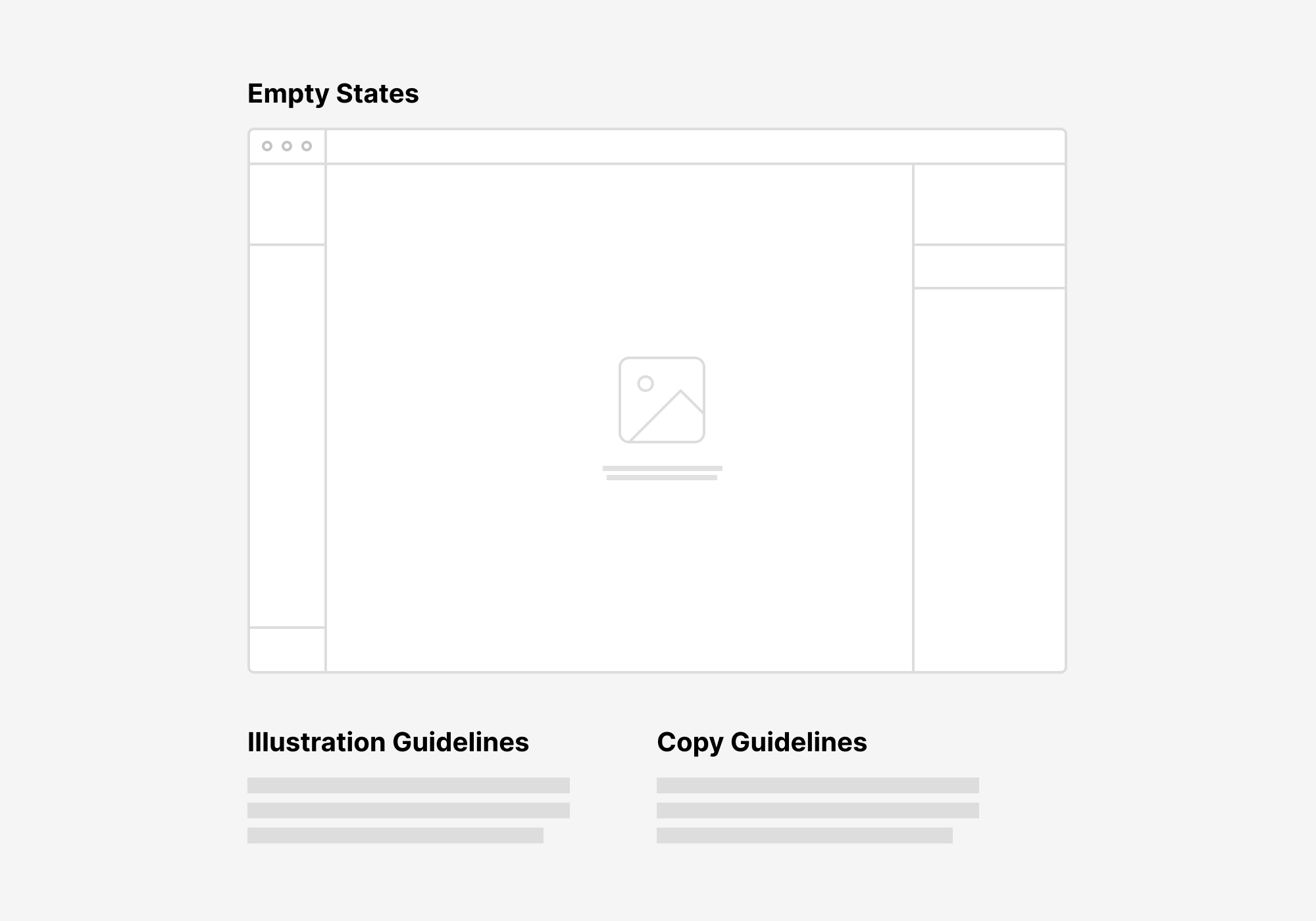
Empty states
Empty states are often afterthoughts, but they don’t have to be. In fact, they’re a great place for content guidelines to help accomplish a concrete goal. Empty states help users understand features that they haven’t encountered before or explain to users that they’ve hit a part of the product they can’t use.
Illustrations are usually the primary concern when it comes to empty states, but that’s not necessarily the most important part. This is because the best way to approach empty states is to make clear how a user can become unblocked.
Develop guidelines that specify how copy can be used to unblock the user from whatever they’re trying to accomplish or discover about your product. The question to answer is, what does a user need to know in order to make this feature useful or relevant to them?
Copy documentation for empty states can easily live alongside other guidelines for empty states, like those for illustrations. If you don’t clarify the goal of copy in empty states, it’s likely you’ll end up with visually consistent but ultimately less-than-useful states. Your goal is to get the user out of limbo, and the best way to do that is to provide a clear guideline for how your messaging can accomplish that.
Microcopy
It’s difficult for style and tone guidelines to be especially useful for microcopy. After all, you’re often dealing with very short strings, and in many cases, the link between language and visual presentation is an integral part of how you’ll communicate. With a design system, you can provide guidance on language used for common actions to eliminate guesswork.
Tooltips and error messages are major targets here. With both, you’ll have to decide how much of the product’s voice you want to inject. Maybe you want to be apologetic in error messages. Or you could state the facts of what’s happening as clearly as possible. The choice will depend on the feel of your product.
In any case, you can help define some concrete elements of the message. Indicate what pronouns can be used and how the user is going to be addressed. Do you want to use “we” to refer to the voice behind the product, or is that something to avoid entirely?
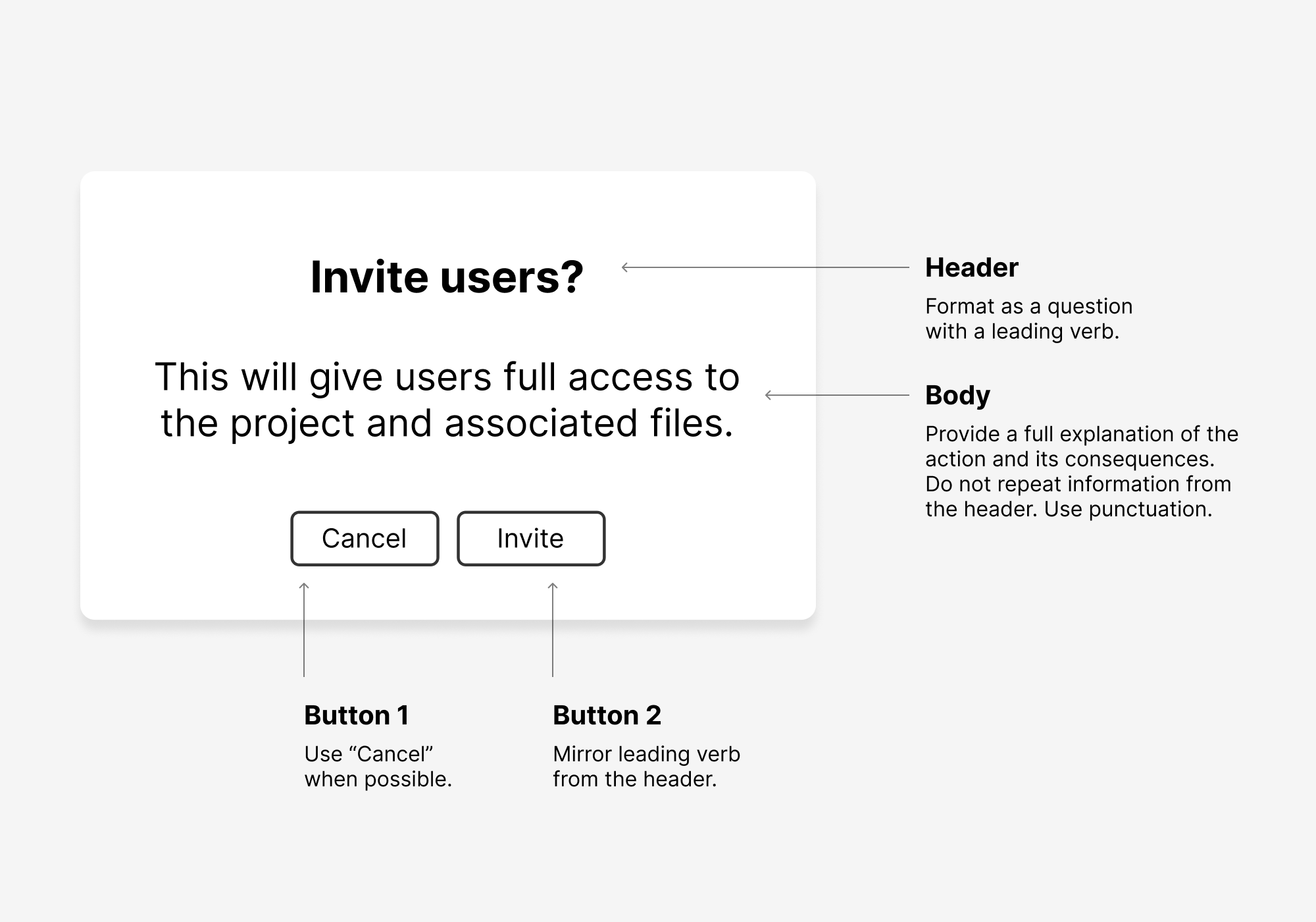
Confirmation dialogs present some different challenges, and you’ll need to go beyond clarifying whether to use “OK” or “Okay.” Guidelines here are all about giving the user an extremely clear set of options about how to proceed in your product.
One way to do this is to define the relationship between modal headers and the button copy for confirmation and cancel actions. Anything you can do to clarify how to write for both of these will help designers create consistency throughout the product. You can, for instance, match a leading verb in your header to the confirmation button so that the two mirror each other, making the action clear to a user.
It’s unlikely that just one person will be writing the microcopy for your product, so it’s easy to end up with clunky messaging that varies wildly. Take the time to lay out the shape of each type of messaging, and you’ll go a long way toward making your product feel consistent.
Localization
The best comes last—everyone’s favorite topic, localization! Your internationalization efforts need to account for a range of differences—date formats, currencies, temperature, address formatting, etc.—but there are areas that have a real effect on UI elements as well. If you treat localization as an afterthought, you’ll end up with intractable problems later on.
The first thing to consider is string length. German isn’t the only culprit here. You’ll run into plenty of instances when translating to another language means upping the length of a string in a way that breaks your design. So you’ll need to make sure that your UI elements have a way to scale text down when necessary. This is particularly important in navigation bars or other high-traffic areas of your product.
Avoid text in illustrations, as you’ll end up needing to recreate the illustration in every language that you localize into. And be sure to keep an eye out for visual metaphors that could be confusing in other cultures.
Also keep in mind that you can’t count on the word order being the same in localized content. So, for example, if you have multiple text-input fields that help to complete a sentence, you’ll end up causing UI confusion when the content is translated.
Localization is difficult because you can easily get blindsided by changes in an area you simply didn’t consider. I recommend making a separate section in your design system or style guide for localization considerations. This allows designers and content strategists to view all guidelines in one place and think of them holistically. Separate out each guideline into a section and try to provide examples of how poor localization strategy can break your design. The best approach is to keep it top-of-mind and get everyone on your design system used to considering how localization changes will affect any decision they make.
What’s Next?
Once you’ve tackled the concerns I’ve talked about here, you’re just getting started. But it’s a great start. You’ll encounter plenty of situations that will require you to standardize content. Treat content decisions for your design system just like you would any others—bring up inconsistencies and confusing scenarios with your team, talk them through, and document your decisions. Soon you won’t have any guesswork around content for your product’s UI elements and patternized components.

