Color
Color is a critical part of any design system, but it can slip out of control easily. With a seemingly infinite number of hues and shades, variability from different color spaces, and various methods of picking and sampling colors, it’s easy for teams to end up with dozens of color values that are being used inconsistently.
By defining a color system you can ensure you have a controlled (and consolidated) palette of acceptable colors, consistent and proper usage, and also improve ease of maintenance. As a simple starting point, take a look at your brand's colors. That palette may heavily influence the swatches you use in your system. Incorporating brand colors will ensure you maintain your brand’s personality throughout your UI, too. You'll want to make sure you have shades of these colors that you can use when it’s not appropriate or ideal to use colors in their full intensity. If the system needs to support both marketing and product, you may also want to include usage guidelines about how color is used in each.
You'll also want to think about how accessible your colors are. Not every swatch in your palette may need to meet this requirement, but you want to make sure you’ve included an ample set of accessible colors that you can apply to text and key UI controls and the backgrounds they’ll need to contrast. Depending on your requirements, you may need to meet AA or AAA accessibility standards, so make sure your color pairs are well defined.
Consider adding colors that communicate the meaning and tone of functions. In the example of showing a user a message, certain colors help convey the content of the message: red for an error, blue for information, and green for a confirmation.By defining the meaning of some colors, you create a repeatable pattern for how they should be used in the future.
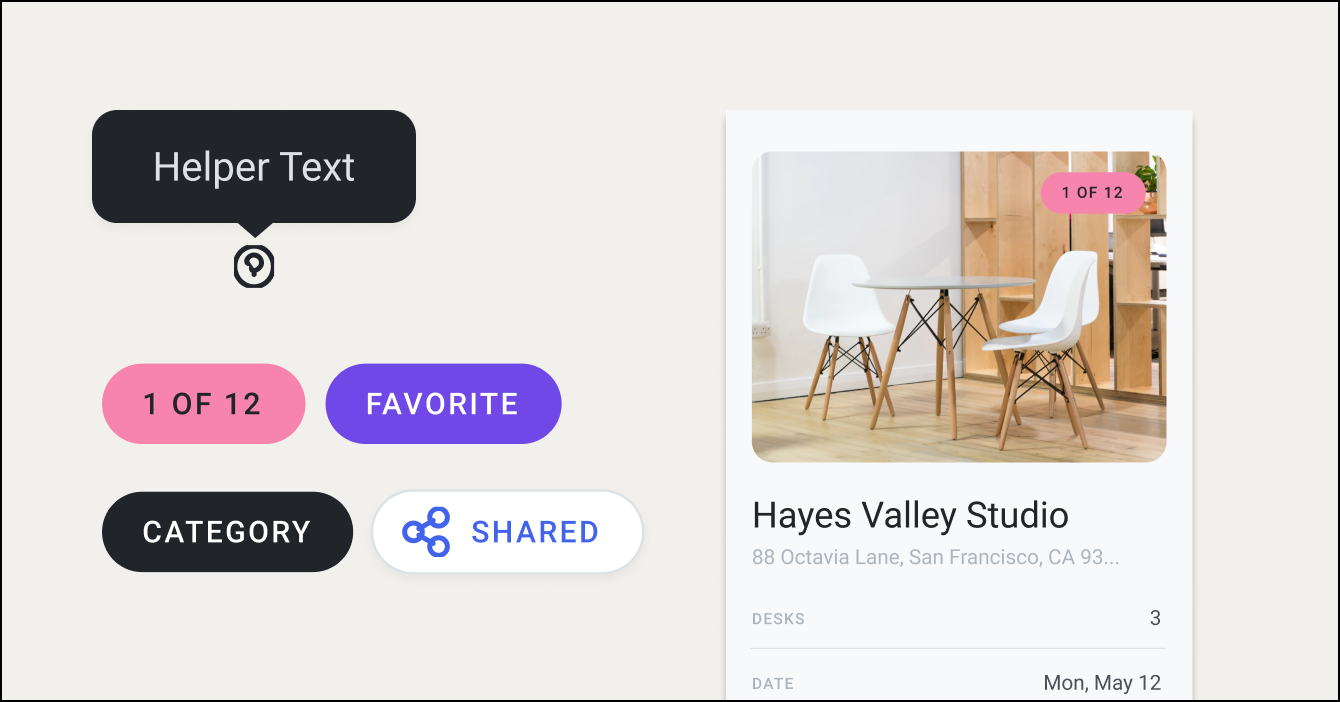
In addition to picking colors, think about opportunities to clarify their usage. Many teams have introduced a variable or token system to add a semantic layer to their color naming. Naming a color "red," and referencing "red" is much easier than remembering an exact Hex/RGBA/HSLA value, but it does little to describe its intended usage. Some teams will add another modifying word to a color’s name to describe its intended use and to ensure it gets implemented correctly. This also makes maintaining the palette across multiple platforms much easier if colors need to change.
Here are some in-depth guides on color to get you started:
Lyft design on re-approaching color
Kevyn Arnott shares how Lyft builds color systems for accessible UIs that scale, and walks through how you can build your own with ColorBox.
Nathan Curtis walks through 16 takeaways he has learned while working with color in design systems, including stabilizing a primary palette, tint and shade choices, secondary palettes, and solving for accessible contrast.