White-labeling: Putting the design system in users' hands

The era of design systems is booming, and with good reason. The methodologies behind design systems can simplify development tremendously. Though they are not all equal, each system improves the development process by employing one simple paradigm: constraint. Design systems add structure to what can, and more importantly, what cannot be done. Under the right conditions, constraint can greatly increase development speed.
Using constraint to speed up development
All design systems employ constraint, but how do they differ? One comparison point is how dynamically they’re consumed. For example, a basic design system could be implemented as a component kit built within another project. On the other end of the spectrum, a complex system may be dynamically consumed through something like a CMS.
For a client of ours, we were tasked with building something in between.
Building a fully customizable app
Our client’s project involved building a web application that was fully themeable — by the client and end-users, allowing them to effectively white-label the app themselves. With those requirements in mind, we knew the building blocks needed to live within the project itself. However, the theme, the instantiation of those blocks, had to be sourced dynamically so each user could have a unique, custom experience. Also, since our client was selling this application to arbitrary companies, they needed to ensure that it was possible for their users to customize every aspect of the app to fit their brand. This was even more critical because the application would be deployed on-premise, making it difficult to push updates in a pinch.
In order to combat these limitless possibilities, we knew we wanted to create a design system to keep the app consistent. However, allowing users to customize every look and feel to meet their own brand specifications meant balancing the constraints of the system with user’s needs, creating a whole new challenge on its own.
Though building a system like this is straightforward, we found that creating a simple and manageable solution is contingent on choosing the right tools for the job.
Relying on styled components and systems
For our client, it was crucial that their customers be able to make a few changes to a theme (changing the colors and font to match their company’s brand, for example) and end up with a beautiful result. We immediately thought of two tools: styled-components and styled-system. Styled-components was the perfect tool for this job, since it includes built-in theming capabilities, and remains flexible by supporting all of CSS. It also ensures that your styles are encapsulated by components, which is ideal for building atomized units.
import { theme } from './styled' // our design system folder

export default function App(props) {
  return (
    <ThemeProvider theme={theme}>
      {props.children}
    </ThemeProvider>
  )
}
import styled from 'styled-components'
/*
* Basic themeable component:
*
* → Customers are able to adjust link color
* for this section
*/
export const Container = styled.div`
p {
margin: 0;
}
a {
color: ${props => props.theme.colors.primary};
}
`So styled-components covered flexible theming; however, in order to ensure that the app would always look great by default, we also had to introduce constraints into the system. This is where styled-system came into play.
Since we were not the owners of the codebase, setting up restrictions was important to prevent future developers (or even our future selves) from using the pieces incorrectly or ballooning their individual capabilities until they are unmaintainable. Styled-system allowed us to create building-block components that only permit specific properties to be configured, providing the exact limitations we needed. To show what I mean, here’s an example of our “Header” system component:
// No need to import `react` or `styled-components`!
import system from 'system-components'

export const Heading = system(
  {
    is: 'h1',
    // primary, medium, text, etc. are all theme variables!
    fontFamily: 'primary',
    fontSize: 5,
    fontWeight: 'medium',
    lineHeight: 'normal',
    m: 0,
    color: 'text'
  },
  // only allow a few props to be used
  'fontFamily',
  'textAlign'
)
Here, the component sets a few default properties like color and font-size using the theme itself as reference, and then permits the adjustment of font-family and text-alignment. This was essential since we knew this component was going to be customized with branded fonts by the end-users. System components enabled us to support this customization while preventing unwanted changes by only exposing the properties we wanted to allow them to adjust.
As a final example, take a look at how easy it is to translate a real-world style guide, like Airbnb’s, directly into a system-components theme:
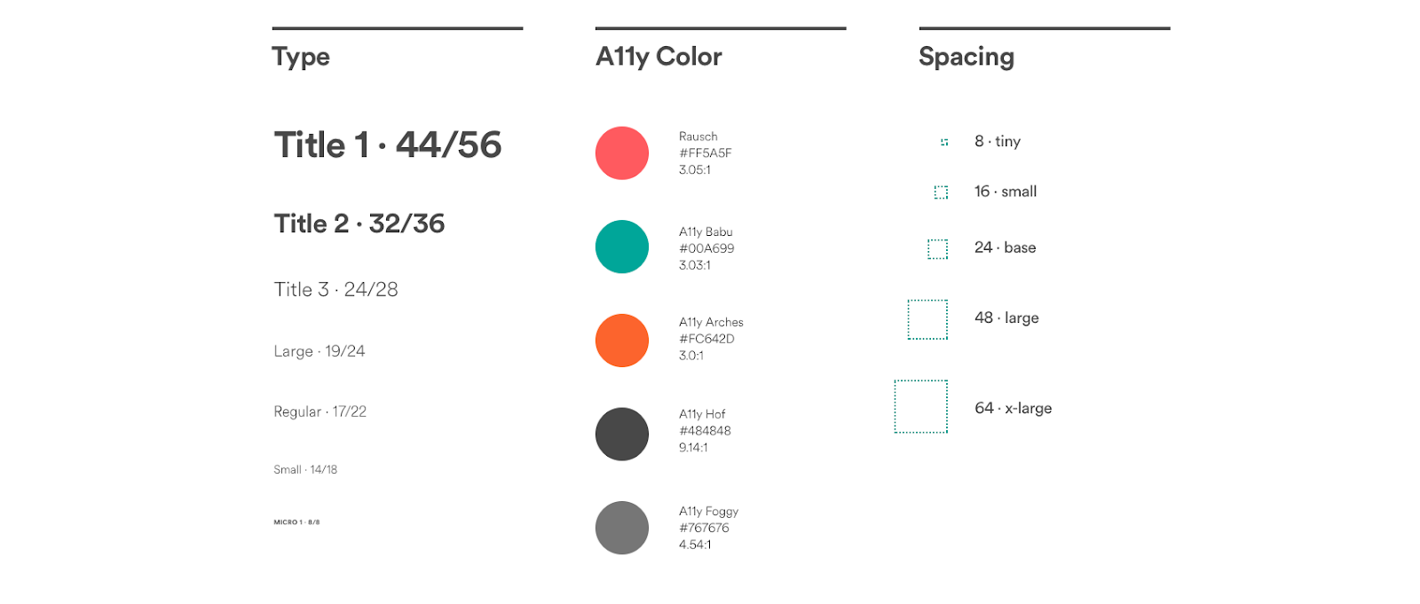
// You can adjust these according to your use case
export const breakpoints = ['32em', '48em', '64em', '80em']

export const colors = {
  rausch: '#FF5A5F',
  babu: '#00A699',
  arches: '#FC642D',
  hof: '#4848484',
  foggy: '#767676',

  primary: '#FF5A5F'
  // more colors would go here
}

export const space = [0, 8, 16, 24, 48, 64 /* add more to your liking */]
space.tiny = space[1]
space.small = space[2]
space.base = space[3]
space.large = space[4]
space.xlarge = space[5]

export const fontSizes = [
  '8px',
  '14px',
  '17px',
  '19px',
  '24px',
  '32px',
  '44px'
]

export const lineHeights = [
  '8px',
  '18px',
  '22px',
  '24px',
  '28px',
  '36px',
  '56px'
]

// other things like fontWeights, borders, and shadows can be added here
Together, these two modules make it super simple to create a component kit to match any style guide.
Creating your own white label
The examples above are missing one crucial piece: where do the user’s customizations come from? We knew we needed some sort of backend to store these configurations. We also wanted to make sure that they were conventional, meaning they follow some sort of schema, in order to ensure that bad data didn’t break the application. Leaning on these requirements, we found that a GraphQL backend was perfect for the job. GraphQL forces your data to adhere to a predefined schema, and also adds the structure to enforce that only valid data is used. Like we mentioned before, these self-imposed constraints actually improve product development. By setting up a GraphQL backend, we were now able to store each user’s settings, creating a custom experience for each visitor to the app. GraphQL wasn’t a requirement, but utilizing it made setting up this system a lot easier. We used Apollo’s GraphQL client to handle most of the dirty work, and simply queried for the user’s theme, passing it directly into the hands of styled-components. Here is a stripped-down example:
import { merge } from 'lodash'
import { ThemeProvider } from 'styled-components'

import { theme } from './styled' // our design system folder

// This component wraps the Query component from `apollo-client`
import { GetTheme } from './containers'

export default function App(props) {
    return (
        <GetTheme>
            {userTheme => (
                <ThemeProvider theme={merge(theme, userTheme)}>
                    {props.children}
                </ThemeProvider>
            )}
        </GetTheme>
    )
}
Reintroducing flexibility
Supporting themeable colors, fonts, and spacing went a long way toward creating a white-label-able application. However, to meet our client’s needs, we needed to extend this customization further.
What they needed was a styling escape hatch. A solution that would let the end-user customize whatever they wanted to without our client’s intervention. After investigating our options, we found that this functionality called for global CSS injection. Thankfully, with styled-components V4, it could not have been simpler — it was as easy as adding a single new component to the application:
import { ThemeProvider, createGlobalStyle, css } from 'styled-components'

export const CustomStyles = createGlobalStyle`${props =>
  css`
    ${props.children};
  `}`;

// Usage
<ThemeProvider theme={theme}>
  {props.children}
  <CustomStyles>
    {/* user's custom styled go here */}
    {userTheme.customStyles}
  </CustomStyles>
</ThemeProvider>
⚠️ Note ⚠️: this specific example opens the door to XSS attacks. This was not a concern for our specific project, as it would only be deployed on-premise, but if you were to adopt a similar method you should definitely sanitize all inputs first.
You might be thinking, won’t this break the very design system we set out to create? Not if you use CSS variables. CSS variables give you a way to hook your stylesheets back into the system, keeping all your color, spacing, and font information accessible. This means your entire theme still has a single source of truth, even while supporting full CSS.
import {createGlobalStyle} from 'styled-components';

// This becomes the source of truth for the application
export default const GlobalStyle = createGlobalStyle`
  :root {
    --primary: cyan;
    --text: #506784;
    --borders: #EBF0F8;
    --page-background: transparent;
    --nav-background: white;
    /* add more colors */

    --font-primary: "Helvetica Neue", system-ui, -apple-system, BlinkMacSystemFont, sans-serif;
    --font-mono: "SFMono-Regular",  Consolas,  "Liberation Mono",  Menlo,  Courier,  monospace;

    --x1: 4px;
    --x2: 8px;
    --x3: 16px;
    --x4: 24px;
    --x5: 32px;
    --x6: 64px;

    --f1: 0.75rem;
    --f2: 0.875rem;
    --f3: 1rem;
    --f4: 1.25rem;
    --f5: 1.5rem;
    --f6: 2rem;

    /* add more variables to fill our your system */
  }
`
export const space = [
'var(--x1)',
'var(--x2)',
'var(--x3)',
'var(--x4)',
'var(--x5)',
'var(--x6)',
];
export const fonts = {
primary: 'var(--font-primary)',
mono: 'var(--font-mono)',
};
export const fontSizes = [
'var(--f1)',
'var(--f2)',
'var(--f3)',
'var(--f4)',
'var(--f5)',
'var(--f6)',
];
export const colors = {
primary: 'var(--primary)',
text: 'var(--text)',
borders: 'var(--borders)',
pageBackground: 'var(--page-background)',
navBackground: 'var(--nav-background)',
// add more colors here
};
// rest of theme:With these components in place, the end-users can utilize the declared CSS variables to customize their app, allowing them to follow the design system themselves!
No matter how flexible a design system is, the fundamentals remain the same. Introducing constraints will not only ensure that your app doesn’t break on an edge case, but it will also drive creativity. Following these approaches to instantiate a design system can enable new features that are not really feasible without one — like custom white labelling — all without eliminating the powerful benefits of consistency and reusability that the system provided in the first place.

