The Forge: Harry’s approach to the multi-brand component library


Most component libraries share an origin story. A growing company offers a new product or service; engineers write new code to support the new products; someone notices that the engineers keep rebuilding the same (or similar) features. Eventually, the company realizes that if it wants to scale its engineering team, applications across its architecture need to start sharing code.
Until recently at Harry’s, we were following that same general trajectory. We had no scalable way to share code between applications and found ourselves rebuilding features across our two personal care brands: Harry's and Flamingo. Because we plan to release more brands, we realized we needed to share code between our front-end clients to avoid repeating work.
Frequently, large, public companies with massive, highly-leveraged engineering teams and highly-opinionated design systems build component libraries. These libraries stem from sophisticated style guides that ensure all components come from a prescriptive, unified design system. Companies like Google, Atlassian, or Salesforce all aim to define a single system that fuses the brand expression across customer touchpoints.
At Harry’s, we face a different, more complex challenge: how do we build a component library that supports dramatically different brand styles? Our library has to flex and adapt to new brands and styles in the future. Even our two current brands have totally different styling. If we look at Harry’s homepage next to Flamingo’s, the challenge becomes obvious.
The solution we came up with is called the Forge. It’s a centralized resource that helps any brand within the company build its own design system. While the Forge contains multiple initiatives, one important piece is a library of visual components that new brands can use to spin up applications quickly and that mature brands can use to iterate on existing designs.
While the Forge is still a nascent initiative, we think it’s worthwhile to share some of the tradeoffs we’re making and obstacles we’re running into as we go. In the end, we think that the Forge can help facilitate conversations between designers and engineers, and help brands make the right decision based on flexible options the Forge provides to them.
Brand Individuality
As a multi-brand company, we encounter additional complexities when sharing components. Generally, each brand has its own design, engineering, and product teams, which means the Forge needs to allow for full customizability so that a brand can develop a one-of-a-kind design system. A solution that only allowed for tweaking a color scheme or replacing typography would be too limiting for our brands.
This customizability needs to extend beyond styles, and into component layouts as well. Although Harry’s and Flamingo are both brands in the personal care space, their audiences are relatively different. If we expand outside of personal care, future brands will likely have more varied audiences and feature sets. All of them will share some core e-commerce functionality, but the specific UX manifestations may need to vary across brands according to their individual needs.
Given this need for the Forge to remain flexible, we had to solve for sharing components across brands.
Building in Layers
We’ve chosen to construct our components in layers by leveraging React’s composition over inheritance model. (In this case, we’re not talking about layers in a file, but how we piece components together). The lowest layer is a set of flexible base components that cannot be deconstructed further. Think of these components as the base case, or the lowest common denominator. Base components are elements like a <Button />, <Link />, or <Input />. Simple components like these usually don’t need to vary much in functionality or layout between brands. The only changes brands will make to these components is extending their styles to match their brand guidelines.
The second layer is more complex and consists of multiple base components arranged in specific and opinionated ways. In other words, we construct more complex components out of multiple layers of sub-components.
By implementing components in layers, the Forge lets brands opt-in to their preferred level of flexibility. Before the Forge, brands only had one option: build everything custom. The Forge provides two more options:
- consume an existing component out-of-the-box, or
- assemble a component using a set of sub-components
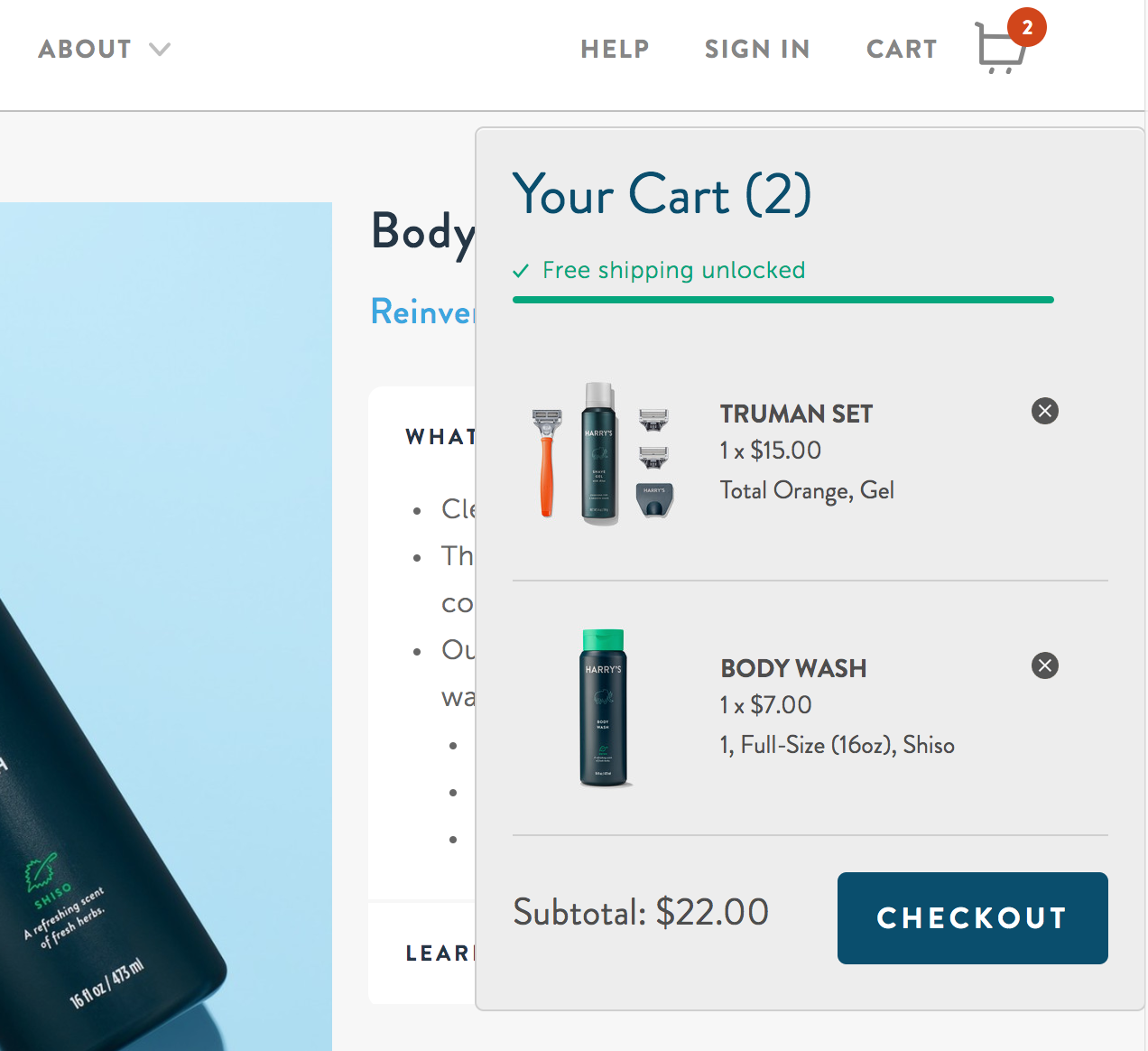
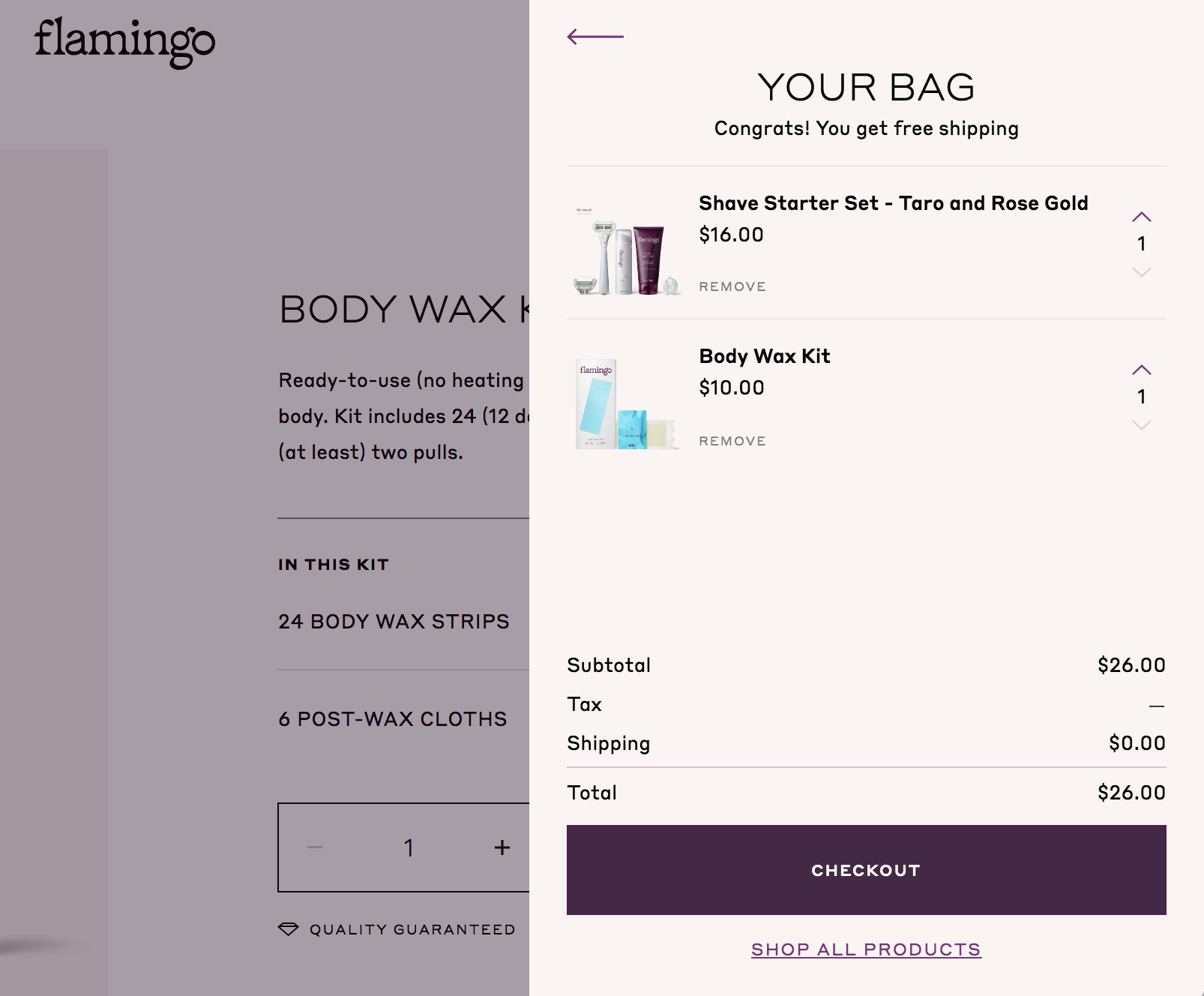
A <Cart /> is a useful example of this concept. A <Cart /> is comprised of many different sub-components, and brands may want flexibility in the UX of a component like this. We can see this in the structural differences between Harry's popup <Cart /> and Flamingo's sidebar <Cart />.
Below, we can imagine a simplified view of how these components are implemented to visualize how React’s composability can help with component reuse.
PopupCart (Harry’s)
<Popup>
  <Heading>Your Cart (2)</Heading>
  <CartProducts products={products} />
  <Subtotal amount={invoice.subtotal} />
  <Button>Checkout</Button>
</Popup />
SidebarCart (Flamingo)
<SidebarModal>
  <Heading>Your bag</Heading>
  <Subheading>Congrats! You get free shipping</Subheading>
  <CartProducts products={products} />
  <PricingSection invoice={invoice} />
  <Button fullWidth>Checkout</Button>
  <Link href="/products">Shop All Products</Link>
</SidebarModal />
By providing reusable building blocks like SidebarModal, Popup, and CartProducts, brands are free to arrange the structure of their Cart however they want, while still getting reusability benefits. With the Forge, brands are free to combine sub-components to create solutions tailored to their users without requiring any changes to the component library.
Brands that want to use an existing SidebarCart or PopupCart can import and style them directly, no assembly required! In this way, the Forge can speed up workflow for brands that just need to style an existing component, while providing flexibility to brands that need more customization.
Of course, brands are free to develop custom components from scratch. If another brand wants to start using any of the components, then we can extract it from its context, refactor it to make it more generalized, and move it into the Forge.
Building the Forge with reuse and composition in mind allows individual brands to decide where to invest in additional customization for their needs.
Decision-Making
At Harry’s (and generally across product organizations without a design system), it’s not unusual for a designer to invent an ideal, customized solution for every use case. The designer often brings the design to the engineering team, and the engineering team tries to push back by asking if they can reuse existing components already live in the app.
In that case, the product manager only has two options: ask engineers to build custom components to meet the design, or choose not to build the new components, and try to achieve the same result with existing code.
The Forge changes that decision-making framework. It offers product managers two additional options:
- Existing Option A: Build custom components
- Existing Option B: Try to reuse components from the existing codebase
- New Option C: Assemble “new” components out of Forge base components
- New Option D: Use an out-of-the-box Forge component
By adding options to the menu of approaches, the Forge frees up product managers to make decisions based on a brand’s users, rather than being forced into decisions by technological and time constraints.
Additionally, the way we’ve implemented the component library allows new brands with short timelines can choose to implement out-of-the-box components, while more mature brands can arrange sub-components as they test variants, or replace some of their existing base components with the Forge’s sub-components.
As we keep iterating on the Forge, we expect to see teams make faster, more effective decisions about where to spend time, and where to save time by using the Forge. We think giving product managers more choices will help them invest based on the user, not on design or engineering constraints.

