Building ChimeKit with Atomic Design and a collaborative process

UI/UX designer creating meaningful and engaging experiences for Chime.

Chime celebrated a lot of milestones this year - 7 years old, 5M accounts opened, over 100 million dollars spotted to members. The company is growing and scaling, and as a design team, we've spent a lot of time working on how we grow and scale alongside the company. One of the biggest tools that can help a product development org scale is a design and development system. This wasn't something we had historically invested in. The team had a sticker sheet in Sketch, like so many other companies, but that sticker sheet wasn't a system. It wasn't serving anyone beyond the design team. This year, we invested in building ChimeKit, our design and development system.
There are many benefits to a joint design and development system. Not only does it bring benefits to the design team, but it also brings benefits to engineering teams. It makes sure that our experiences have a consistent look and feel, not just in our design specs, but in production. It helps unite all teams across the company around common components and a common language. It helps make sure we're all spending time in the right place - standardizing reusable components and clearly defining behaviors means that both designers and engineers are spending less time debating the look and feel of each screen, and more time focusing on the problems that are so acute to our members.
As we continue to build and implement ChimeKit, here are some takeaways I’d love to share:
1. Treat it like a product
From the very beginning, we decided to treat ChimeKit as a product, not a project. This is because a design and development system is not a temporary endeavor. It is a continuous effort and should adapt to meet the needs of designers, developers, and end-users, Chime members. There is no clear deadline when it is done. In fact, a design and development system is never “done”.
Like any other product, we organized a cross-functional team for ChimeKit. Hass is the lead of ChimeKit, setting up the team and the process. Every designer is an owner of ChimeKit by owning different components. Dennis is the product champion for ChimeKit. He is responsible for getting resources and advocating for our continued investment in the system. Also, as any design team can be guilty of getting too "designery" about things or getting carried away with rules, Dennis keeps us grounded and makes sure that we're keeping an eye on the practical, too. Lucy, Diego, and Jessica are the dev owners of ChimeKit. As the developers for our iOSs and Android app, respectively, they own the app interfaces and work closely with the designers on ChimeKit implementation.
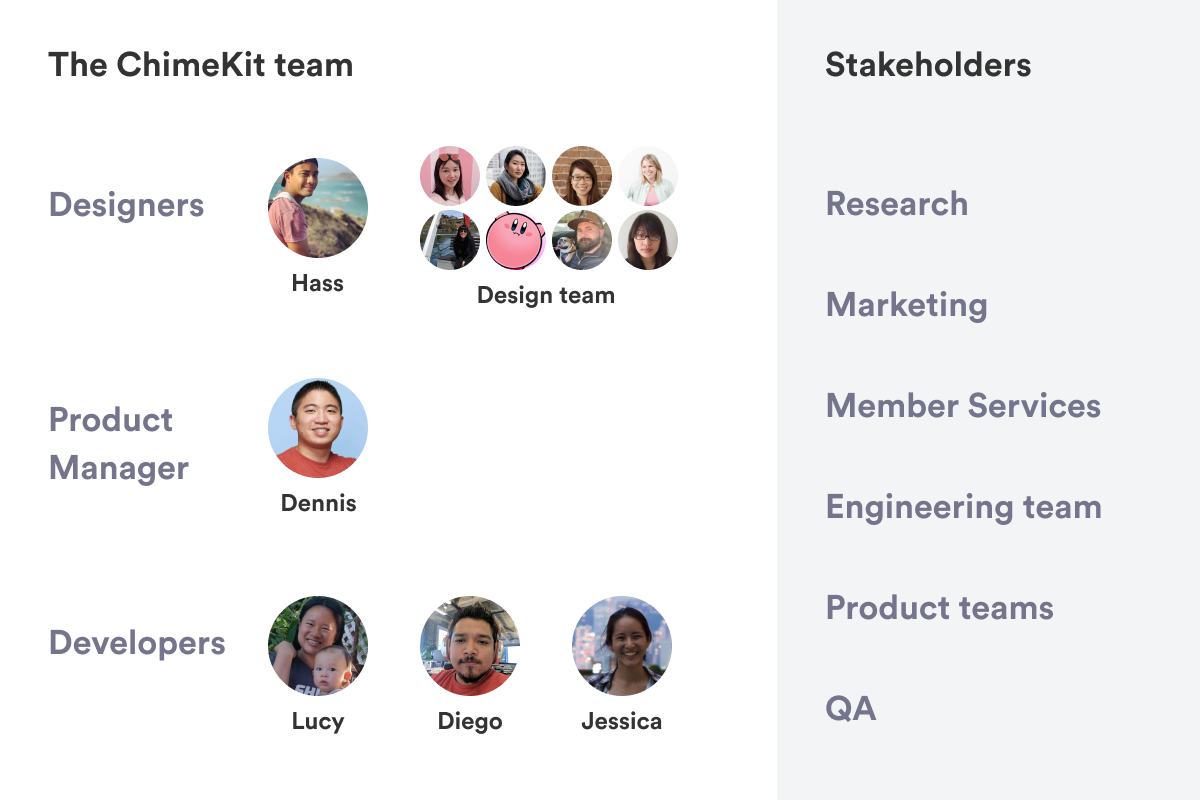
In addition to a cross-functional team, ChimeKit has stakeholders across our company, such as the research team, the marketing team, etc.
Not everyone needed to be working on ChimeKit full-time, given the size of our teams. However, with the team and roles, we were able to assign designer owners and dev owners, and implemented processes and rituals to maintain and publish ChimeKit.
2. Implement processes and rituals
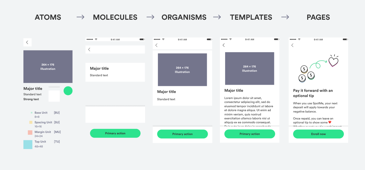
For ChimeKit 1.0, we wanted to lay the groundwork for future versions and get all existing experiences properly documented. For this reason, we started by componentizing all existing app patterns using the atomic design approach.
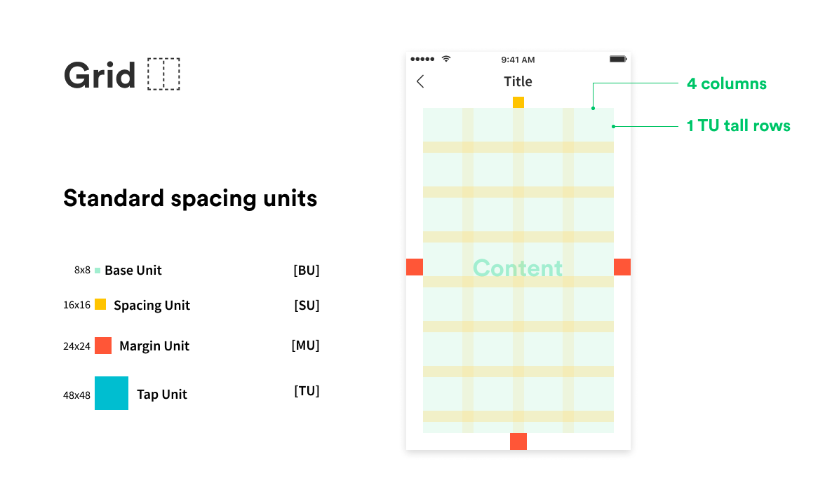
We started by defining a grid, including different spacing units.
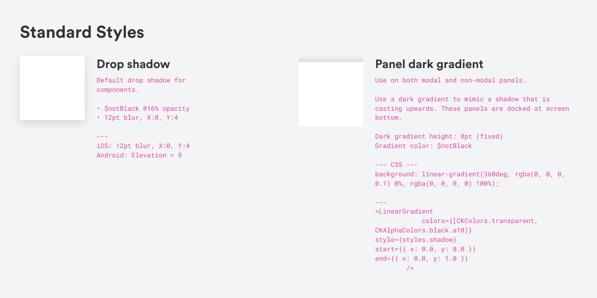
At the same time, we audited all the font styles and colors and other atom-level components in the app and standardized those components in Figma. For example, we standardized and documented our shadows. The drop shadow was coded differently on iOS than on Android so we made sure to put that in the specs, even though Figma has a code view. To make the upward shadow consistent across all platforms, we worked with devs to use a gradient as a workaround.
With the atomic design approach, we continued to standardize the organization of atomic components into screen templates, and finally pages. Below is an example of how we componentized the educational screen template. The educational screen template turned out to be one of the most commonly used screen templates in the Chime app.
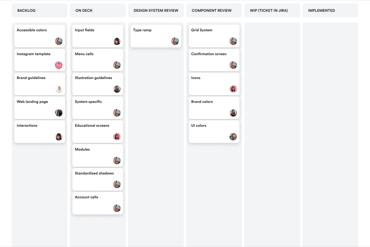
For collaboration and progress, we set up, and continue to use, a JIRA board.
In the beginning, we listed out all the components in the “On Deck” column and assigned design owners in the JIRA ticket. Things that were paused in process, or planned for the future, went into the "Backlog".

Once we made a list of items, we started to move them forward step by step. This is the process we continue to use today. Each item, once created and defined in the Figma file, is moved into "Design System Review". We also propose new components or iterations on existing components by adding tickets under “Design System Review”.
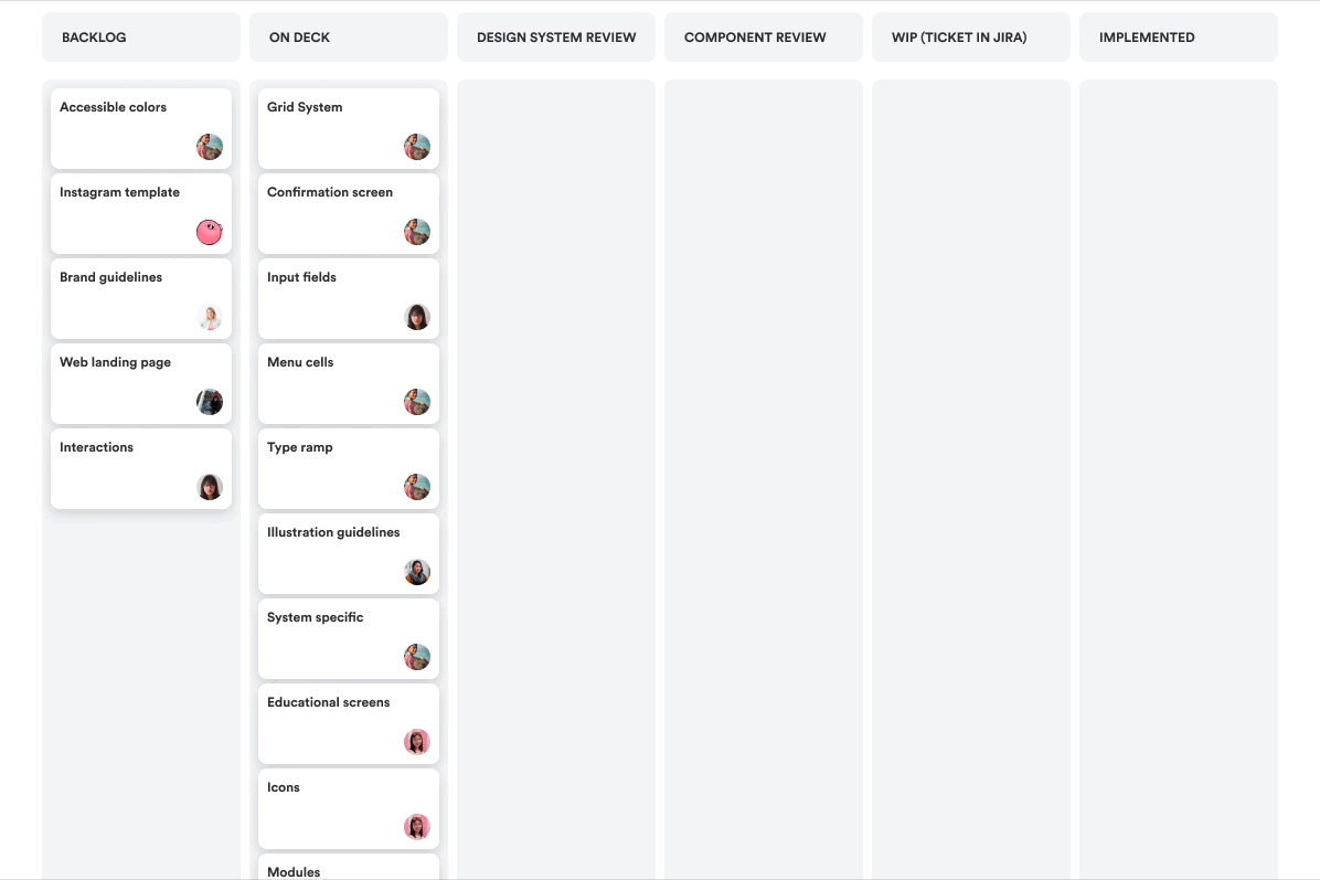
We started a ritual where every Monday, the design team reviews the items in the "Design System Review" category. Together as a team, we decide if the component is ready to be considered "standard", or if it needs more iteration. The items that get the team's blessing move onto “Component Review”.
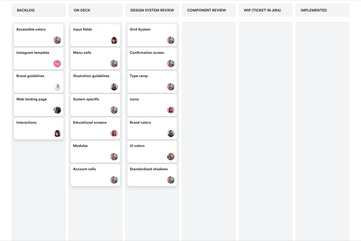
Every Friday, the ChimeKit council (design owners, PM, and dev owners) reviews all the items under “Component Review” to decide if the component is ready to add to the code library. If everything goes well, a ticket (representing a component) will move from left to right on the JIRA board to finally get published in the app.
When deciding if a ticket (component) can move to the next column, we ask ourselves:
Is it following the basic guideline?
Is the component following the rules of the type ramp, the rules of color usage, as well as the spacing unit? If there’s an exception, is there a strong case for the exception?
Are the use cases and different states clearly defined?
For example, a list item - what are the use cases for a list item, is it always actionable or unactionable? How many lines of text can it fit? Is there a disabled state and what should the universal disabled treatment be?
Is the component flexible or scalable?
If there’s a banner component, what kind of content does it contain now? What other content can it hold in the future and is there a general rule around that?
3. Evolve
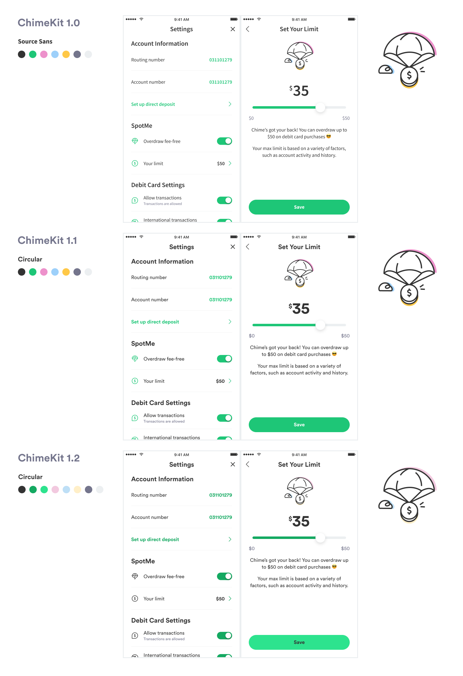
Like we talked about in the beginning, ChimeKit is never done. Like any good product or experience, it continues to evolve over time. In just the short time since we built ChimeKit 1.0, we've already evolved to versions 1.1 and 1.2. The biggest changes were our type ramp and colors. Once those were componentized in both Figma and code, it was easy for us to transition from Source Sans to Circular, and from inaccessible colors to accessible ones. All of the mocks changed with just a few taps, and the Chime app changes with just a few new lines of code.
Chimekit alleviates the pains of modern product development by offering a design and development system that takes care of the mundane stuff. By systematizing frontend engineering, and freeing our team to focus on the harder (funner) problems, we can be more productive at building high-quality experiences for Chime members.