About Wonder Blocks, Khan Academy’s design system and the story behind it


Design VP at Khan Academy (Emeritus)
Did you know Khan Academy is a not-for-profit?
You might be familiar with our video content – that was just our beginning. Nowadays, we build for teachers and students working together in classrooms. We also design for people preparing for a big standardized test on their own; district administrators trying to support teachers; our creators who make, translate and localize content; parents; and donors. We make products, tools, programs, and content. It’s all part of our our mission to provide a free, world-class education to anyone, anywhere!
The design team works to meld deep design craft with thoughtful pedagogy. So many parts of education are not yet getting the high-caliber design love we feel they deserve yet. Our goal is to make learning feel like a tiny party 🎉.
When we embarked on creating our design system, we unearthed over 50 kinds of buttons and links, multiple inaccessible conflicting color systems, and 100+ instances of style definitions for type. Designers were hemorrhaging time choosing between a plethora of similar elements, and front-end engineers were struggling with unnecessary complexity. It was time for change!
Making the case in the first place
We know it can be difficult to convince your company and colleagues that there’s a need for a design system. Here’s a little history leading up to how we made the case for ours.
📜 A bit of ancient history
Like many companies, Khan Academy had a long “move fast and break things” phase. One of the old engineering values was “anyone can fix anything.” While the value had good intent, people often shipped without any design collaboration beyond “please draw us an icon” 😱. There were only three or four designers for around 60 engineers. The process felt like whack-a-mole.
For about 2 years, project teams were brought together only on a per-project basis. Usually, the team would last a few months before being broken up and reorganized. In theory, this variety might sound fun, but in practice, nobody could name who was responsible for a given product once it was complete.
If even products didn't have clear long-term owners, you can imagine that overarching systems and architecture were even worse off. Maintenance and debt burndown were a huge challenge. Many people tried during this time to standardize design components, but there was nothing in the operations to support those efforts 😭.
The takeaway: Pay attention to your organization’s operations. They often they go unnoticed by designers, but can really get in the way of a successful design system. Or any good design at all, really.
💖 Design and engineering
In early 2017, a small group of product leaders designed and implemented a new way for the product team to operate. At the same time, Ginny Lee started her work in earnest as the new President & COO. It felt like the potential dawn of a new era.
Around this time, May-Li interviewed Marta Kosarchyn for the VP of Engineering role. Her most pressing question was, ”How have you successfully advocated for the time and people to burn down technical and design debt?”
By the summer of 2017, Marta and May-Li, as the VPs of Engineering and Design respectively, were in full conspiratorial swing. They had bonded over the urgent need to better systemize the codebase and the design system (and their shared fandom of Prince 💜).
Marta proposed that the engineering and design teams halt usual product work and dedicate an entire milestone of six weeks to kick start getting things in order. It was called the Technical Sustainability Milestone. Here’s an excerpt from the proposal:
What is the TSM (Technical Sustainability Milestone)? A time-boxed period of inward focus for the engineering and design teams to address tech debt, consistency, infrastructure upgrades including performance, security, practices, and tools
Why do we need the TSM? Sustainability of rhythmic and efficient delivery of software requires taking time for restoring/refreshing code, technology and design systems, tool upgrades
Why? Opportunistic timing after our heaviest launch season
The proposal was met with resistance, mostly from outside the design and engineering teams. But Ginny had the final say. She already knew, having learned the hard way in her decades of experience, what happens when organizations do not build sustainably. Her rule of thumb is that organizations should spend ~20% on technical sustainability every year.
We were years behind. She made the ultimate decision that the Technical Sustainability Milestone would take place in late 2017.
The takeaway: Find co-conspirators to help you advocate for your design system! In the end, our engineers estimate that they’re able to develop around 20% faster with Wonder Blocks.
🗓 How we organized ourselves
In theory, we had the whole design team on deck. In reality, design managers were split in trying to work on annual planning with PMs while also participating in the milestone. People were worried about what our process would look like. We tackled our first design problem: how to organize ourselves.
We split up into three guilds so we could more efficiently self-manage: visual design, interaction design, and design ops (operations). With the guilds established, we identified the areas of responsibility for each as well as leads to help orchestrate the work. Here was the breakdown of what each guild was responsible for:
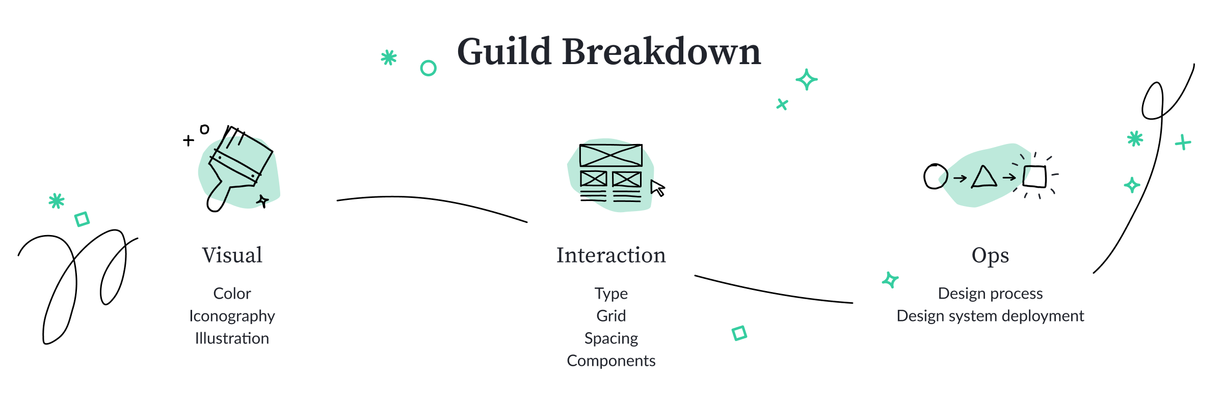
We ensured there was at least one designer from each product in each of the guilds. The marketing and brand designers are on our team and were an integral part of the effort too. This meant that each guild could meaningfully try out systems across all product and marketing areas.
Each designer had a primary guild, but in some cases they helped out in a secondary guild. We also had heavy collaboration between guilds, for example:
- The visual and interaction guilds ensured that there was alignment around the type choices, as well as making sure that components felt visually on-brand
- The interaction and ops guilds worked together on the process for design system deployment
We also collaborated with front-end engineers. This was an official part of the process. They pitched in to help prototype parts of our design system. This was great because:
- It helped us try out changes that were more complex/dynamic in nature (specifically, the interactions between our type system, our grid system, and browser/screen sizes)
- It allowed front-end engineers to experiment with various technical approaches for packaging up functionality nicely for other engineers (e.g. build UI aligned to our grid system)
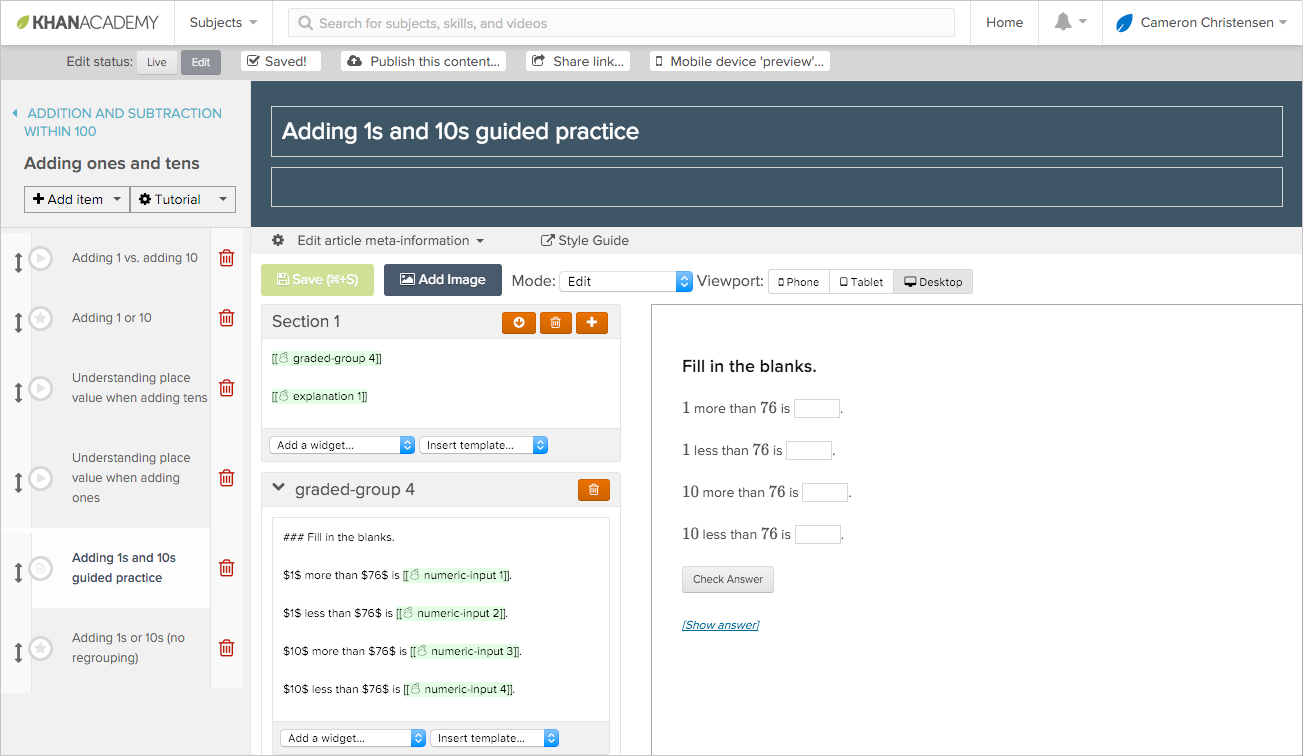
You can get a glimpse of the prototype in its half-broken, no-longer-maintained state here.
The takeaway: Get as much of your design and frontend engineering teams involved as you can—that way your design system will benefit from a sense of shared ownership. Partner with your engineers to help work through highly technical design problems.
✅ ❌ Our design principles
Many designers were worried about how we’d make design decisions along the way. There was too much to do in a limited amount of time, and teams needed to be able to move fast.
May-Li was responsible for guiding things in the right direction overall. She was the tie-breaker if necessary. But the team needed strong design principles to help make their own day-to-day decisions.
Over the years, many principles had been proposed, discussed, and used for different projects, but there was no overarching set. So May-Li put together our principles, drawing from what she'd learned from listening to and observing teachers and students, studying pedagogy, and experiencing the organization. She collaborated with Nancy Lee, the VP of Marketing at the time, to align brand and design principles (Nancy and May-Li were conveniently also conspiring on a rebrand).
Each of the design principles is loaded with a lot of different meanings. Here’s an introductory summary of each one:
💪 Empowering. Students are here to learn and should feel as much ease and agency as possible: they should feel capable, not patronized. Everyone is extremely short on time. Nobody is here to learn fancy UI. We should not feel like an ivory-tower imposition. Instead, students should feel their rough thoughts are safe and valued. After all, learning involves building from those rough thoughts. This follows from a constructivist philosophy of education, which is very important to know about if you’re interested in learning about learning.
🎓 Credible. There’s an immediate sense of trustworthiness conveyed by clean, structured modern design. Clutter and sloppy craft are a no-go. Our challenge is to fuse minimalism and efficiency with the approachability of friendly classroom decór. We also need to make sure we use accurate and carefully thought-through representations, data visualizations, and icons.
🤸♀️ Flexible. Khan Academy serves a very wide array of audiences, from students to donors. Also, teachers have to roll with what’s going on in their classroom that day. Students come from all kinds of backgrounds. Our system and our interactions need to flex and be inclusive, both to our audiences and our internal users, as well as their variety of situations. We also consider our organization’s needs and our internal production capacity.
🎉 Joyful. The process of learning is full of constructive struggle. It’s so important that we celebrate small wins and give off a joyful vibe, especially for people learning how to learn! We should not underestimate the importance of this, nor of the profound difference it can make in people’s lives. The dream is that everyone learns to love learning. Our color palette, shapes, animations, and audio all need to serve as agents of contagious enthusiasm.
To May-Li’s surprise, there was very little debate about the design principles. The team was excited to receive them. May-Li turned them into a scorecard, and we all dove quickly into making them concrete and tangible together.
The takeaway: Use design principles to facilitate day-to-day decision making. Create a scorecard with the principles to make them easier to use. Gathering concrete examples and counterexamples brings them to life.
🗺 Our process
Each guild prioritized elements by how foundational they were to the system. The more other elements depended on a given element, the more likely it was foundational.
Each designer in each guild was assigned at least one element, usually more. They then roughly followed this process:
- Create a visual inventory of each element from across our products
- Assess the element using the design principle scorecard
- Identify overall strengths and weaknesses with input from representatives across the team
- Gather inspiration from other sources and identify themes to explore
- Generate concrete possible solutions, iterating as quickly as possible and staying open
- Converge on a direction, again using the scorecard
(Repeat steps 5 and 6 as necessary, as much as time permits)
Let’s dig into each step, using our illustration system as a case study.
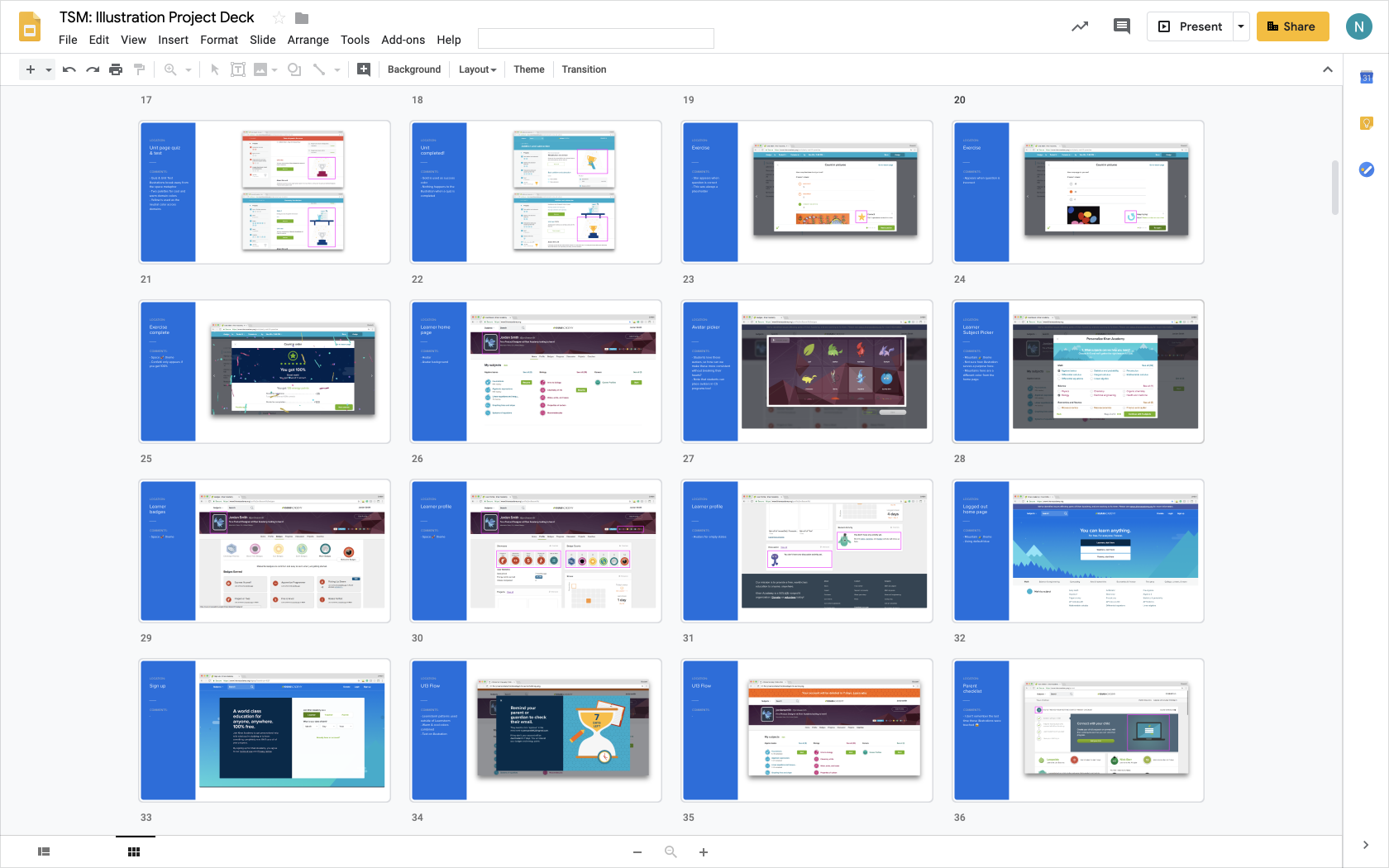
Create an inventory
To know where you’re going, it’s good to know where you’re coming from. In that spirit, we gathered illustrations from across our entire product surface area to determine the current state of illustrations across Khan Academy. We used tools like Figma, Google Slides, and Mural to collect screenshots of examples. These tools allowed us to asynchronously converse (or just emote) about the issues we noticed.
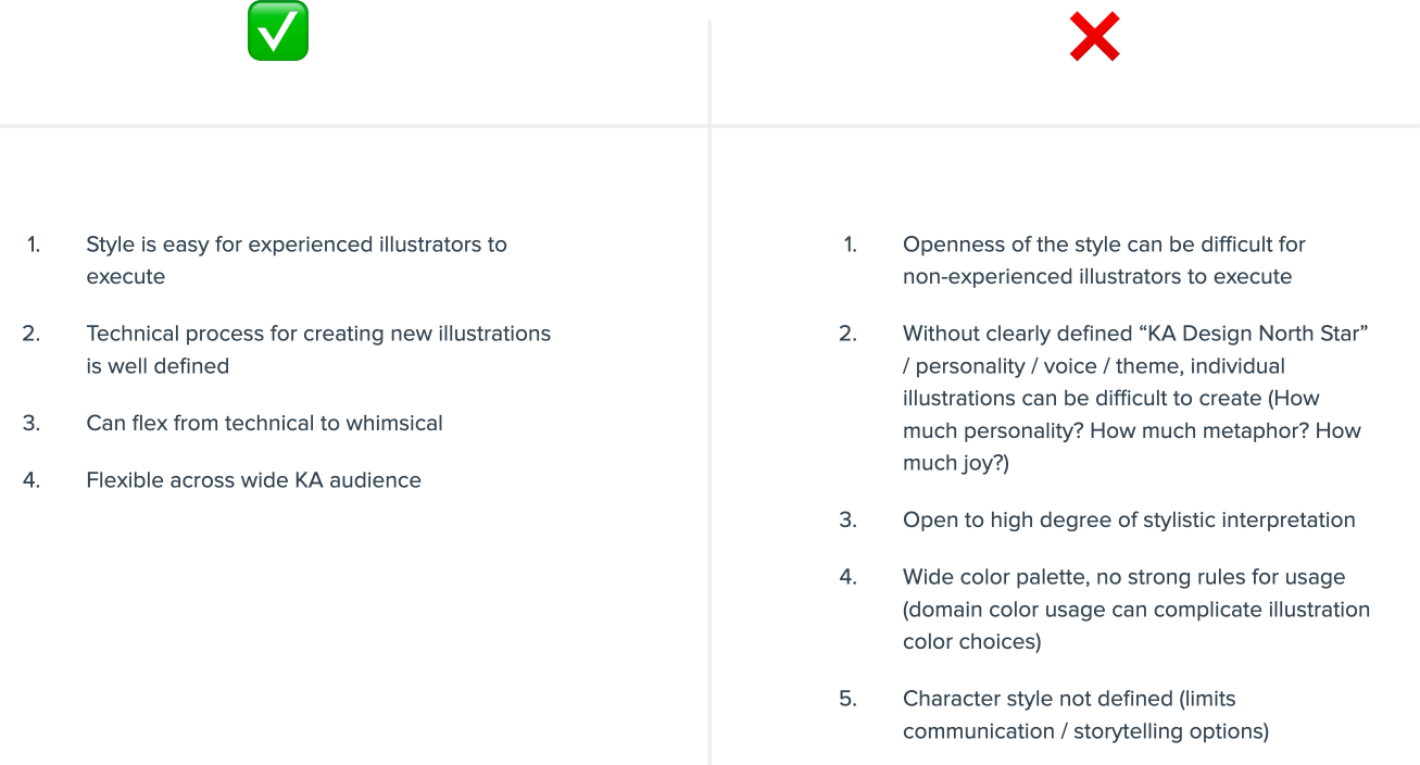
Assess each element
Using our scorecard based on the design principles, we assessed how effective our illustration system was. This was somewhat subjective, but importantly, each grade was accompanied with reasons (see the “why” section below). That way, people who weren’t involved could understand how we arrived at a rating.

Identify overall strengths and weaknesses
We then asked the rest of the team to help identify issues with the illustration system. Based on the themes that emerged from this brainstorming exercise and the key themes from the assessment, we came up with a prioritized list of issues to address.
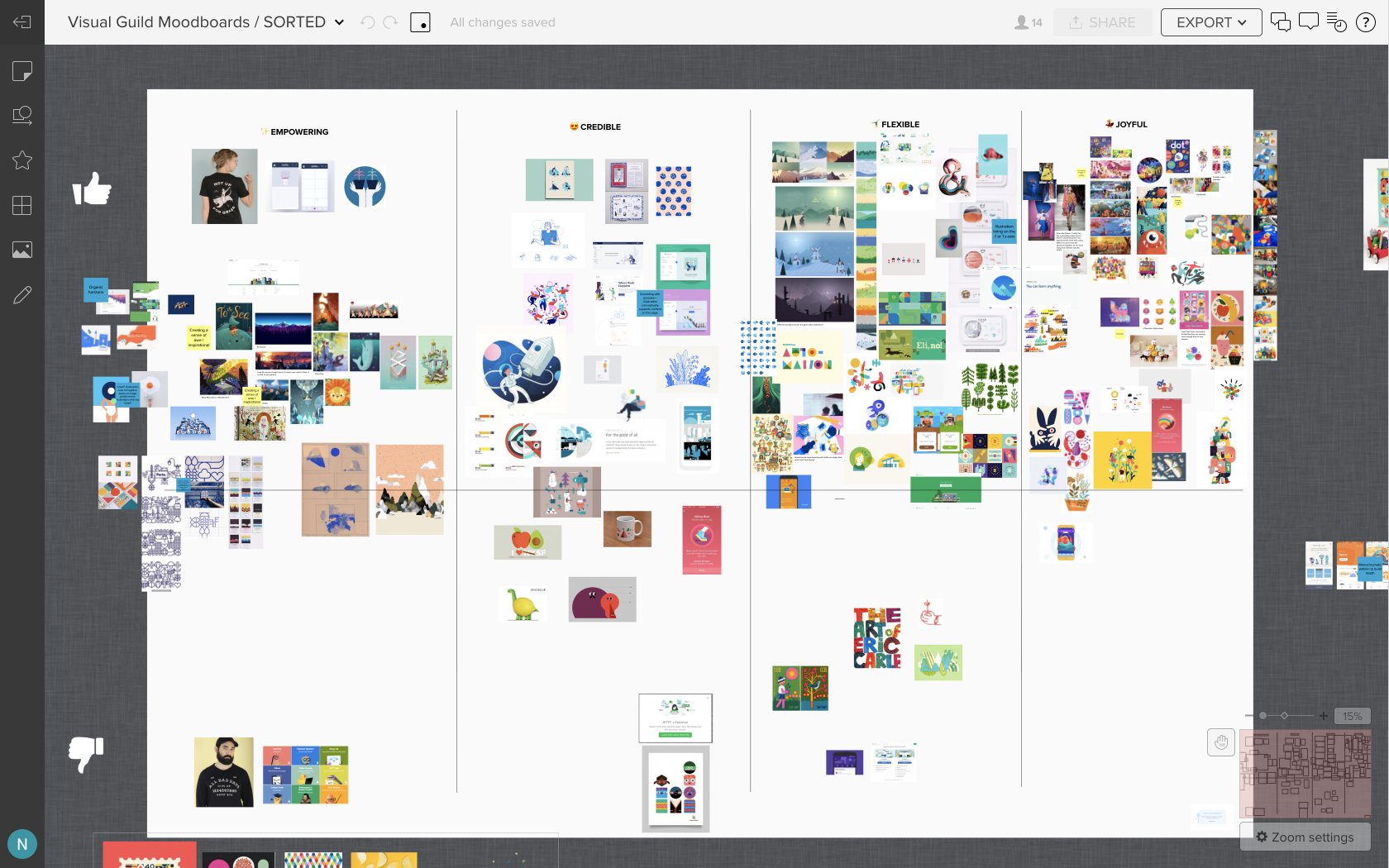
Gather inspiration
Using the design principles as a prompt, we gathered examples that inspired us into one board (we happened to use Mural in this case). We also gathered counter-examples. We had sources that we’d shared with each other over the years, but in addition, we scoured the Internet for more examples of illustrations that gave us the feeling of “joy” – and illustrations that didn’t.
This allowed us to start observing visual patterns, as mood boards are wont to do.
Generate possibilities
Then came the fun part—generating designs! After some lightning-fast rounds of iteration, we identified four major directions to explore more in-depth, nicknamed “building blocks,” “growth mindset,, “worlds,” and “portals..

Converge on a direction
In our final step, we had some tough decisions to make. We re-assessed our options against our rubric and stress-tested the illustration systems in context. That way we could see how they played out alongside the other content in as-real-as-possible product and marketing screens.
We also had to take into account our internal capacity as a team and our budget as a not-for-profit. It was unlikely that we’d be able to justify the budget for multiple, full-time, in-house illustrators, given all the needs across the company. So our direction had to be flexible and teachable. The system we eventually converged on was an amalgamation of some of the best ideas from our initial directions.
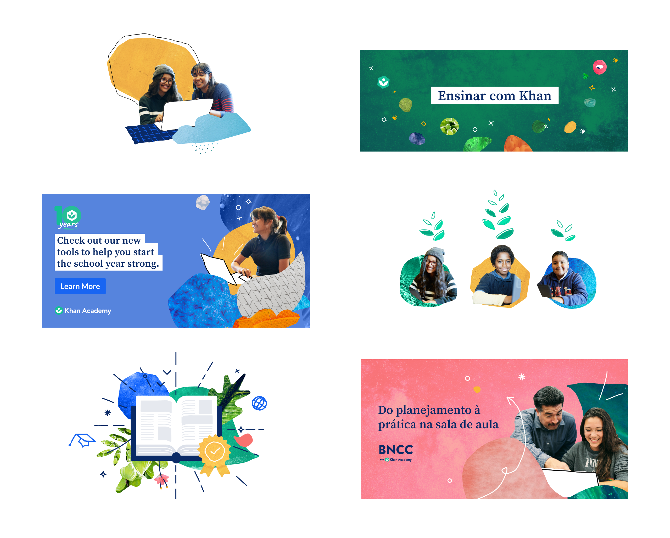
We evolved it again a little while later, and are so excited that it embodies a constructivist philosophy of teaching by embracing roughness and bringing together diverse image sources in a collage-like style. The collages include real students and teachers, and we've created photography usage guidelines to be especially mindful of how people are portrayed and represented
🍒 The fruits of our labor
By the end of the Technical Sustainability Milestone, we had some dramatic improvements to our design language. Here’s a little peek at how things shook out.
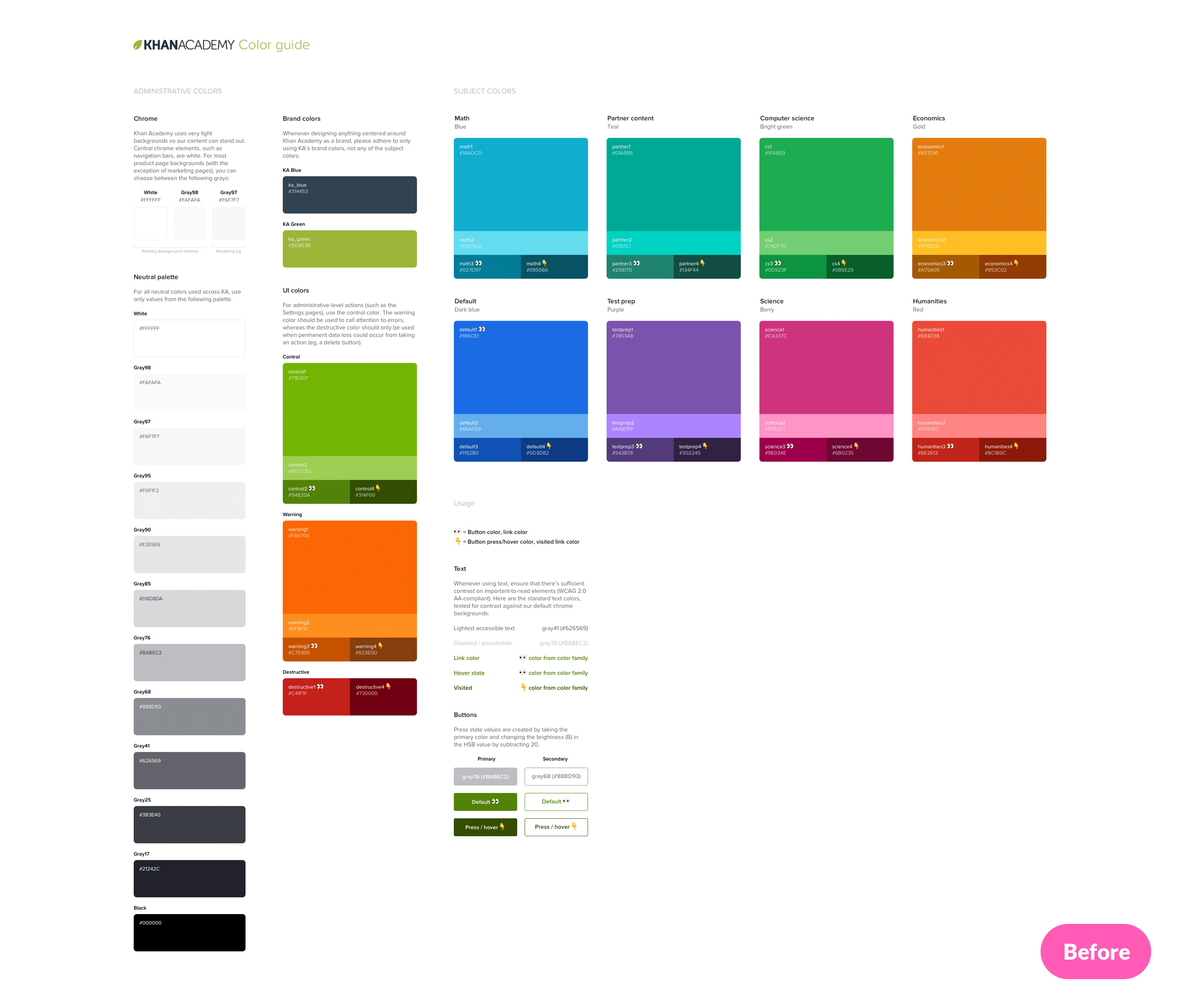
Color
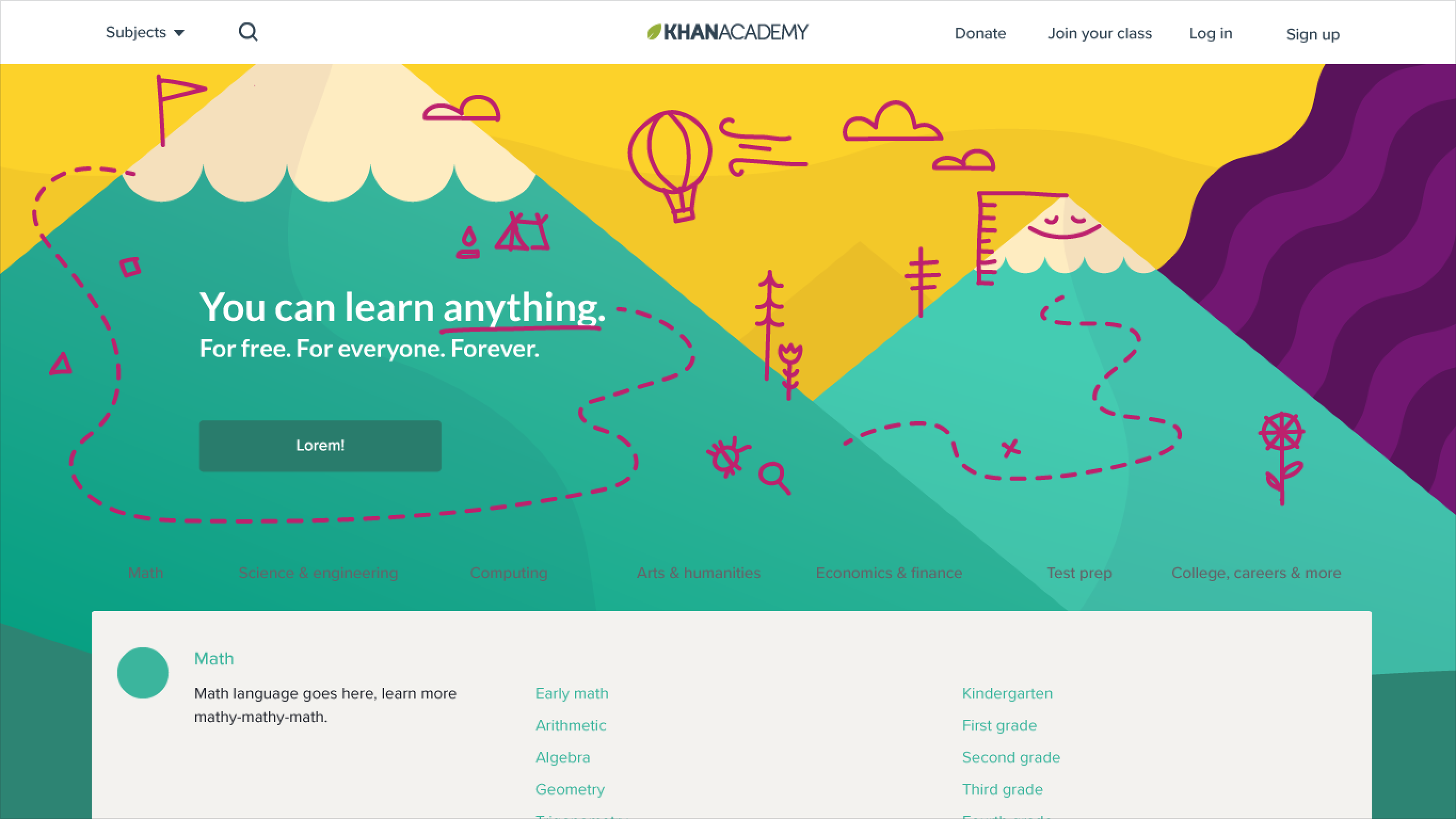
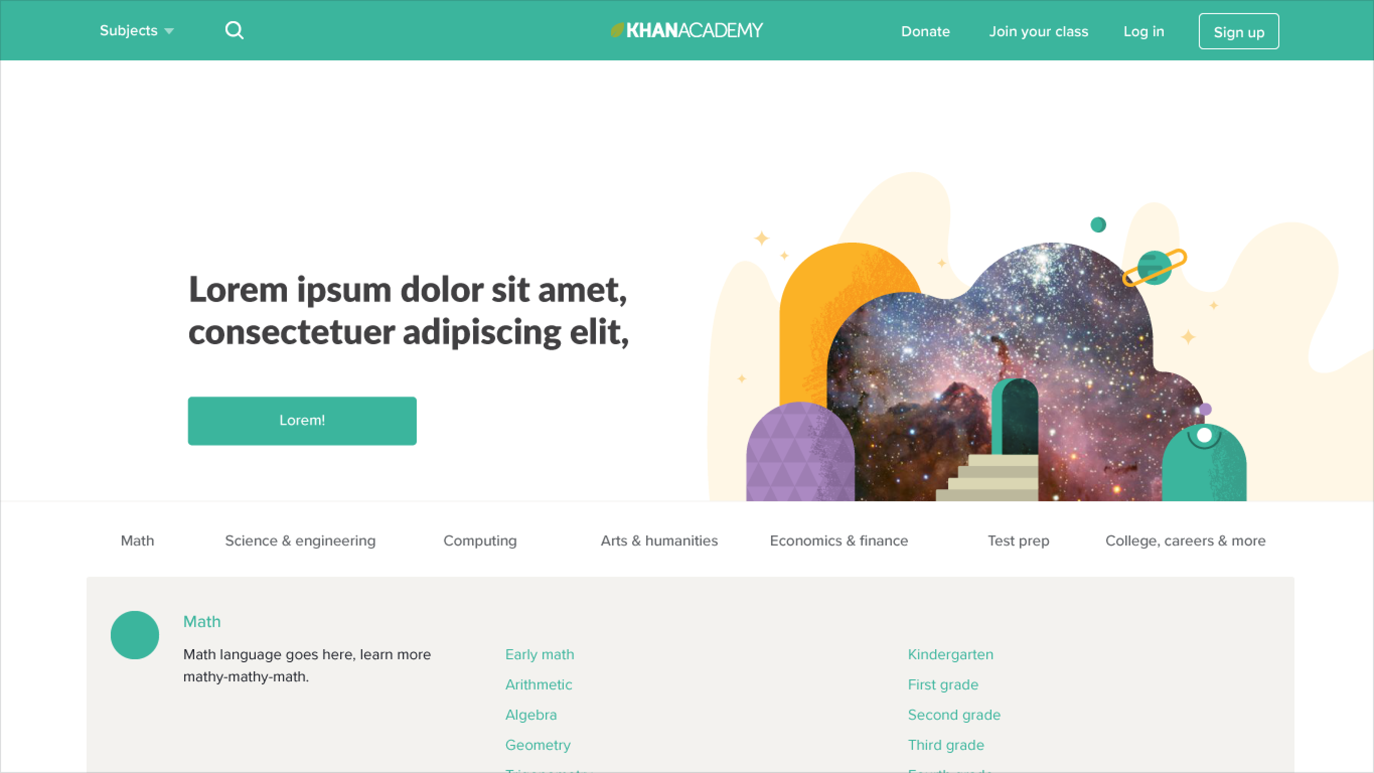
Our new color system had fewer colors (58 → 18) and far clearer definitions for how each should be used. In the past, color had been used to indicate large subject areas (also called “domains”). This caused much confusion. For example, the humanities area, which was red, looked as if it was in a constant state of warning.
In the new system, colors have a functional purpose: blue denotes action, red and green are accompanied by text to connote warnings or affirmative messaging, respectively, etc. This simplified usage also made way for multi-colored illustrations, which project much more joy than illustrations made of multiple shades of one color.
Typography
Our updated type system was designed in conjunction with our grid system to ensure a more comfortable line length in most scenarios. It had fewer typefaces (8+ → 5), fewer type styles (119+ → 14), and increased information density while maintaining legibility (11-18% for sans-serif, 26% for serif). Many of the users who need our services the most are on low-cost, older hardware and low-density screens, with bad internet connections and half-broken input hardware. This means that page refreshes and scrolling are potentially higher cost to them, and information density matters a lot.
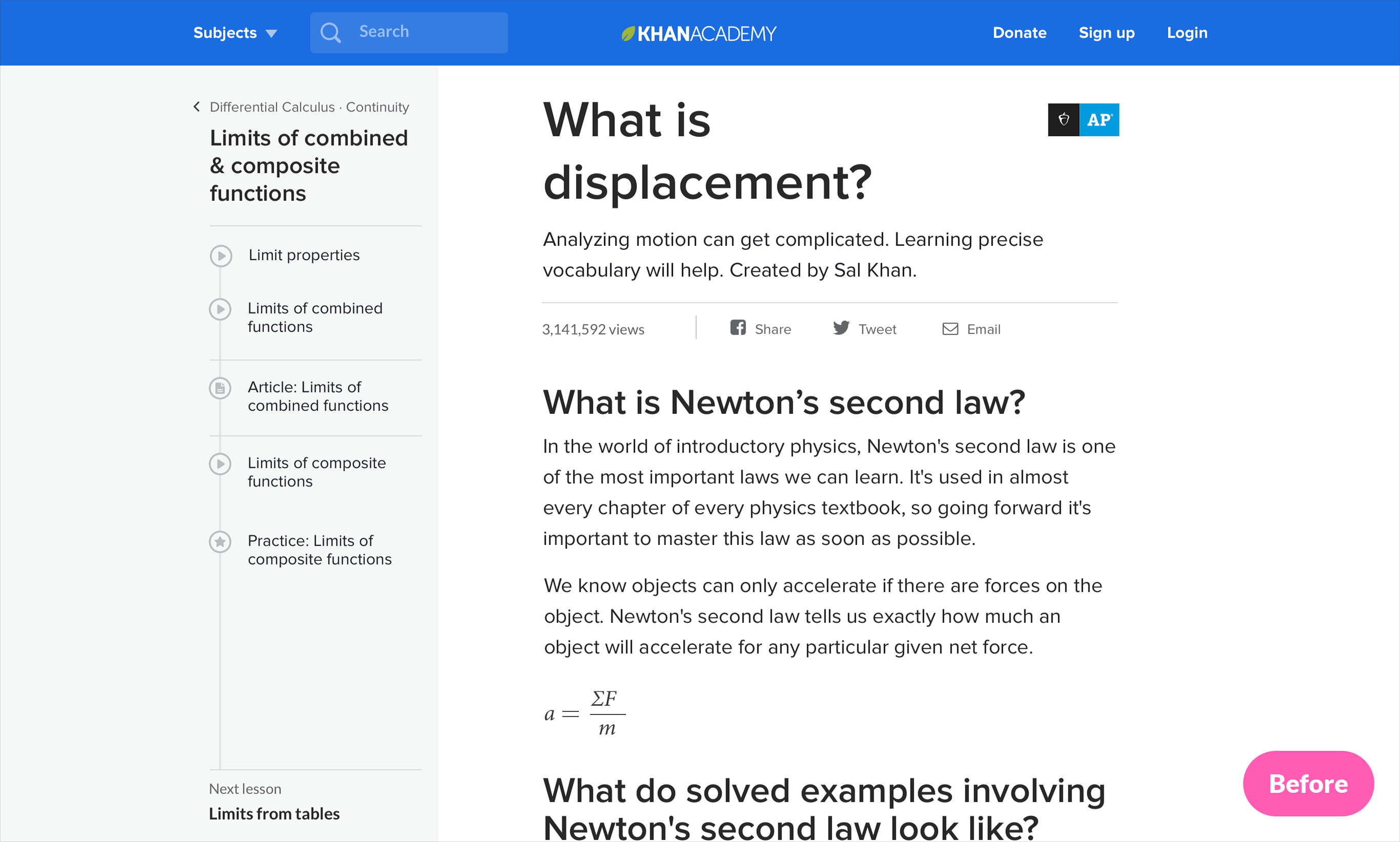
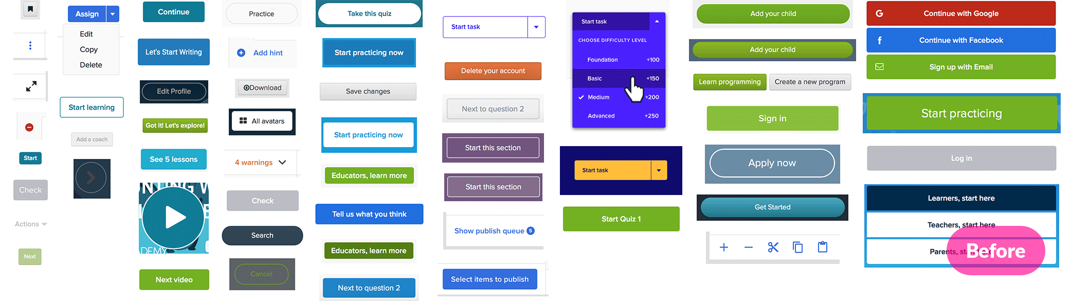
Buttons
We think this before/after visual comparison says it all:
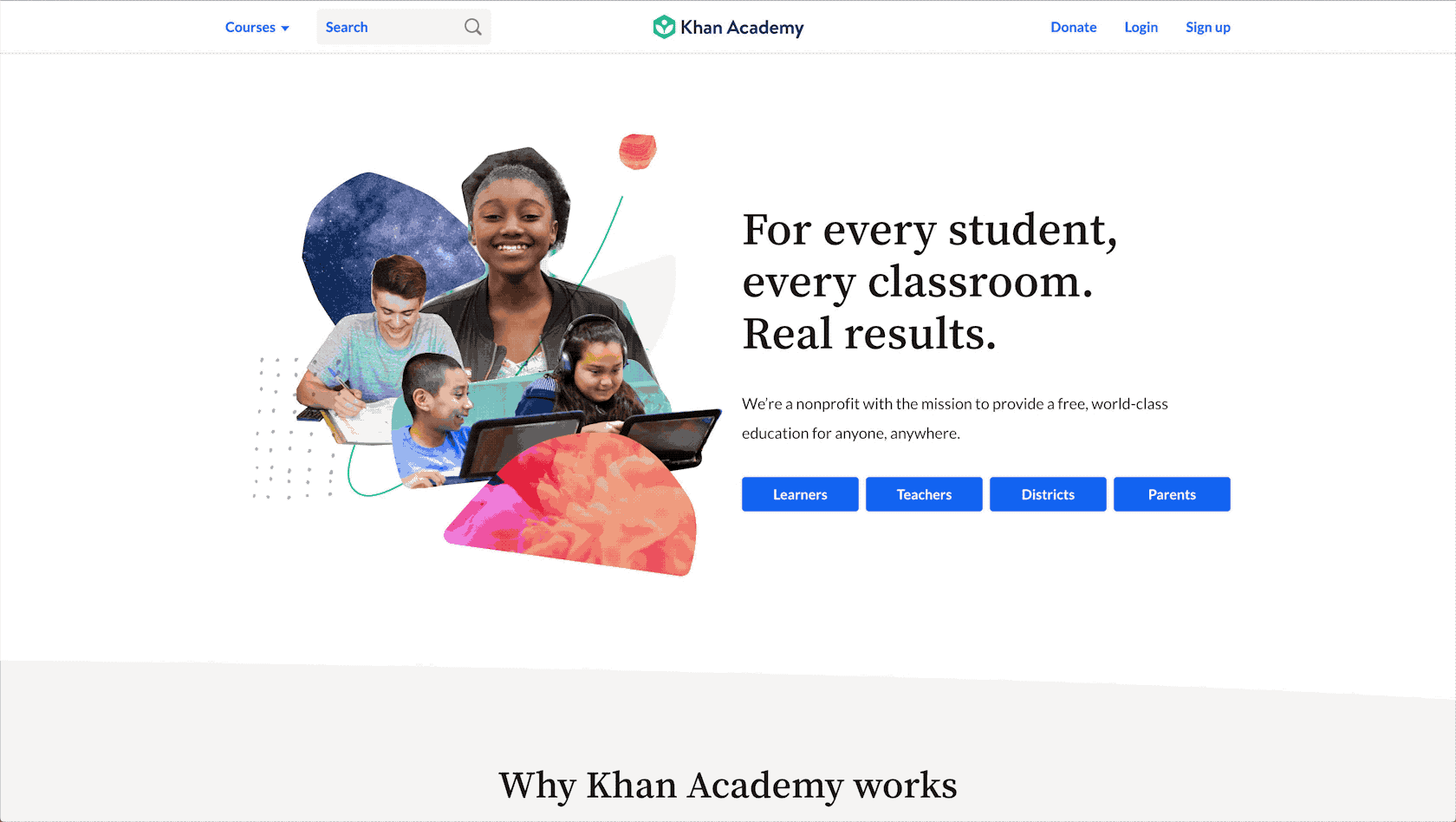
Bringing it all together
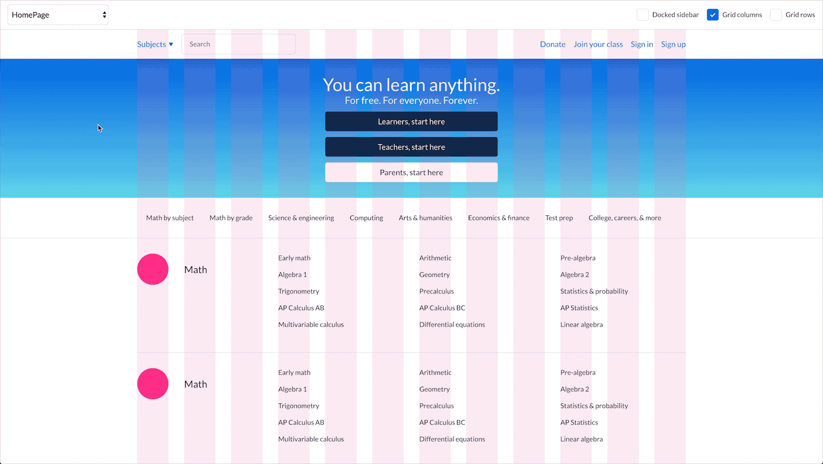
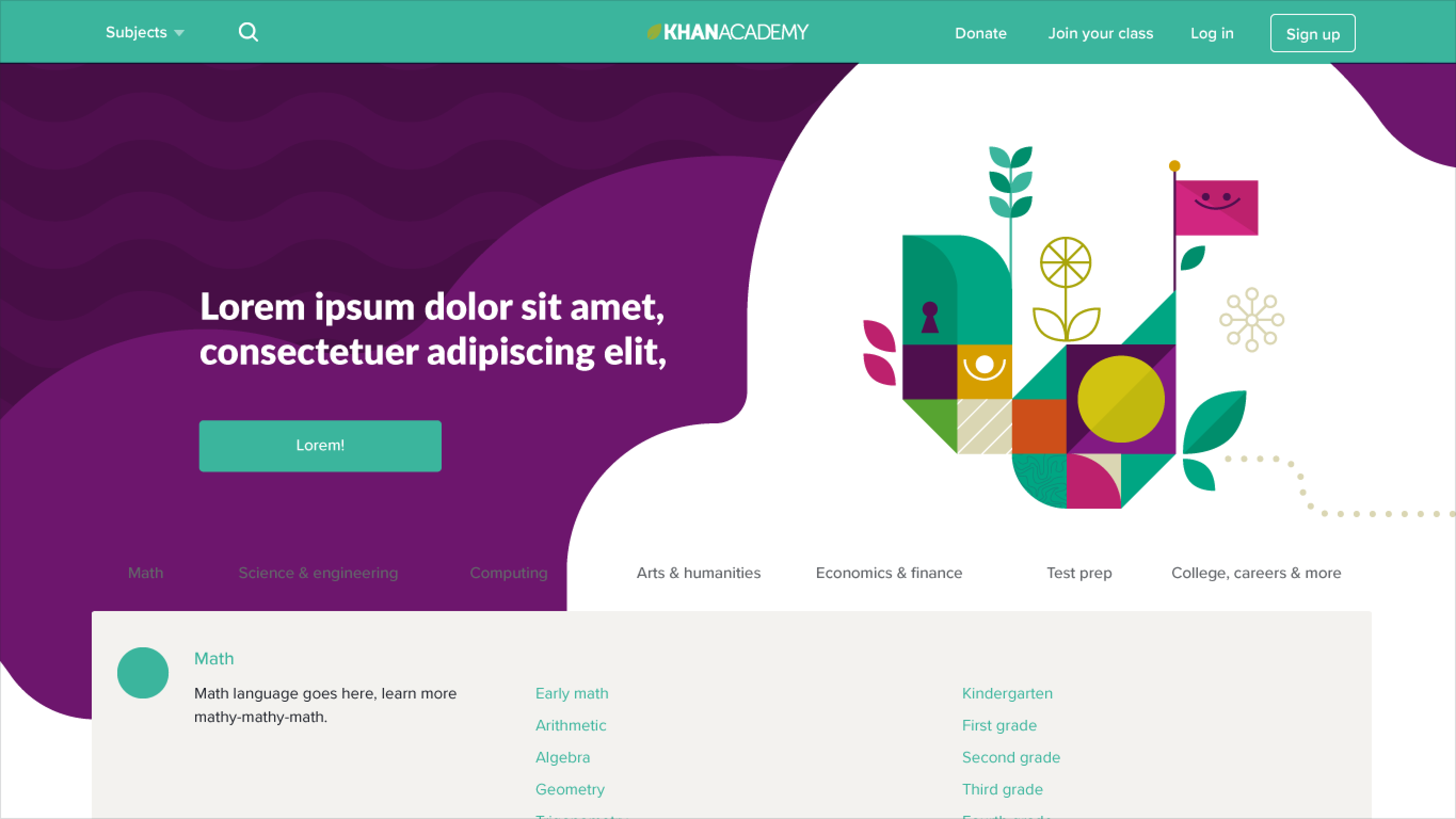
These elements and more came together in the latest redesign of our homepage, which you can experience for yourself while signed out of Khan Academy, by visiting https://khanacademy.org
🏁 The final 80%
As any seasoned designer understands, it’s not even close to over until the design is built and deployed. By the end of the Technical Sustainability Milestone we had answered some big questions. We’d made decisions that provided a foundation for the development of the rest of the system. But we still had a lot of detailed work that remained, for example:
⚒️ Working with engineering to roll out product changes. Given that we have a large product surface area, we had to be strategic about how we rolled out changes. We worked closely with engineering to assess the risks and tradeoffs between various approaches. In most cases we took an iterative approach to rolling out changes. For example, we rolled out our updated type system by initially just switching our primary sans-serif font without migrating type styles to the specific ones defined in our new hierarchy. Later on we went through key flows and updated them to use the newly defined type styles.
📐 Speccing out designs for components. By the end of the Technical Sustainability Milestone, we had a pretty clear idea of what we wanted various components to look like, but we didn’t really have in-depth specs about how that component would look or behave across various states (eg, focus states for accessibility).
📚 Developing and implementing process changes to support the success of our design system. In order to ensure wide adoption of our design system, we needed to build a shared library of components and come up with a process for making updates to it. Since we were using Sketch at the time, we needed to onboard designers by helping them configure Sketch to load our shared library. (We now use Figma!)
📝 Making updates to the design system based on issues we found during real-world usage. In some cases, we found that an aspect of our design system had an issue that we needed to resolve by revisiting the design. For example, we ended up needing to add an additional type style. We also found that our design for modal dialogs was too restrictive because it only allowed for a specific set of layouts.
🏃 Designing components we hadn’t been able to get around to. Since we had limited time, we were only able to design the highest priority components. There were still a bunch of components that we needed to design and build, such as popovers and tables.
📣 Managing user expectations around the changes. We are lucky to have a large and passionate user base. That passion also meant that we got a lot of pushback on changes, particularly when they were only partially rolled out. We worked with customer support to write some articles and respond to people who wrote in. This follow up helped users understand we were listening and had plans that would address their concerns. When users saw good changes continue to happen, the complaints died down. Students still want more avatars, though (we hear y’all!).
💭 Keeping the dream alive
To wrap up the unfinished work, we decided to continue using our existing guild structure. Each team member would remain part of one or two guilds. Guild leads would work within their guilds to prioritize work to be completed alongside product teamwork during “20% time.”
Sadly, in practice, 20% time felt more like “magic time.” The pressures of regularly scheduled product and marketing work, in addition to the overhead cost of context-switching to work on the system, were just too much. Ultimately, we decided to abandon the guild model (both on design as well as on engineering).
Instead, engineering now has a dedicated team called Front-end Infrastructure. They maintain our design system in the codebase. They also do important work that improves the efficiency of our entire front-end engineering team. When we are able to budget the headcount, we will add full-time designers to that team (in the meantime, we’re hiring!).
For now, we’ve settled on a smaller team of 2–3 designers to prioritize, schedule, and in many cases, actually complete design additions and improvements to Wonder Blocks. When it comes to scheduling, we’ve found that it’s most effective to collaborate with our current PMs. They understand that we’ve improved development and design efficiency by having a more cohesive system, so they're excited, too.
Together, we make a case for and schedule Wonder Blocks work directly on product timelines. Oftentimes, that means we roll out a change within a specific product effort first. This has greatly improved the chances of a Wonder Blocks addition/change being shipped, being shipped in a timely manner, and our ability to work sustainably as a team.
The work on Wonder Blocks continues!
Special thanks to the originating team: Leo Basañez, Erica Deahl, Todd Diemer, Natalie Fitzgerald, Jacob Greif, Louis Harboe, Sanyukta Kothari, Elizabeth Lin, Tatiana Salazar Londoño, Vivek Venkatraman, and Tabitha Yong.
And to those who joined us and helped carry the torch forward: Raphael Arar, Garrett Kroll, Priya Samuel, Warren Schultheis, and Irene Wang.
Summary
Here’s a quick compilation of what we learned:
- Check how your organization is operating—how are staffing, time, and tasks being determined? "Is it leading to the development of maintainable, high quality products and overarching systems that have clear ownership?
- Find co-conspirators in other functional teams, such as engineering, and band together to make a case for investing in a design system.
- Involve your entire design team (or as much of it as you can) in the process of developing your design system—ideally in hands-on design work, but at minimum in gathering feedback about issues to be fixed as well as proposed solutions.
- Partner with your engineers to solve some of the more technical design problems together.
- Use design principles to facilitate day-to-day decision making. Creating a scorecard with the principles makes them easier to use. Gathering concrete examples and counterexamples brings them to life.
- Converging on the design system concept is only the beginning of the work. Audit your product with help from your engineering team, and come up with a plan for how you can roll out your new design system with minimal disruption for your users.
- Come up with a plan for maintaining your design system. If you have the resources, dedicate an entire team of designers and engineers to maintain it.
- Be ready to learn and adjust your designs along the way. Inevitably, issues will arise as you start applying your design system across more contexts.
- Celebrate your accomplishments—it’s no small undertaking to develop and implement a design system! 🎉
