A system built on parity: How to treat all of your users equally


Parity is at the heart of how Lyft builds its universal design system. We build parity heavily into every step of our process because we prioritize treating our users, designers, and engineers equally.
At fast-paced start-ups, designers often only have time to hand off one design to both their iOS and Android engineers. Most of them have iPhones, so they design what they know. Android engineers are then put in a place where they have to solve the puzzle for what it means on Android. It starts to build a culture where one operating system becomes first class and everyone else is second. By eliminating the need to understand platform discrepancies, we enable designers and engineers to communicate and build for all platforms efficiently and consistently.We accomplish parity across our mobile platforms through:
Naming
When we start building a new component, we spend a lot of time thinking about its name. Choosing a consistent name makes communicating about components much easier. A designer not familiar with Android might say “navigation bar” and create a lot of confusion until the engineer and designer realized they were talking about different things. For everything we build, a single name is a must.
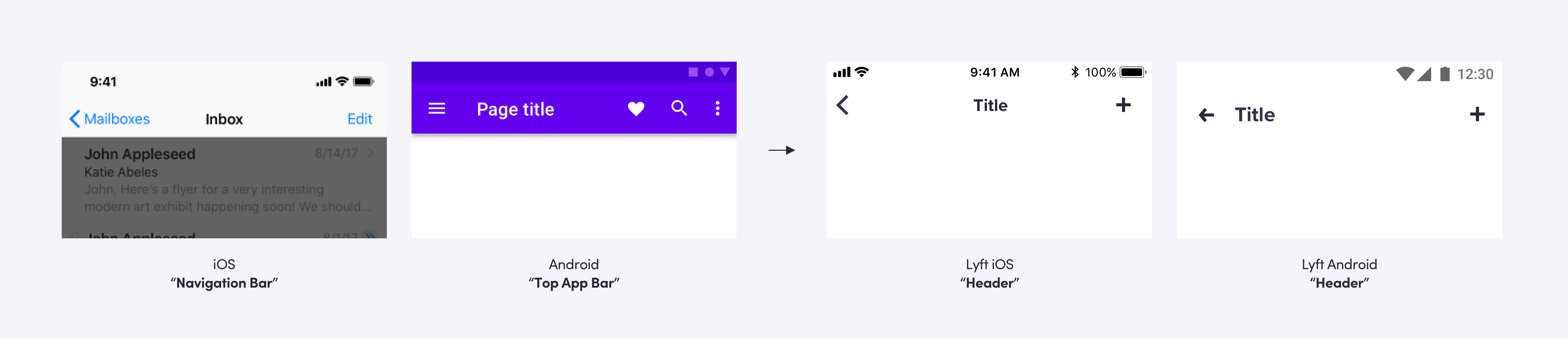
For example, on iOS “navigation bar” is the bar at the top of the screen with the back button. On Android, it’s the bar at the bottom with the system back and home buttons and the equivalent of iOS’s navigation bar is called the “app bar.” For this component, we landed on “header” since that describes what it’s used for and doesn’t conflict with platform names.
Feasibility
At the start, we determine a component’s feasibility based on its ability to work successfully on all platforms. This isn’t always easy because there are frequently solutions that work amazingly for one at the expense of the others.
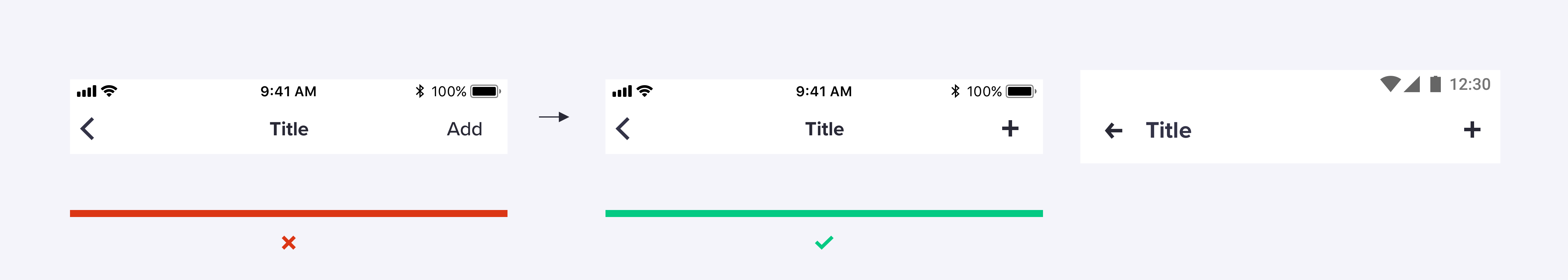
For example, we weighed the use of icons vs copy for actions in the header. Copy and icons are common on iOS, while Android commonly uses icons only. Icons have the added benefit of not growing too long or truncating when localized. Again, we prioritized parity for both platforms, which means a mix of text and icons. We work closely with our iconographers to make sure our icon-only actions in the header are clear.
Platform vs. Design System
Let’s look at our “sheet” component as an example. It’s similar to “action sheet” on iOS and “bottom sheet” on Android.
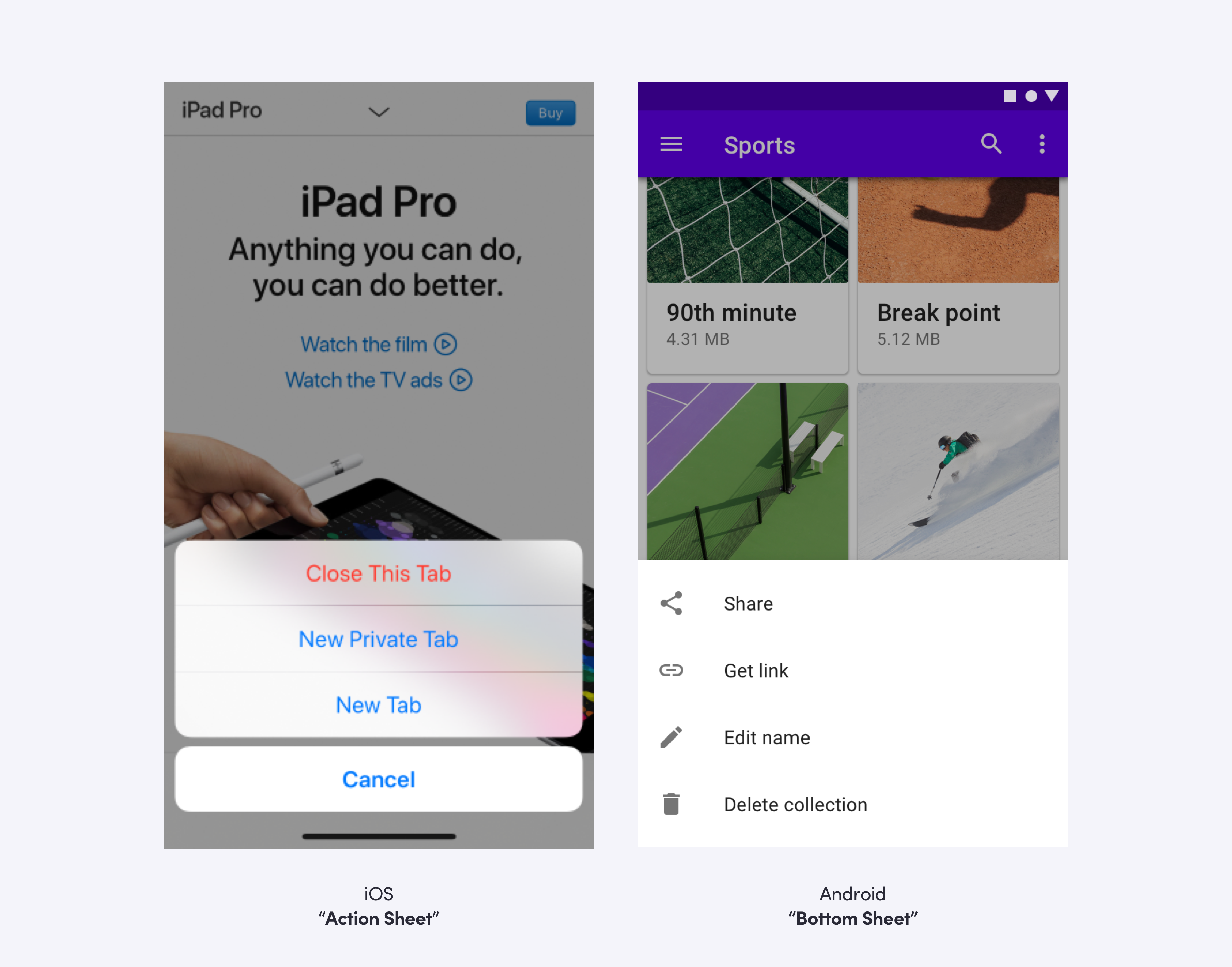
For this component, we chose parity with the platform over parity with the design system. Giving the sheet a familiar feel for the user is more important than looking identical on each platform.
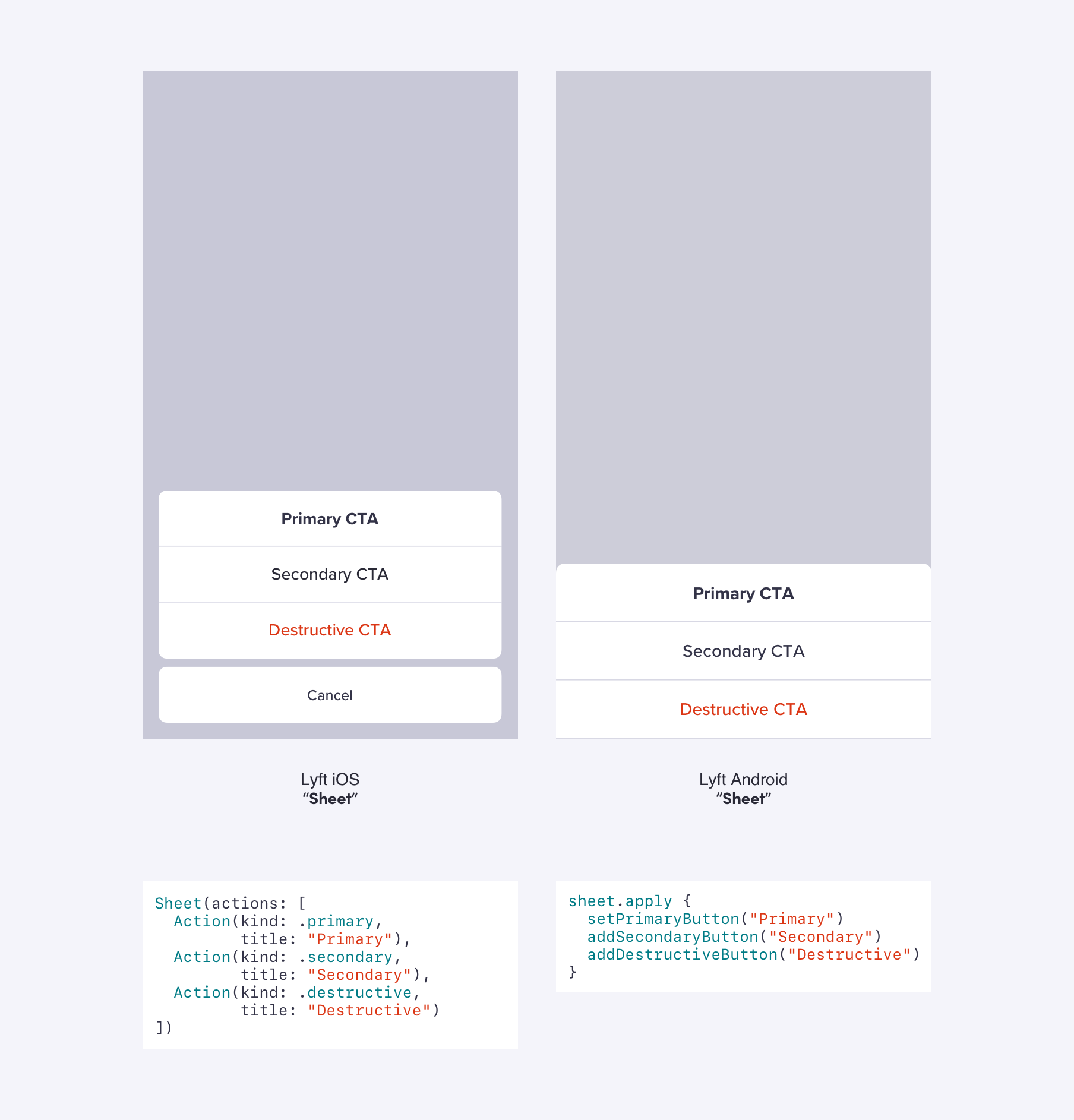
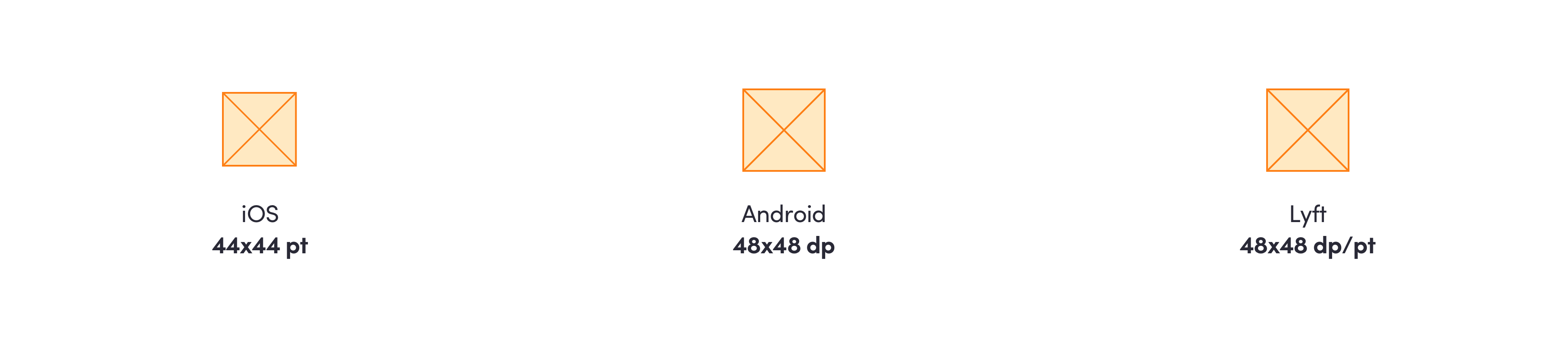
But, we deviate from platform conventions in favor of design system parity when it makes sense. On iOS, the recommended minimum tap target is 44x44. On Android, it is 48x48. Since our design system is in increments of 8, we chose 48x48 for the minimum tap target on each platform, which also provides more space for the user to tap the component.
Contributions
Contributions from other teams can cause a component to fall out of sync. It is rare that both iOS and Android engineers from the contributing team are both available to create the component together (or at all). We treat this lack of parity like a bug and prioritize it over other elements on our roadmap. Parity is only possible with a dedicated design & engineering team focused on it consistently.
When a team is contributing a new component, we create tasks for both platforms before any work begins to ensure we’re building for parity. We’ve seen other teams volunteer their time to help work through the backlog of tasks to help increase parity, too!
Migration
Because Lyft grew rapidly and didn’t have a design system until early 2018, there are numerous legacy features built without parity in mind. By migrating these features to our system, we can fix inconsistent designs and behaviors and, more importantly, shift the responsibility of maintaining parity to a system level, ensuring future changes are propagated to all features in a consistent manner.
We begin the process of adoption and migration by auditing in-progress and existing features that don’t use our components and tracking these use cases in our internal task management system, JIRA. In cases where only a single platform has been migrated, the task of bringing the other platform to parity is prioritized.
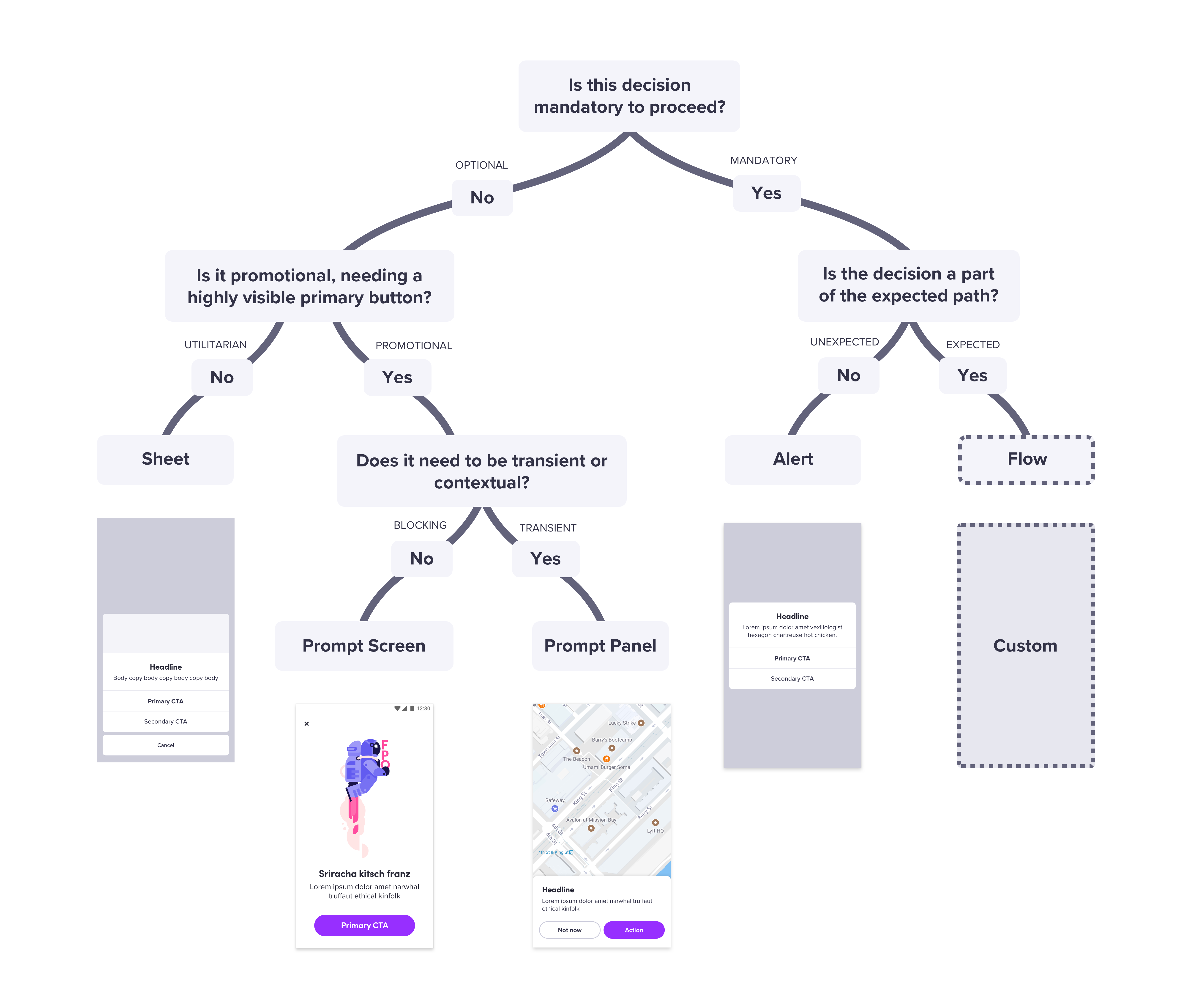
The advantages of a system with full parity shine during the migration process. By rigorously following the design guidelines established in our system, engineers on both platforms are able to independently migrate designs for the same feature and end up using the same system components. We make this process efficient by providing "cheat sheets" like a messaging decision tree to determine which messaging component to use. By solving design problems at a systemic level, we can easily apply these rules to a wide range of use cases.
Migration projects are often highly time-consuming and require cross-platform coordination. We encourage the prioritization of these tasks for both our team and feature teams by ensuring equal support on all platforms in terms of documentation and dedicated 1:1 support from our team.
Conclusion
Prioritizing parity is important because we want to treat our users equally, communicate efficiently with the same language, and promote consistent designs and behaviors. We design and build in parallel so any discussions on details that come up during implementation (and there are usually many) get addressed and considered together. We don’t even announce a component as ready to use until it is complete in design, Android, and iOS. This focus on parity has enabled us to provide a truly universal design system that is adopted equally on all platforms.
Linzi, Kathy, and Sam lead the Design Systems team at Lyft, who are responsible for building, maintaining, and supporting ‘Lyft Product Language’ which spans across mobile and web. You can read more from Linzi over at Tap to Dismiss.

