How a small team built figma.com’s design system

Figma is a collaborative interface design tool that gives individuals and teams a better way to design, but when we did an audit of our marketing pages, we discovered we weren’t heeding our own advice. Our site had a lot of inconsistencies. We counted over a dozen different heading sizes, buttons with varying size and color, and even more frustrating than that, every time we wanted to create a new page, we were basically starting from scratch. Our approach was not the modern way of building websites and we needed to come up with a better solution.
A lack of consistency
As we began to dissect the pages on our marketing site and the process for creating new pages, we realized that we severely lacked the consistency and rigor that we believe to be a best practice for web design. Instead of a repeatable method for building pages and a library with reusable elements, designers and developers were coming up with their own systems and creating brand new solutions, many of which were very similar, though not exact, to solutions already implemented on other pages. Not only was the marketing site difficult to maintain and update, it felt inconsistent for our users. We started to look for ways to bring the same standards we apply to the Figma product to how we develop and design pages for our marketing website.
Working with a small, diverse team
We empowered a small team with a diverse skill set to tackle the problem quickly. The team consisted of a producer, who was responsible for the overall organization and facilitation of the project; a developer, who standardized code across the design system and built everything into a content management system; and a designer, who refined and organized existing design components and came up with new solutions for missing pieces.
Taking inventory
Instead of continuing to reinvent the wheel, we took an in-depth look at what we’d already created. Before we’d even considered creating a style guide, component library, or full design system, we’d been creating marketing pages. That meant we already had a collection of components. Sure, it wasn’t labeled properly and was seriously unorganized, but we had something to start with. Our first step was to take stock of what we had — fonts, sizes, colors, column widths, layouts, and so on. We started compiling all of that information into a doc, and from there, it was easy to see overlaps, or in other words, repeated applications of patterns. We also spotted the outliers, or those components that had been used only once, and therefore didn’t have a place in our style guide.
Some of the repeated elements were quite large, so we dissected them down to an atomic level, which would allow anyone using the design system to then piece the atoms and molecules together to form organisms that fit the needs of any page and the content that needed to live there. It was very important for us to end up with flexible building blocks that could work in conjunction with one another in any combination.
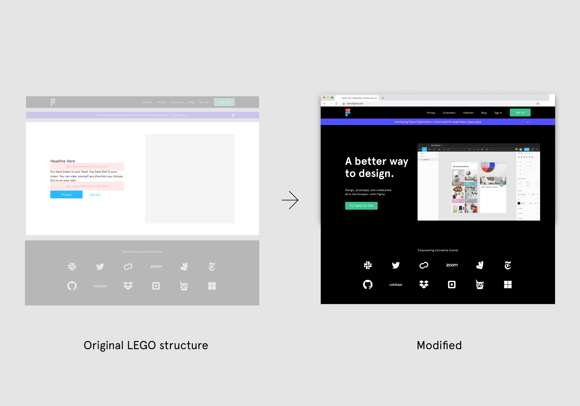
We also looked for elements that were similar, but not exactly the same, and agreed on one style. So in our earlier example, instead of 12 different sizes for headings, we established the standard H1-H6, with one size for each heading type.
Once we interpreted and refined the visual language we’d already created, it was a pretty simple exercise to organize all the components in a shared library so that a person with little design experience or familiarity with Figma’s brand could create something that looked and felt cohesive with the rest of our site.
A simplified, flexible design system
Over the course of a month, our small team created and organized a robust, adaptable style guide and component library that now lives in our CMS, Contentful. Everything is consistent across the board — typography, sizes, padding, line heights, colors, and grid. Where 19 neutral greys used to exist, a designer now has a handful of clear options. And to kick the fun up just a notch, every color has its own branded name, inspired by California, where Figma is based. An earthy green is avocado toast, and an ember yellow is sunset. Not only is it more enjoyable for designers working in the system, but it’s more memorable for teams, too. We also spent a fair amount of time labeling everything precisely, so a designer can quickly locate what they're looking for. Now, when the design team goes to create a brand new page, they’ve got flexible building blocks right at their fingertips. Building a module with an H1, H2, body copy and CTA is as easy as grabbing those componenets from the design system. You can view our style guide file here.
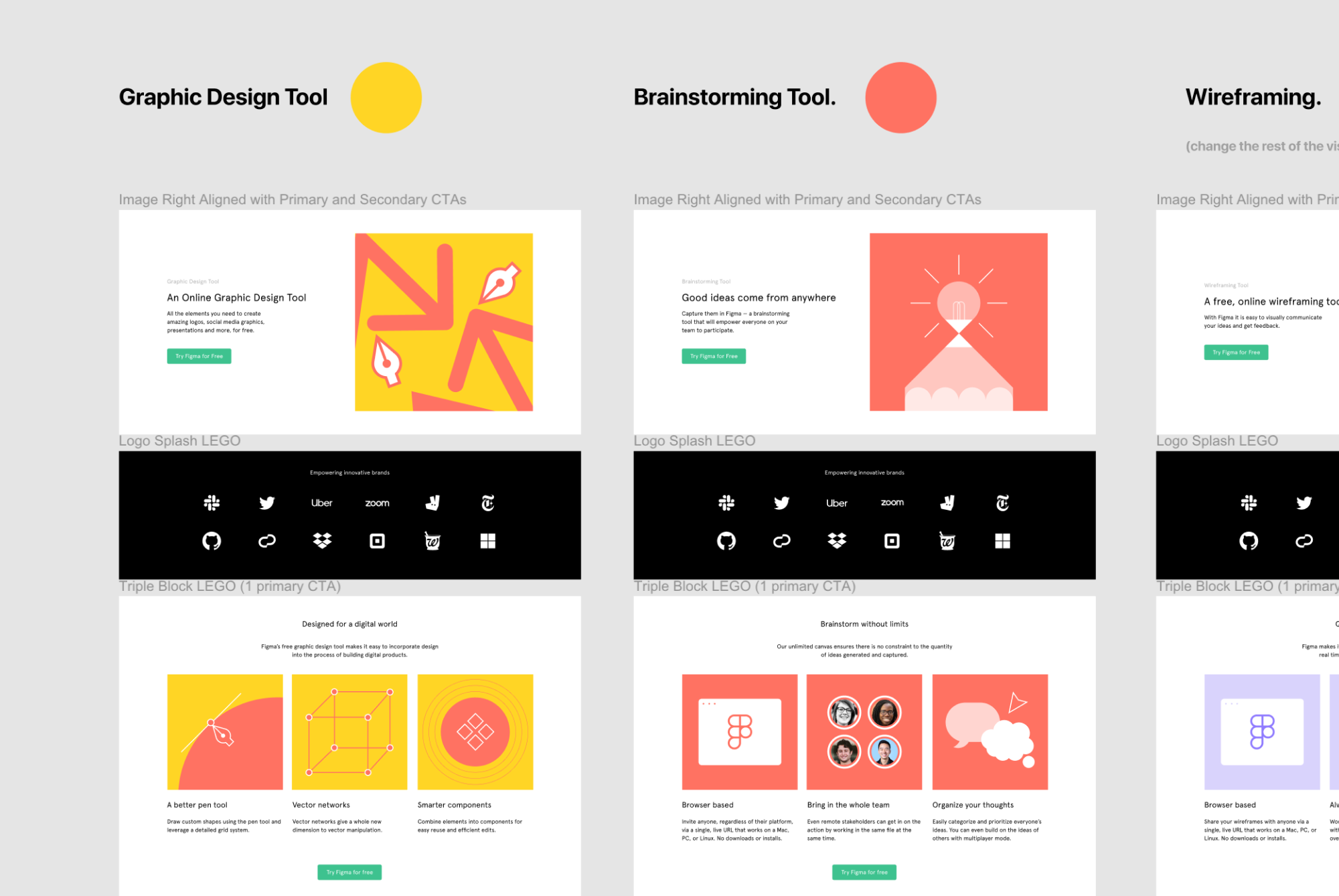
We’ve also begun to “componentize” commonly paired elements and fully assembled sections using the elements from our system. We call these larger organisms “FLEGOs” (Figma + LEGO) and you can check them out here.
Getting to market faster
The majority of Figma’s core marketing site is now built with this framework. Using our design system through Contentful, we can go from concept to ship in one day and can do that without the help of a developer. We used our new design system to announce the launch of our Organization plan, and have since used it to revamp our features and use case pages.
We’re also saving time and money in multiple departments. When a designer sits down to create a new page, instead of opening up an empty canvas, she already has all the necessary pieces. She can focus on more complex problems, like how to best communicate with our audience, rather than deciding on headline sizes and grid styles. Additionally, when we want to make a universal change to an atom or molecule, we can do it once in Contentful, rather than getting a developer to hunt through every page to make dozens of updates directly.
An ongoing evolution
We’ve already been able to rely on our design system for some big projects and continue to , but we’re still revising and modifying as we go, and expect this will always be the case as we encounter new reasons to add components to our library or modify what exists. We have work to do regarding accessibility and that is something we have prioritized improving.
There are also times when we break out of the system. For example, we wanted to capture a visitor’s attention right away on our homepage, so we opted for larger headline text, and a bigger video, whereas a similar component on other pages appears as more of a 50/50 split with a smaller headline.
Whenever we find ourselves straying outside of the system, we’re careful to justify why, and also to investigate the likelihood of that same decision being made in the future. If there’s a good chance we might use it again, it’s a compelling reason to add it to the component library.
Start your own system
Trying to organize and advance your own system? The building blocks of our marketing site that are made from the atoms and molecules in our design system, FLEGOs.